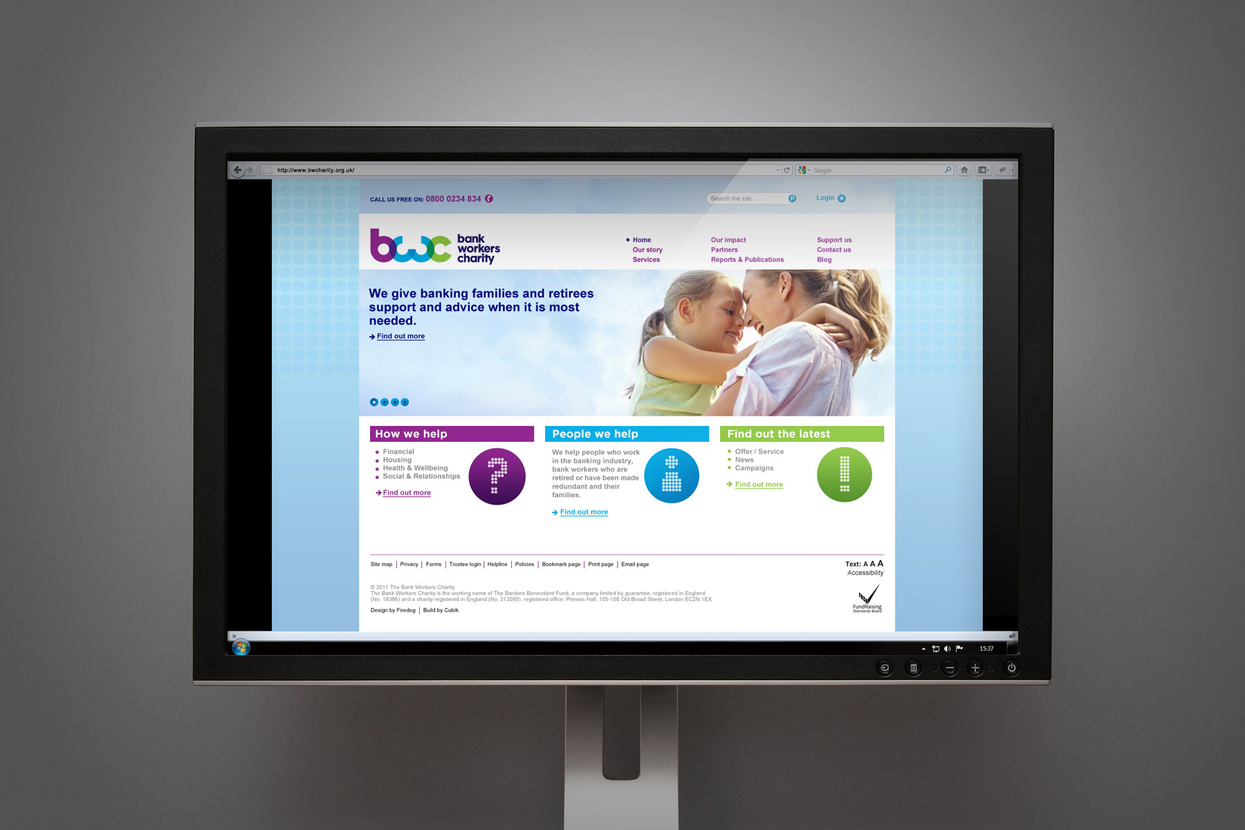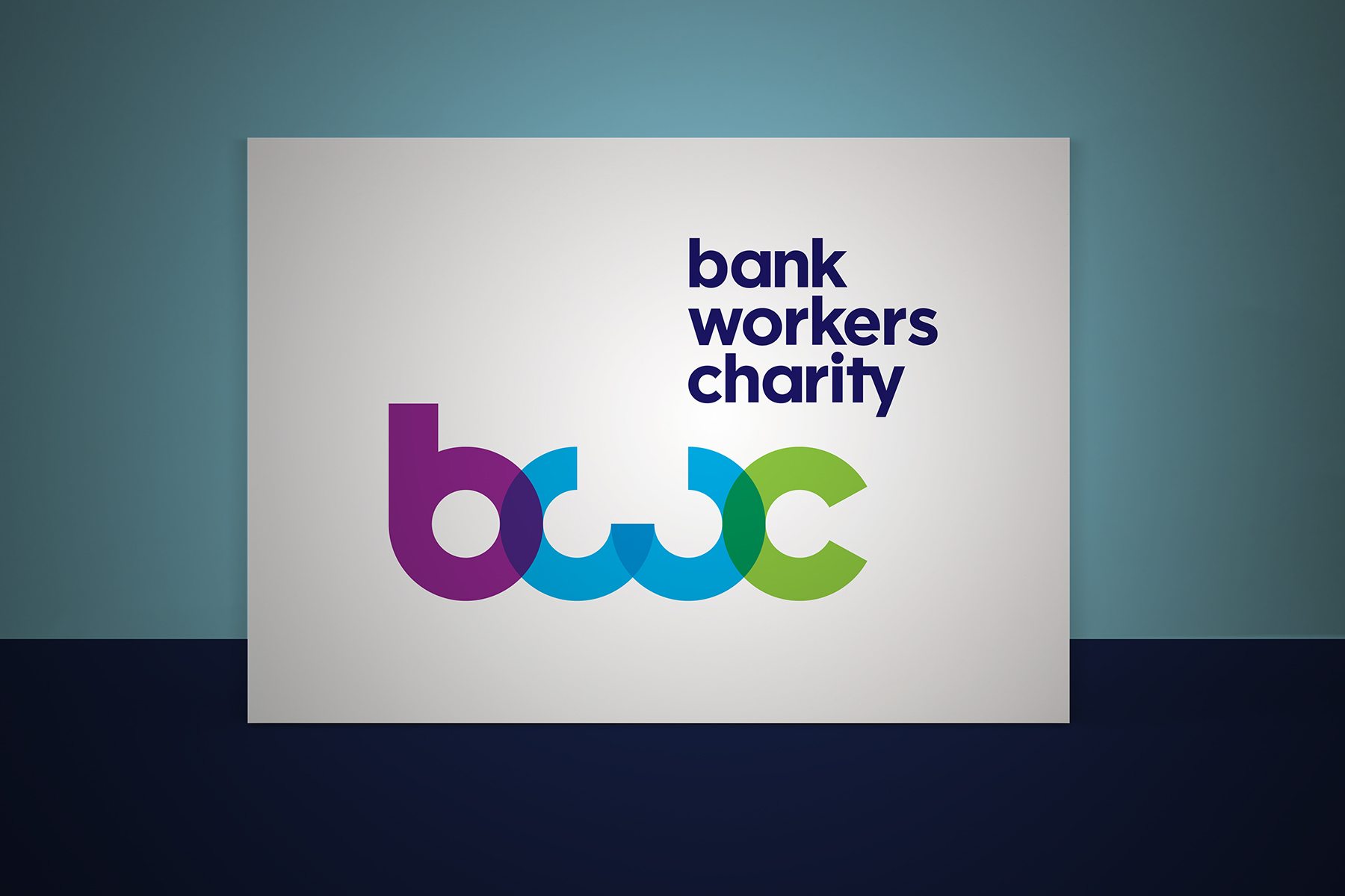
The Bank Workers Charity brand mark is constructed purely out of circular shapes. The transparency and colour creates a modern yet approachable feel.
The Bankers Benevolent Fund, a financial charity, has been around for a number of decades, but not many people were aware of what they do.
With addressing and clarifying their values, offering and vision internally, they needed a fresh, exciting and dynamic new brand to communicate these externally. After changing their name to Bank Workers Charity, they approached Firedog to help them create a modern and distinctive identity to match.
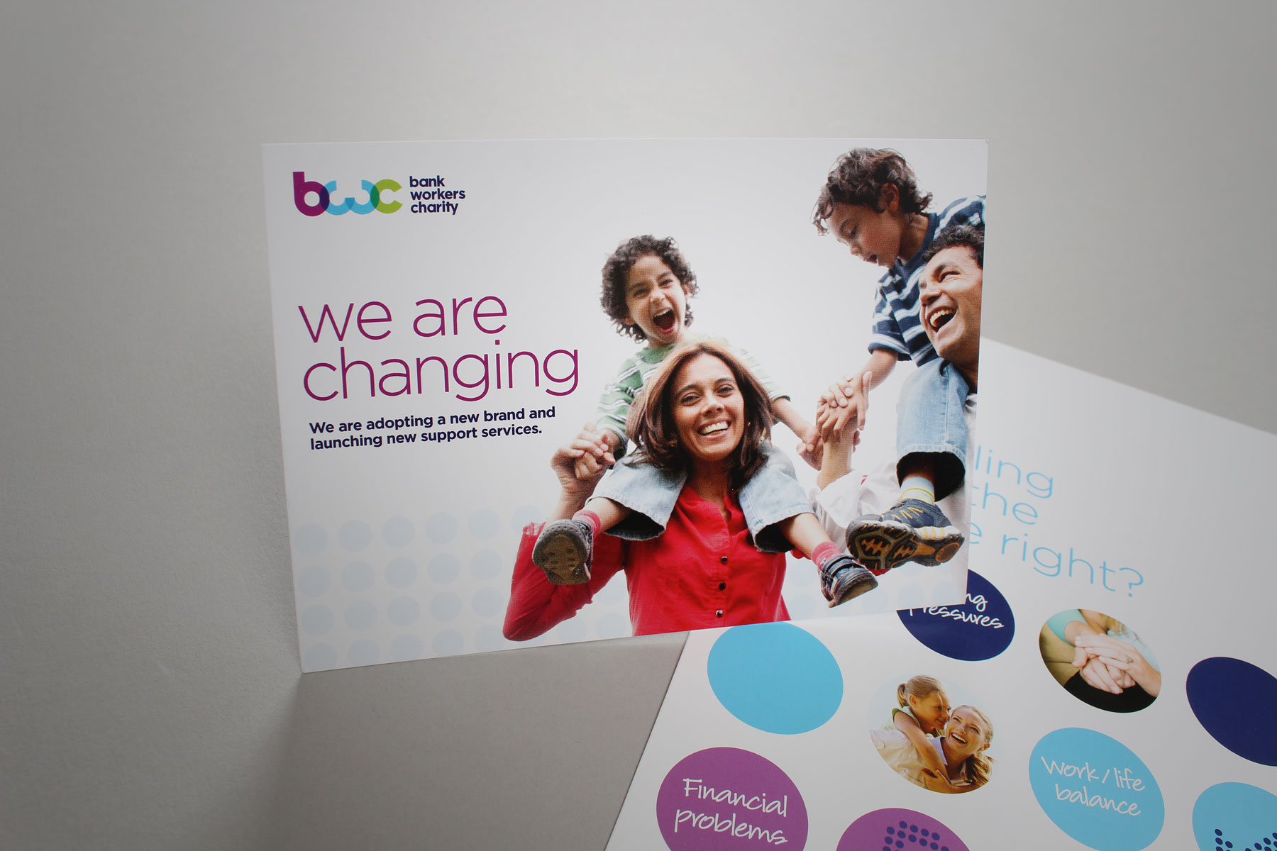
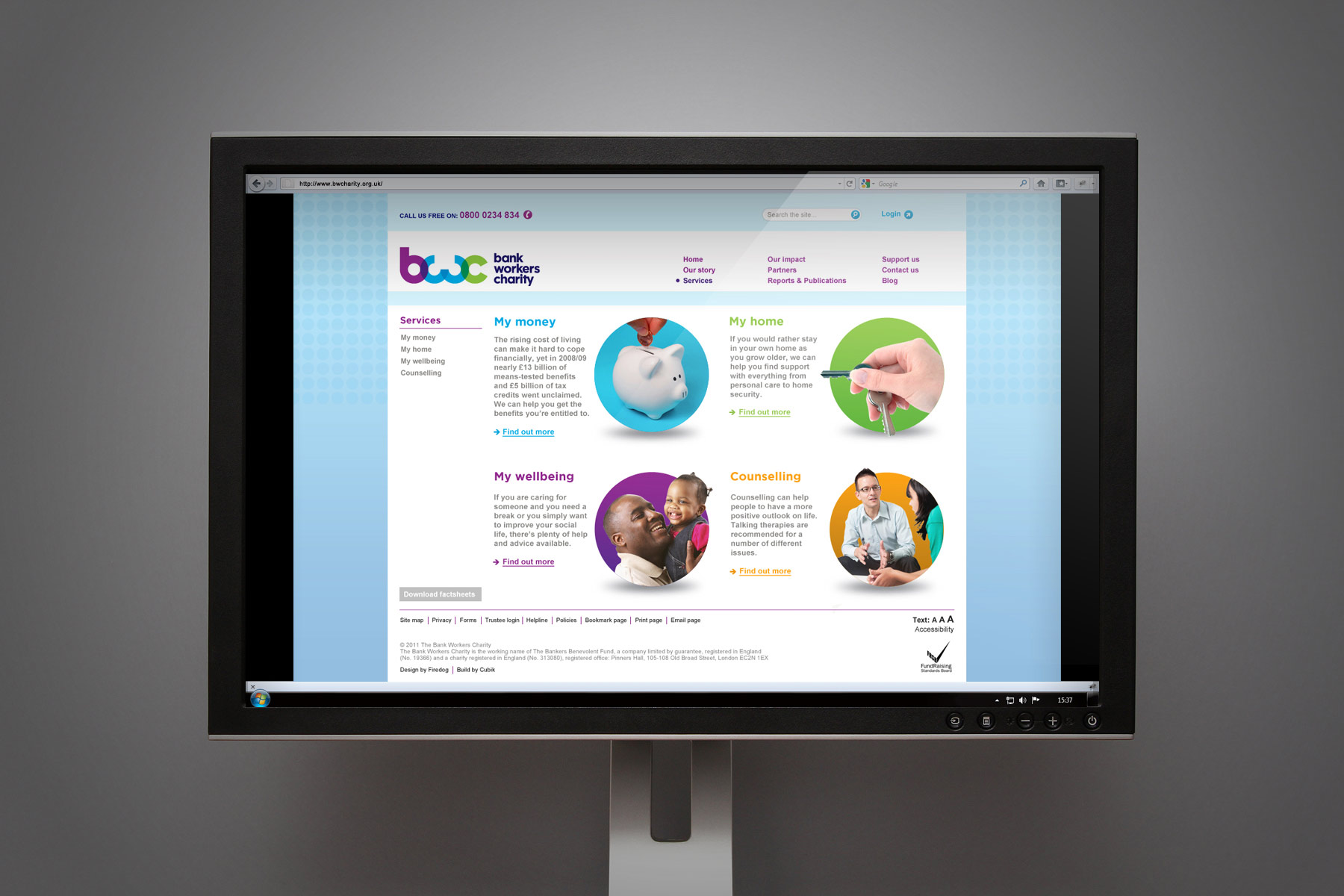
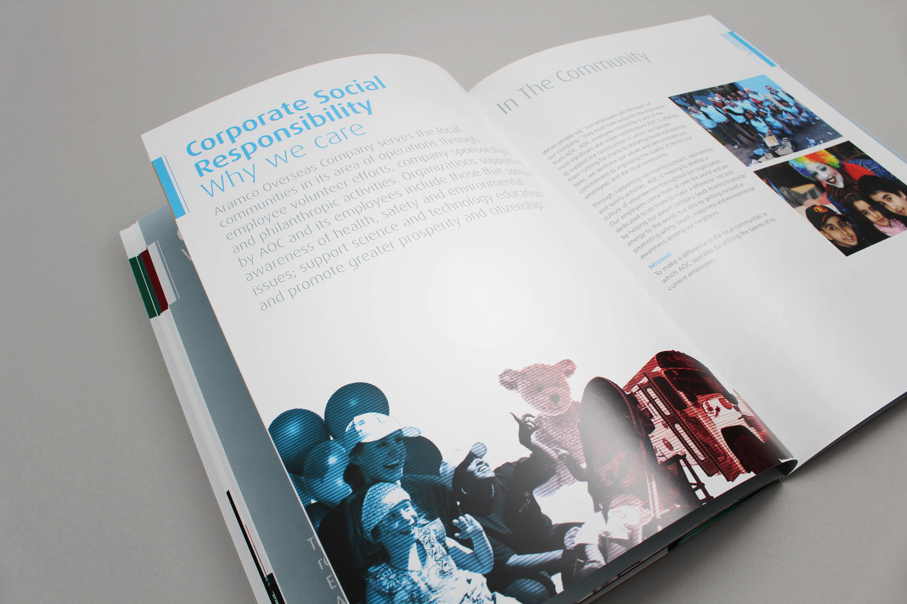
The supporting imagery suite is created from both stock and a series of actual case studies. The tone is confident and assured.
The primary and simple nature of the logo lends itself well to being easily reproduced across all media.
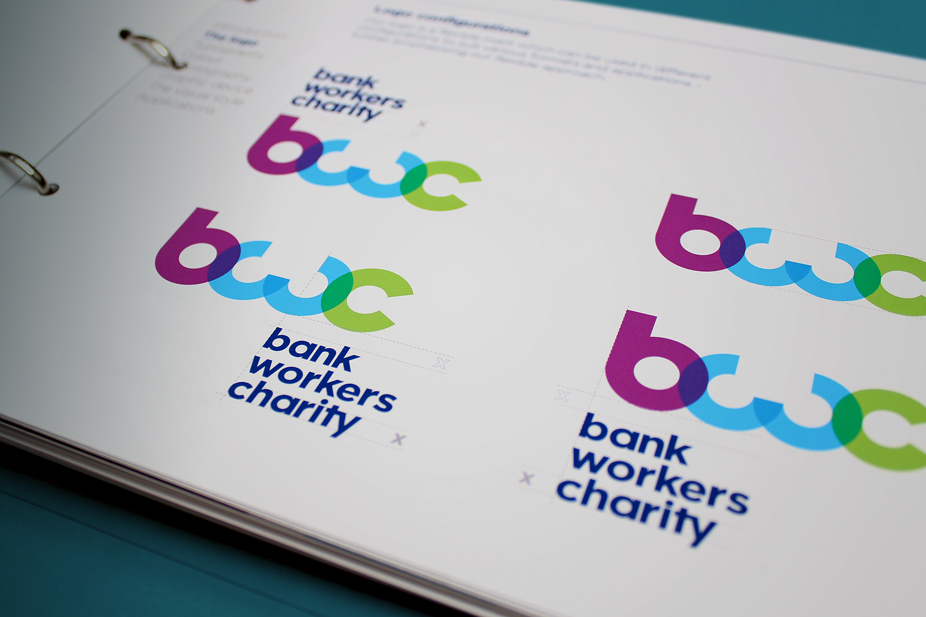
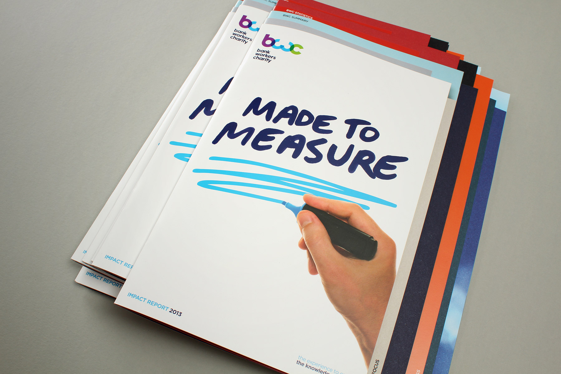
The brand project wrapped up with an extensive set of brand guidelines.
The BWC impact report contains a rich variety of charts and graphs
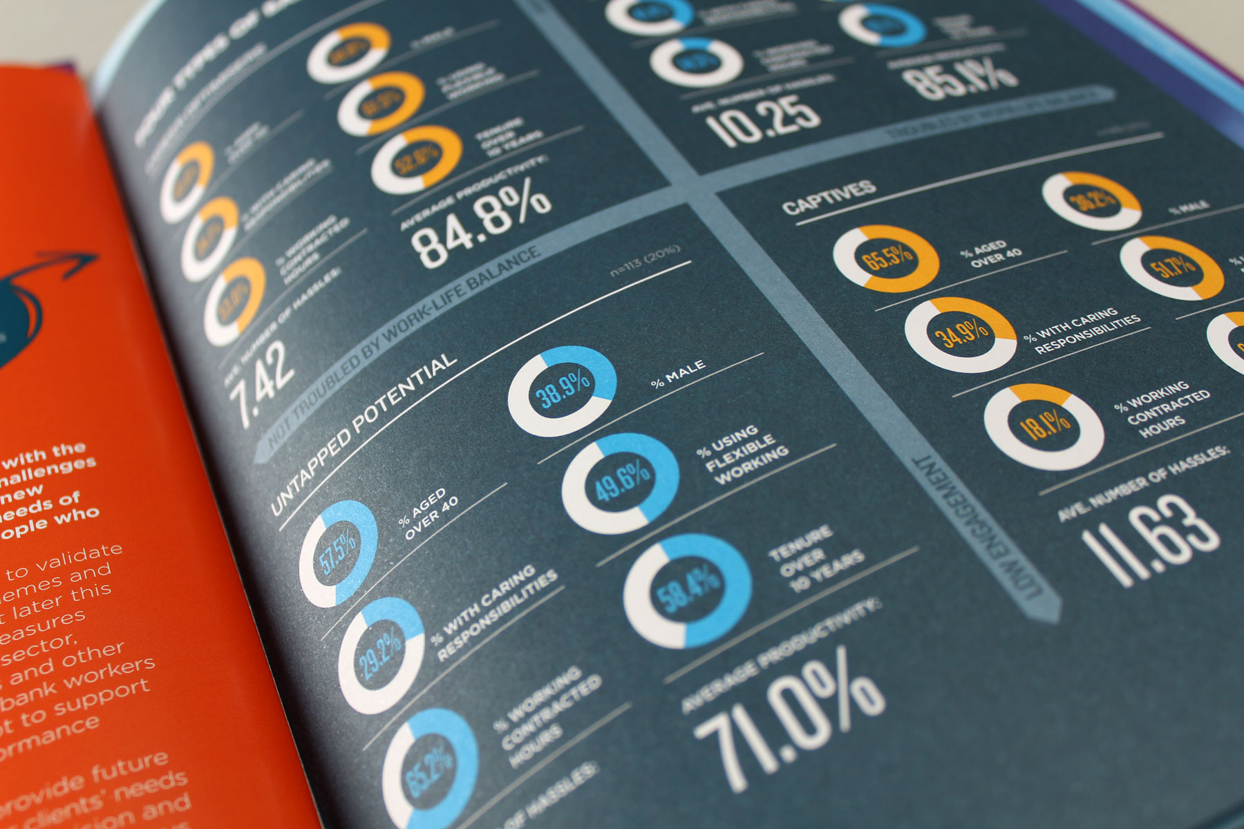
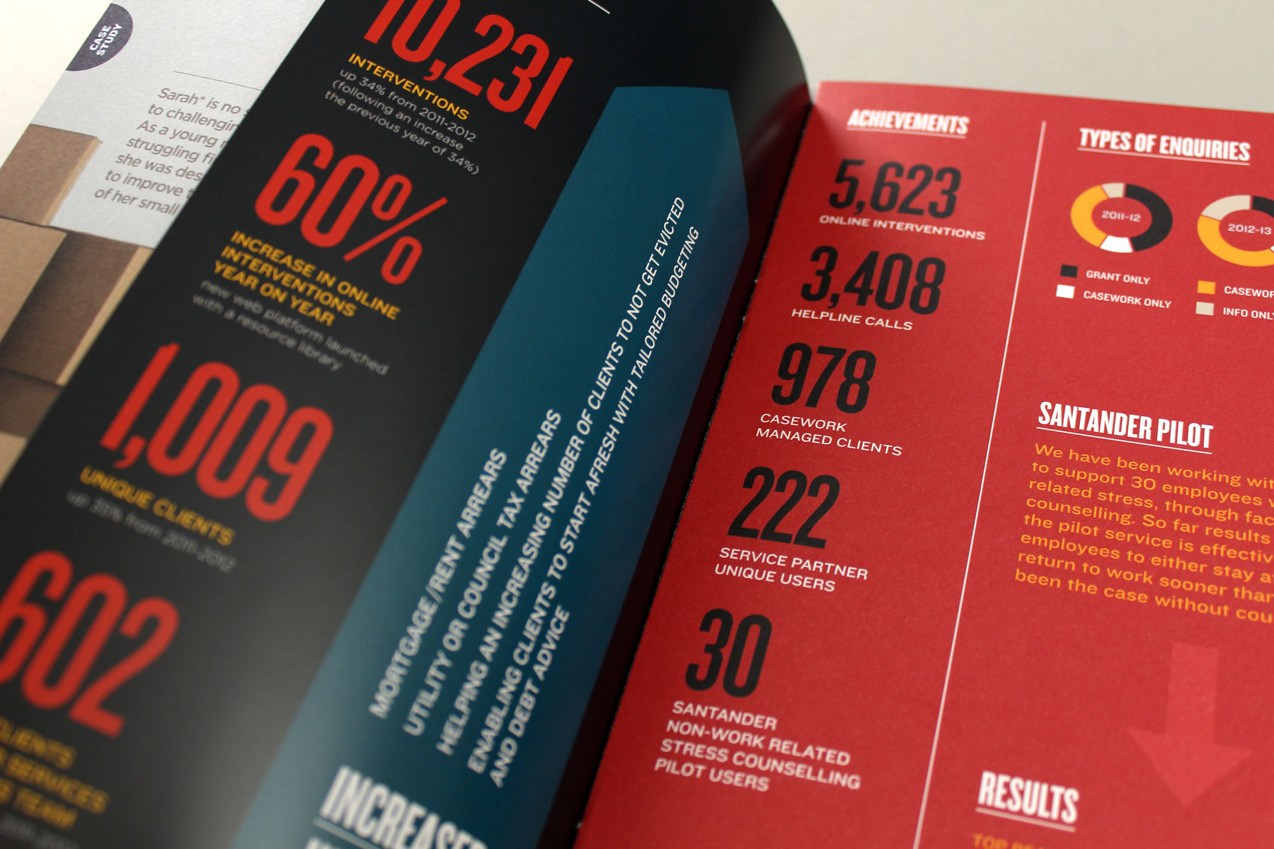
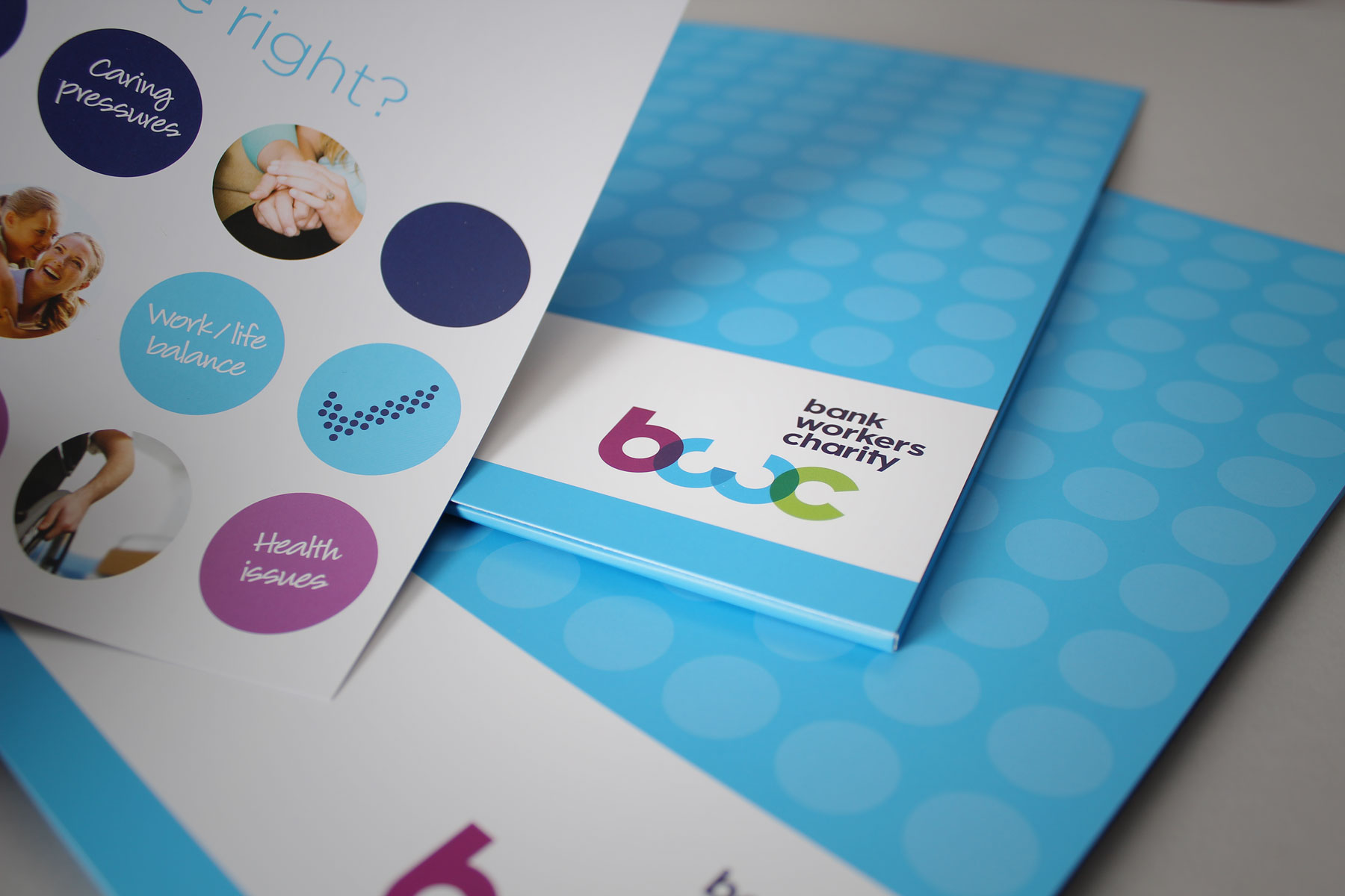
The creation of simple to read graphics aids the legibility of BWC communications
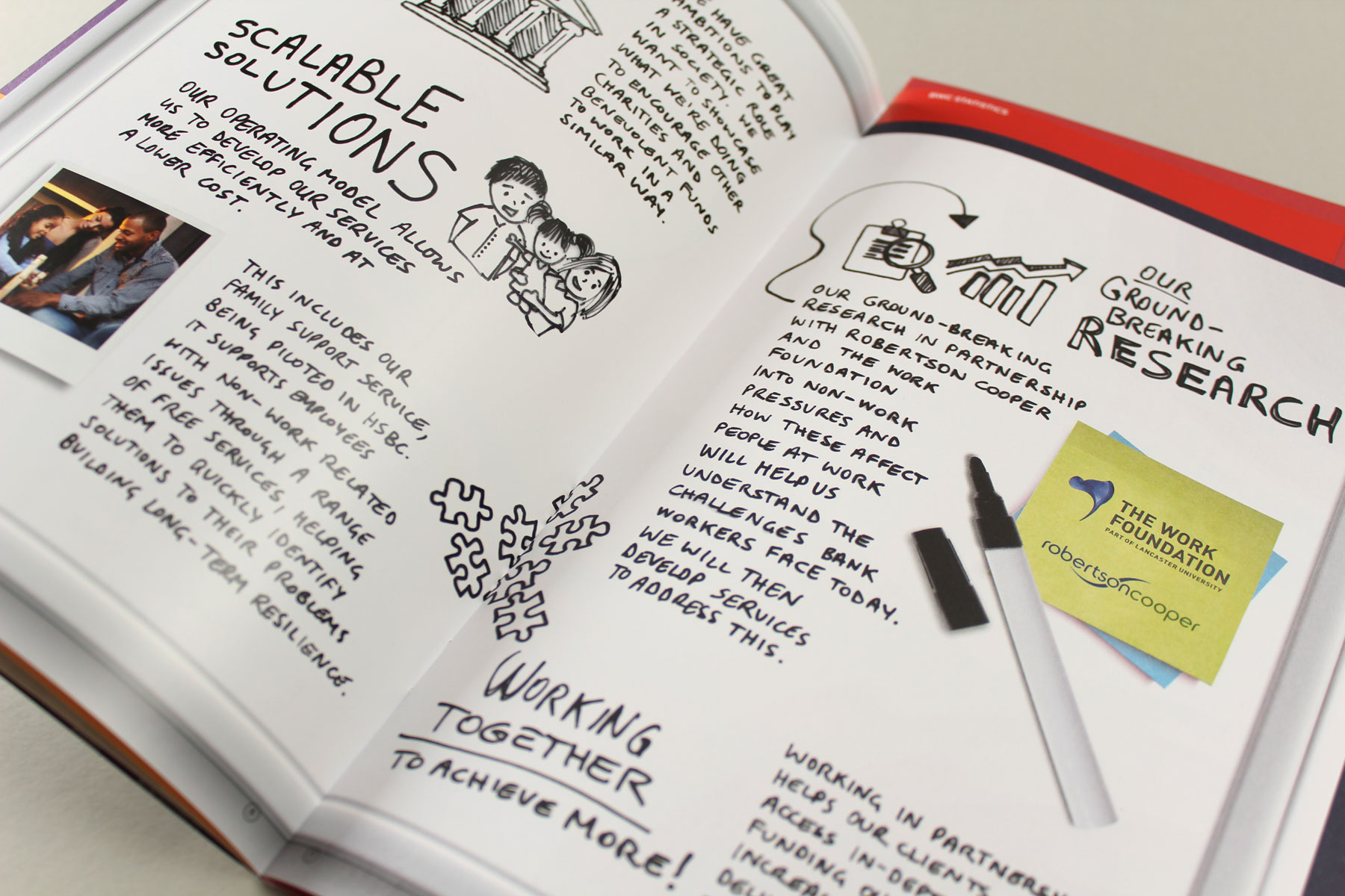
We wanted the printed impact report to reflect the hands on support of the charity - a good deal of the design was created by hand