Brand identity

Netnames

A modular hexagonal visual identity created for leading web technology and digital branding business.

NetNames is a leading provider of global brand protection and internet domain name management services. Our creative remit was to take a disparate campaign identity and wrap it within a cohesive yet flexible visual identity which could be applied across all channels and communications. Our remit for NetNames extended to strategic consultancy, brand identity creation, visual identity universe, visual look and feel, iconography design, print and digital advertising, MS office templates, infographic design and brand and spirit guidelines.

NetNames’ existing identity used the colour orange yet its use of visual assets lacked consistency and a greater brand narrative. Thus, we looked to create a system which would build greater brand recall and presence.

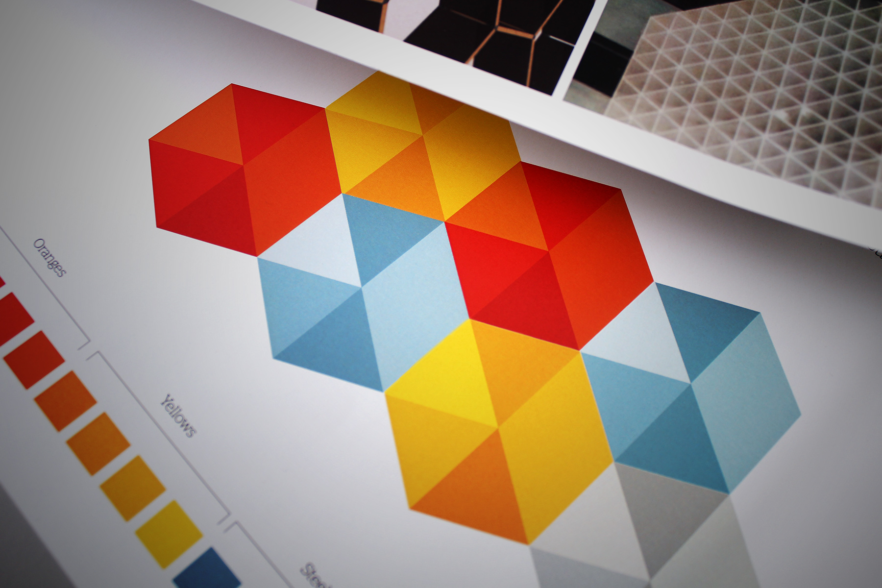
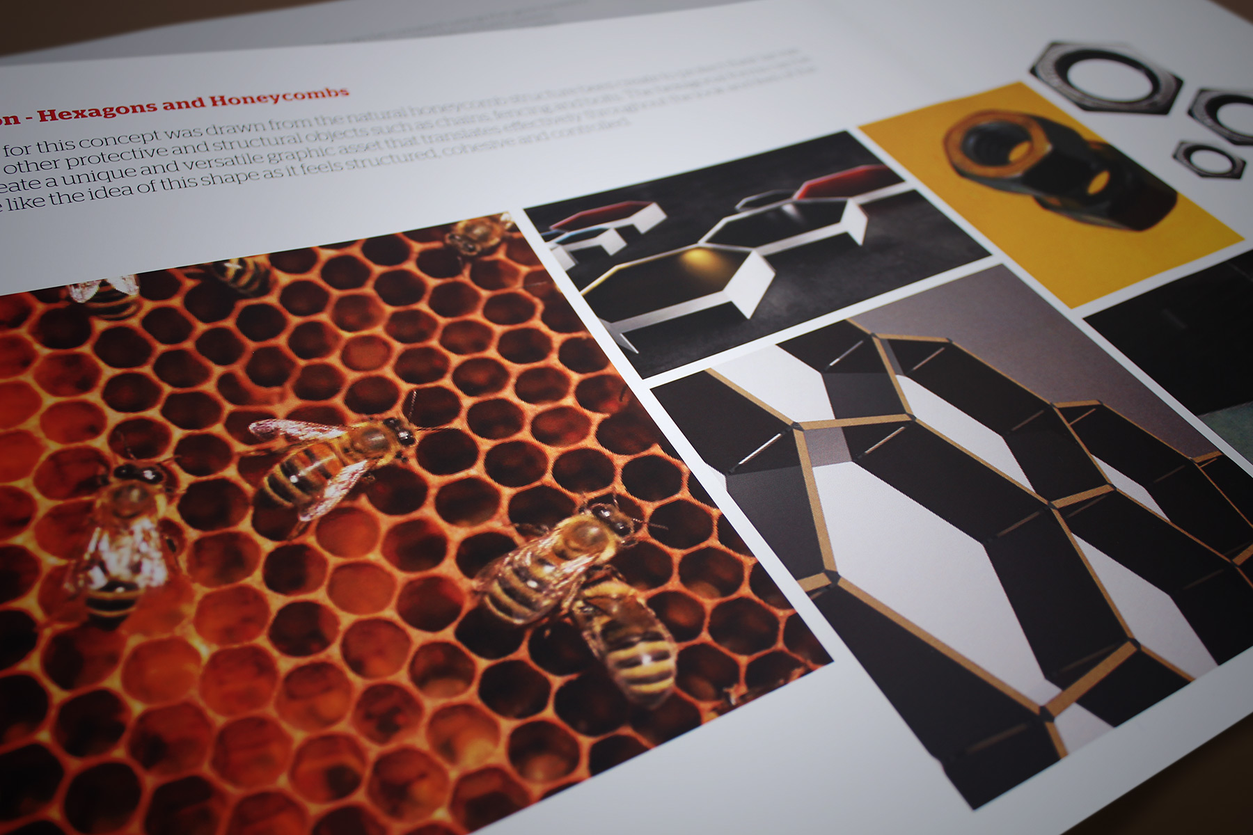
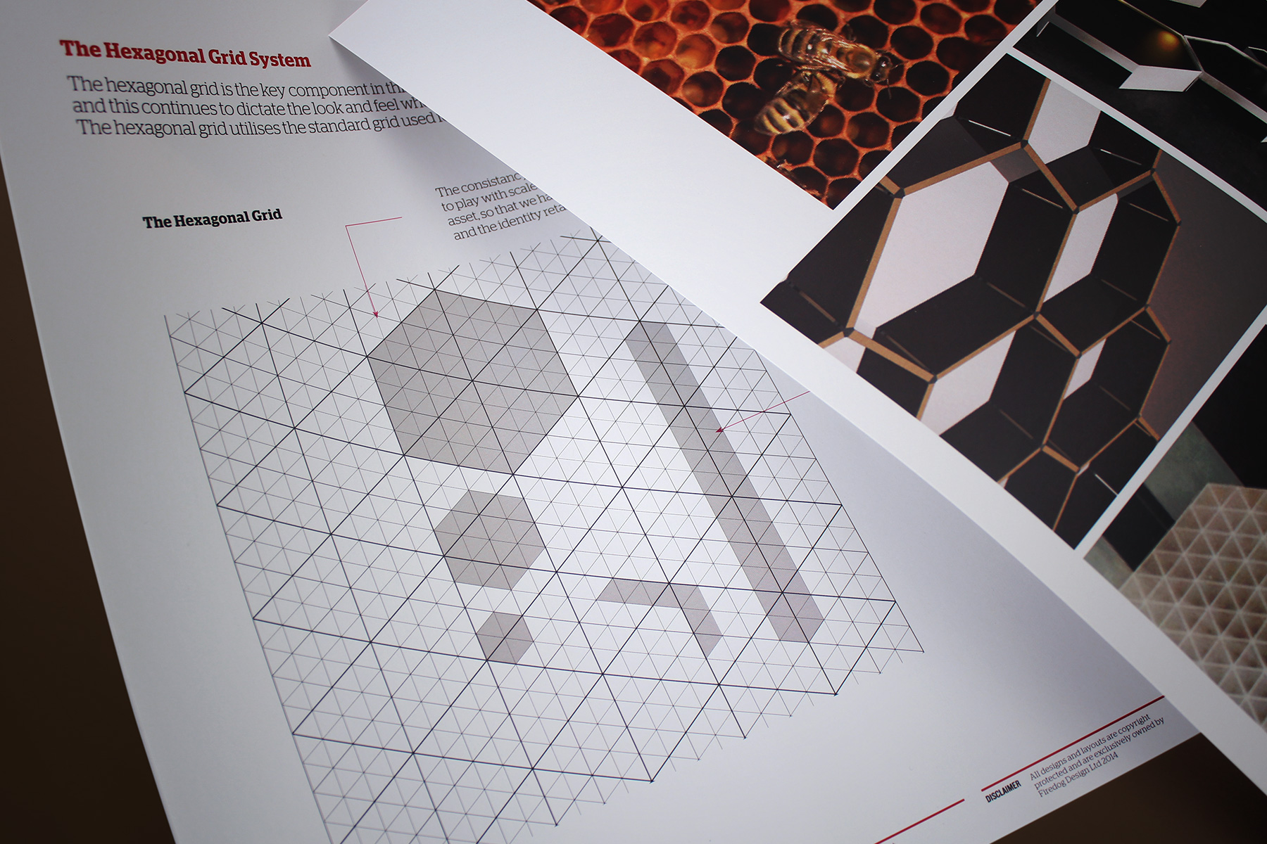
We capitalized on the brand’s existing positive reputation for protection and strength, by developing an associated positioning which supported this key brand promise. We researched deeper to organised systems within nature and struck upon the hexagonal nature of the honeycomb.

We created a flexible hexagonal grid which constrained the identity to particular angles, forms and functions.

We viewed the hive as an apt metaphor for the online world of digital asset management.

The honeycomb logic made sense because we noted the connection with the legacy brand colour as well as the potential visual cue of multiple moving parts within a greater ordered structure. We viewed the hive as an apt metaphor for the online world of digital asset management. We developed a unique hexagonal grid system which we used to create a visual toolkit, as well as unique iconography and custom illustrated infographics.

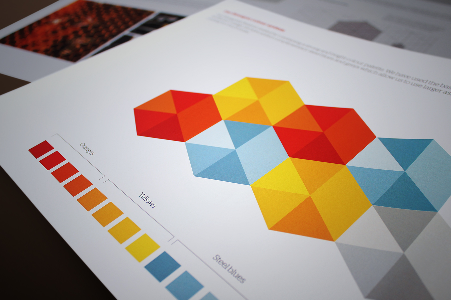
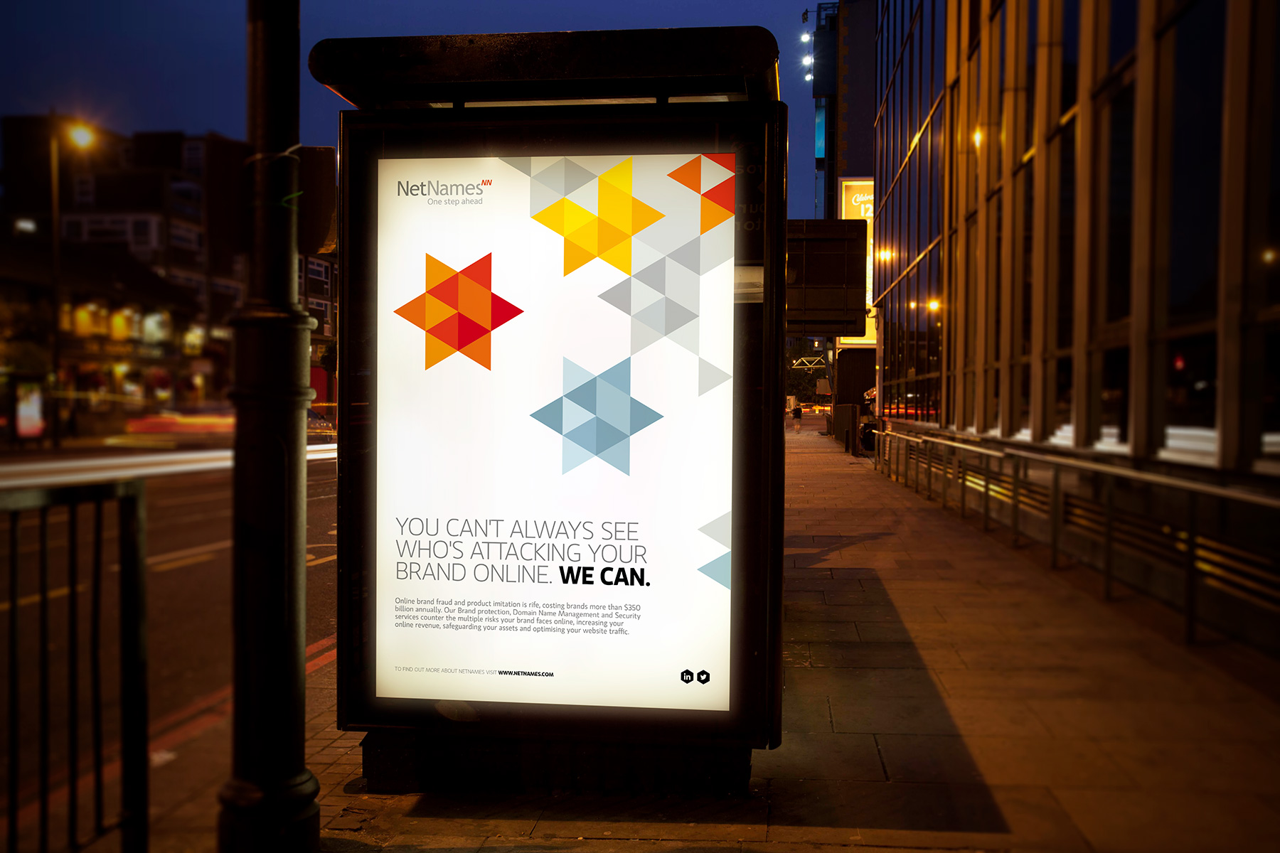
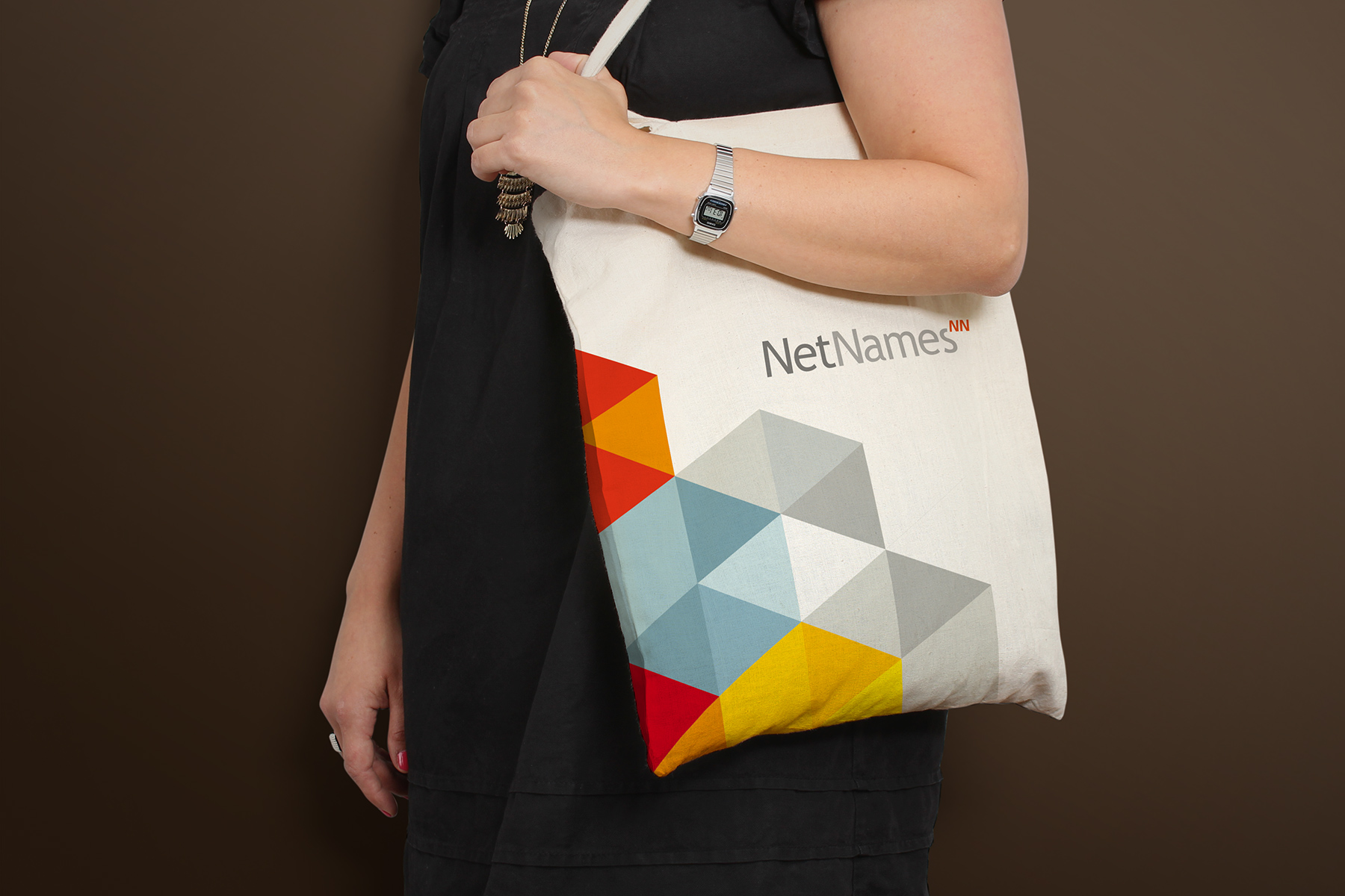
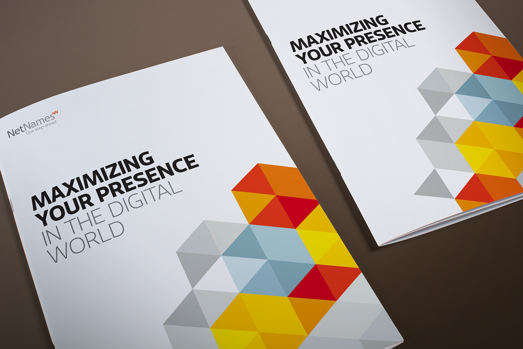
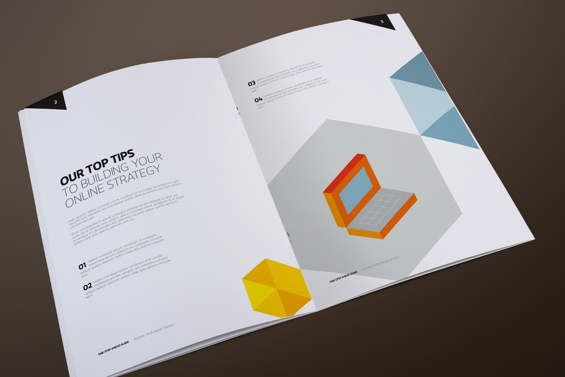
We created a unique brand identity system created from a series of building blocks, paired with bright colours and contemporary type.

NetNames increased their brand equity and subsequently the business was sold on to a larger online tech business.

The sum of the creative assets formed a holistic yet flexible technology brand identity. We then extended the existing colour palette and wrapped up the brand in a comprehensive set of guidelines. As a result of the tactical rebrand process, NetNames increased their brand equity and subsequently the business was sold to CSC, a US-based, leading provider of business administration services to corporations.

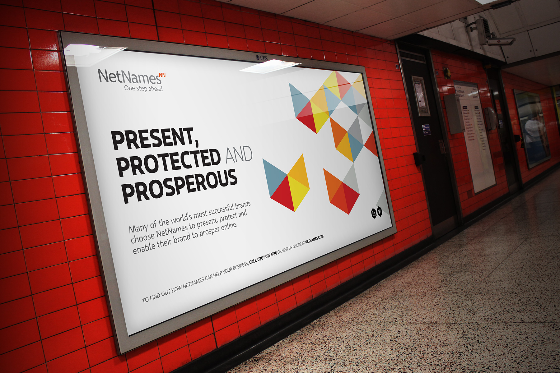
The resulting brand identity enabled NetNames to create brand stories using unique and quirky iconography which linked to positioning statements.
We created a brand library which enabled internal staff and other third parties to extend the language into day to day communications.
Sign up for our Firedog Newsletter
* = required field