-
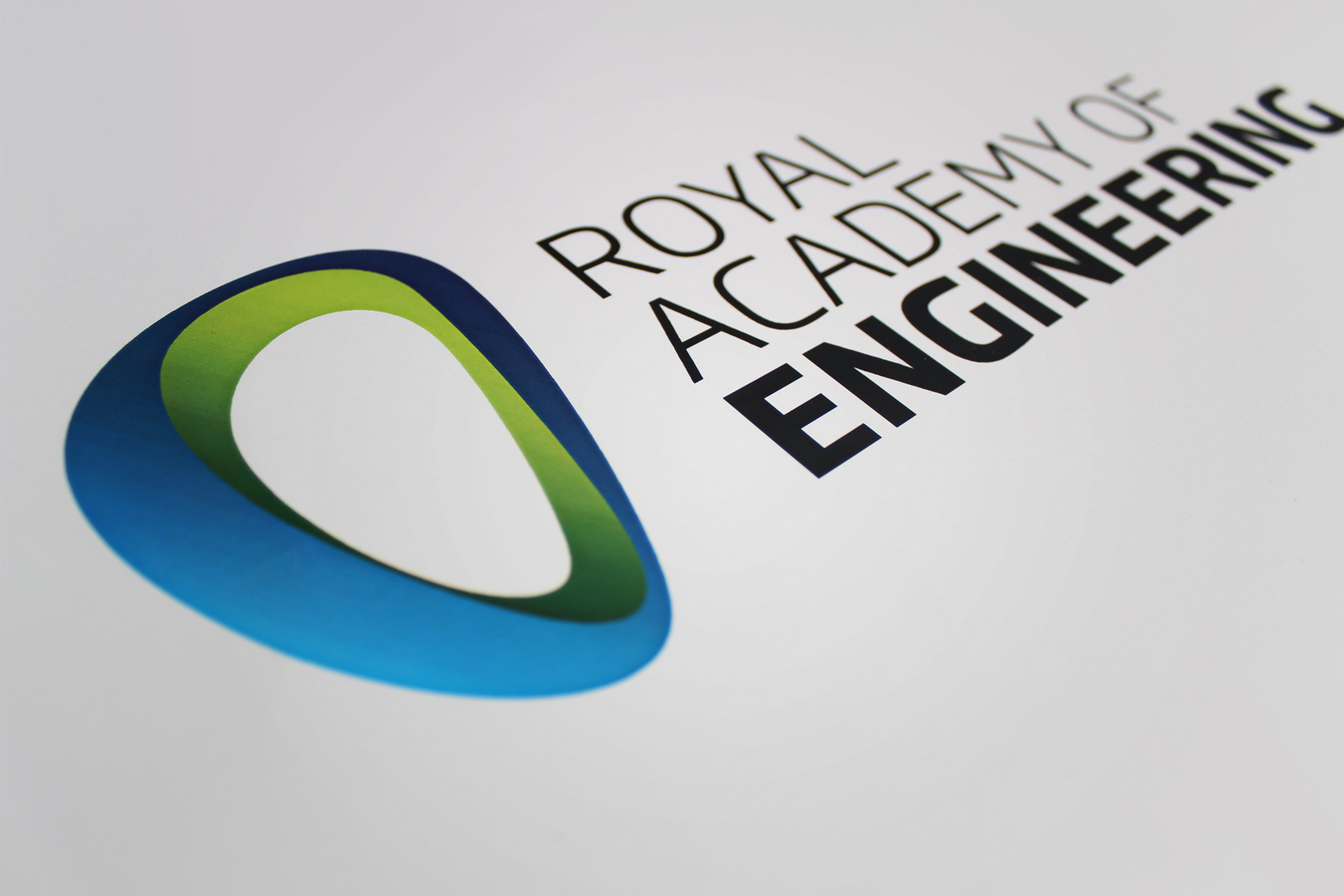
The resulting symbol pays respect to the past but is now far more vivid and robust.
-
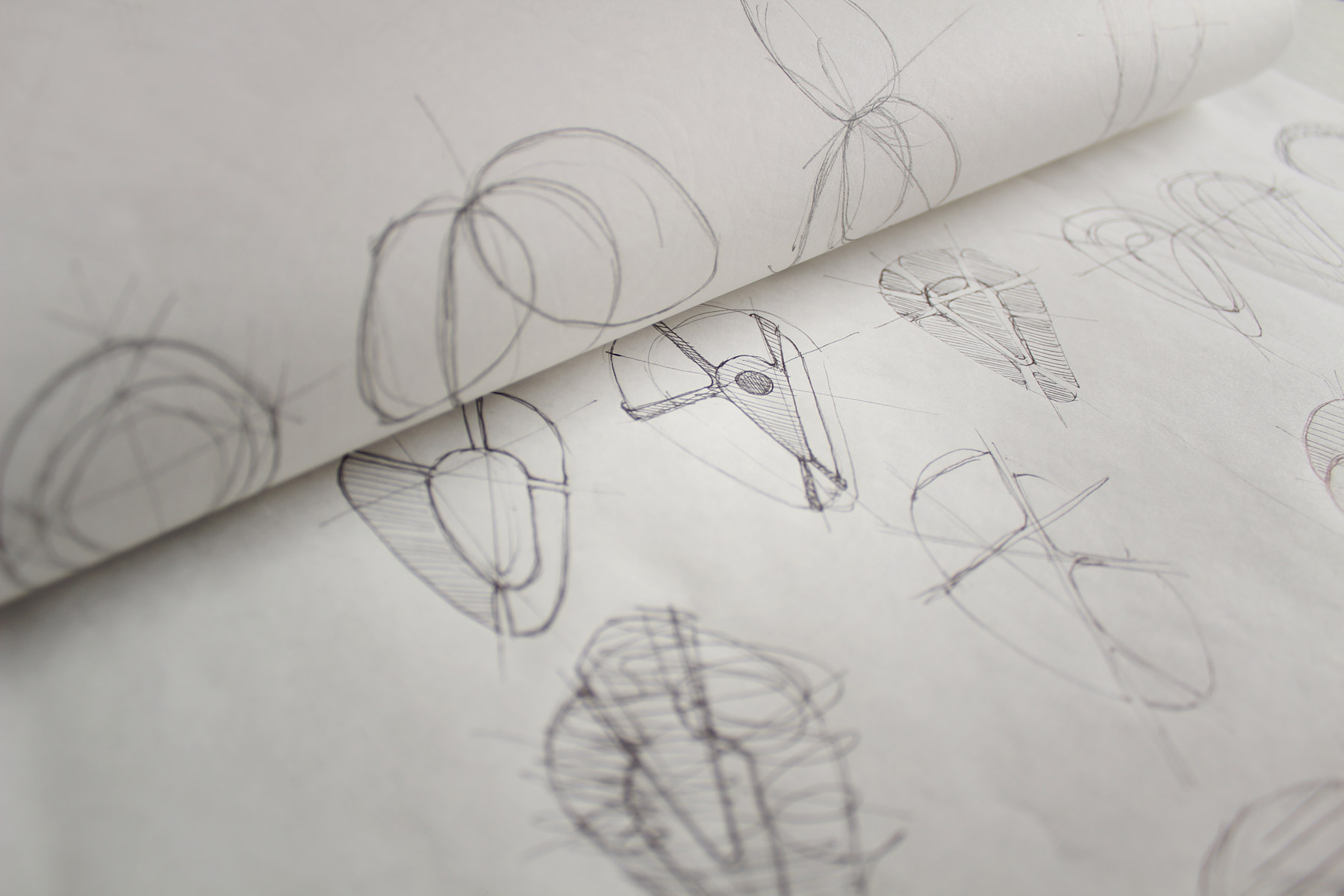
Firstly, we looked to add strength to the symbol itself. The symbol had been derived from a hand axe, yet the execution lacked some of the associated strength.
-
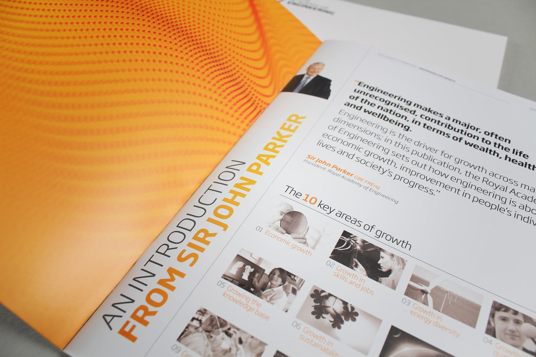
The development of the brand started with key stakeholder research. The brief was to find the DNA behind the academy and its purpose in society.
-
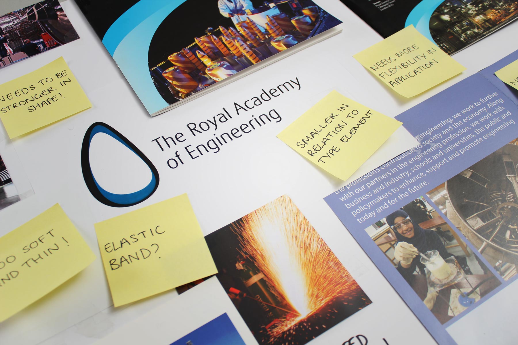
A key motivator for the refresh was to address issues which the incumbent brand possessed. The overarching problem was that although the brand carried an innovative symbol, it lacked punch and strength.
-
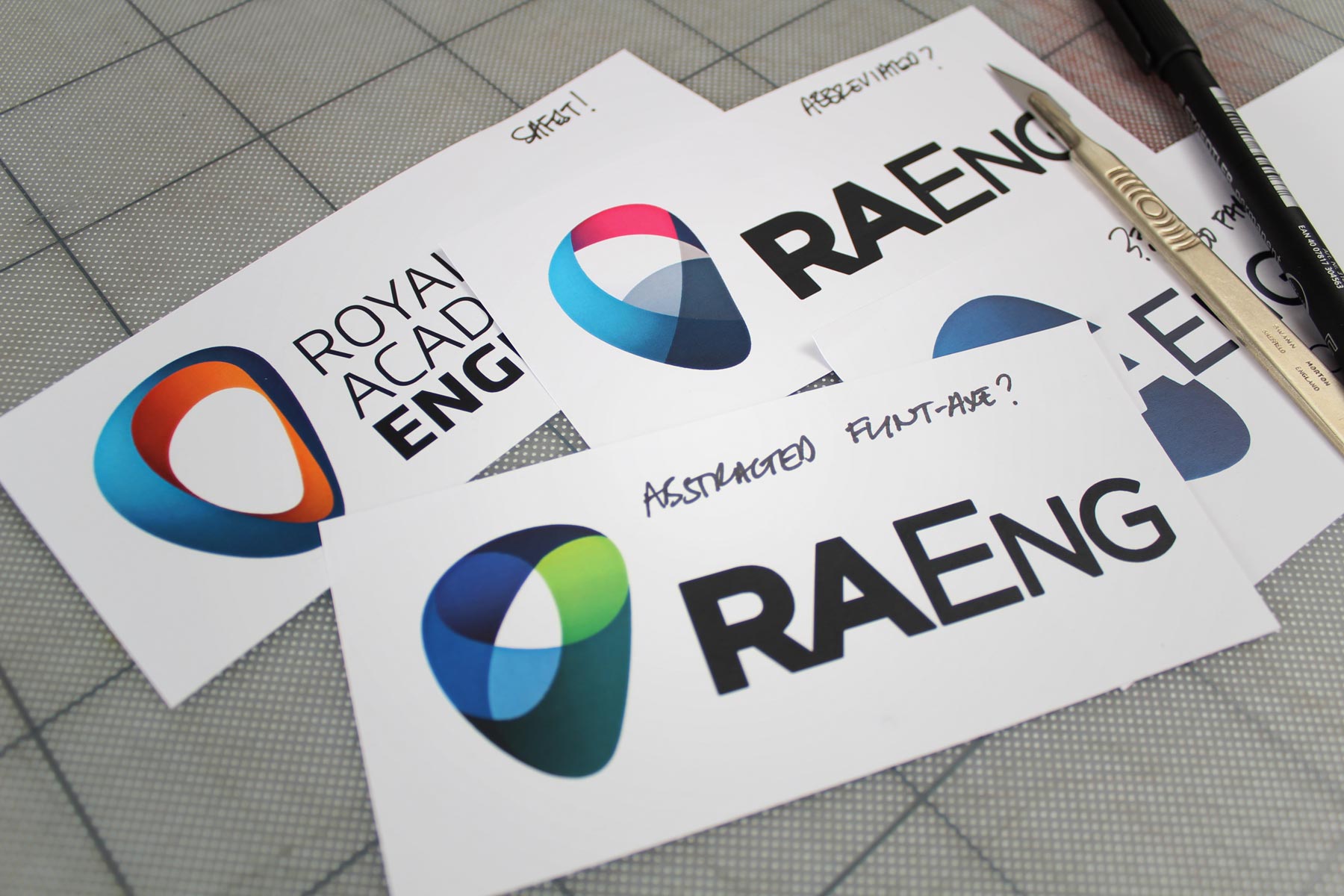
Our first thought was to turn the symbol on its head. We felt that the narrow element orientated downwards would be more aggressive. It would also be the natural way that the flint hand axe would be held.
-
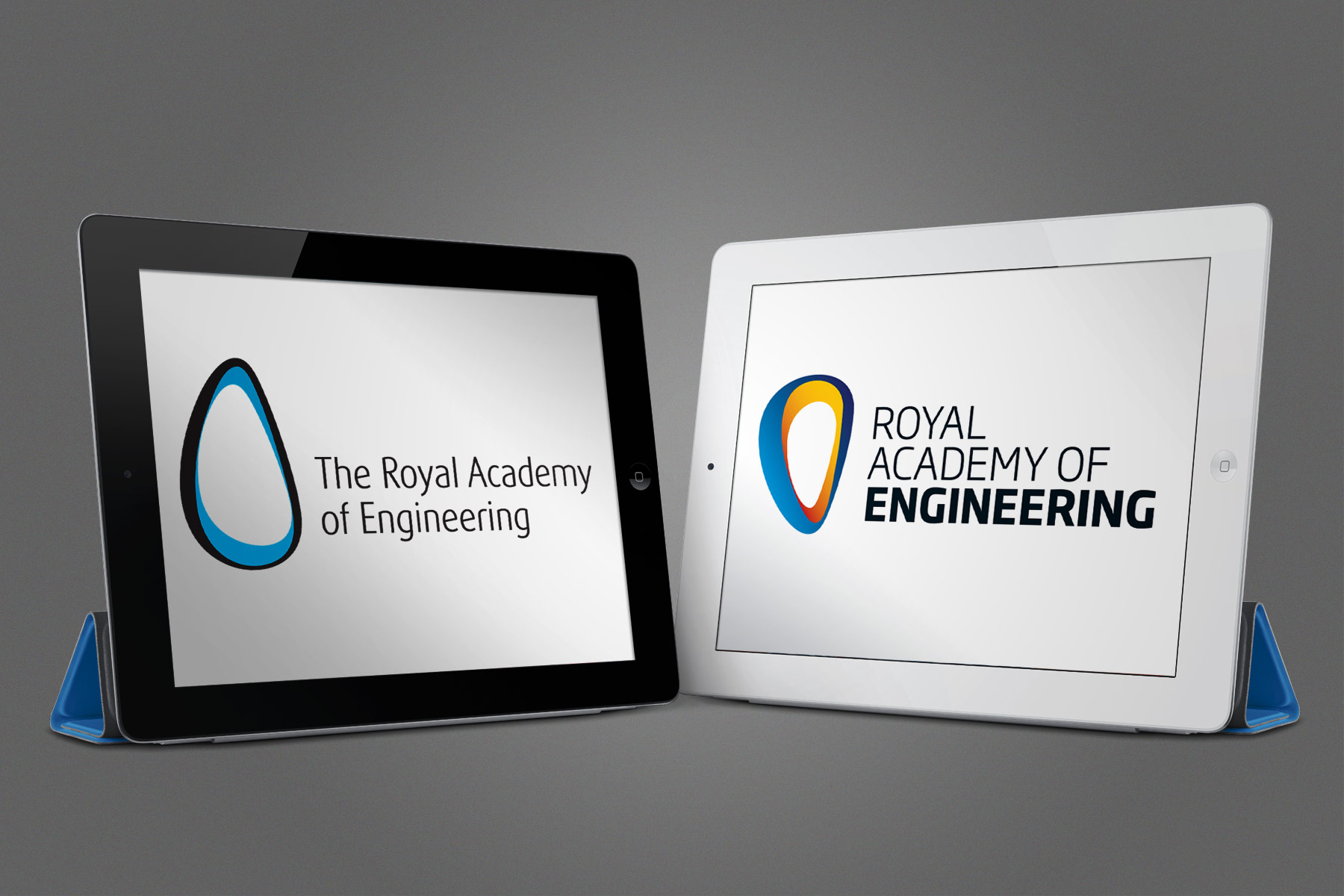
When put in comparison with the previous identity, the new brand identity shows its strength. For the typography in the mark, we used caps, adapted to a more contemporary type style and dropped the definitive prefix. The emphasis on engineering was designed to add variation to the three decks of type.
-
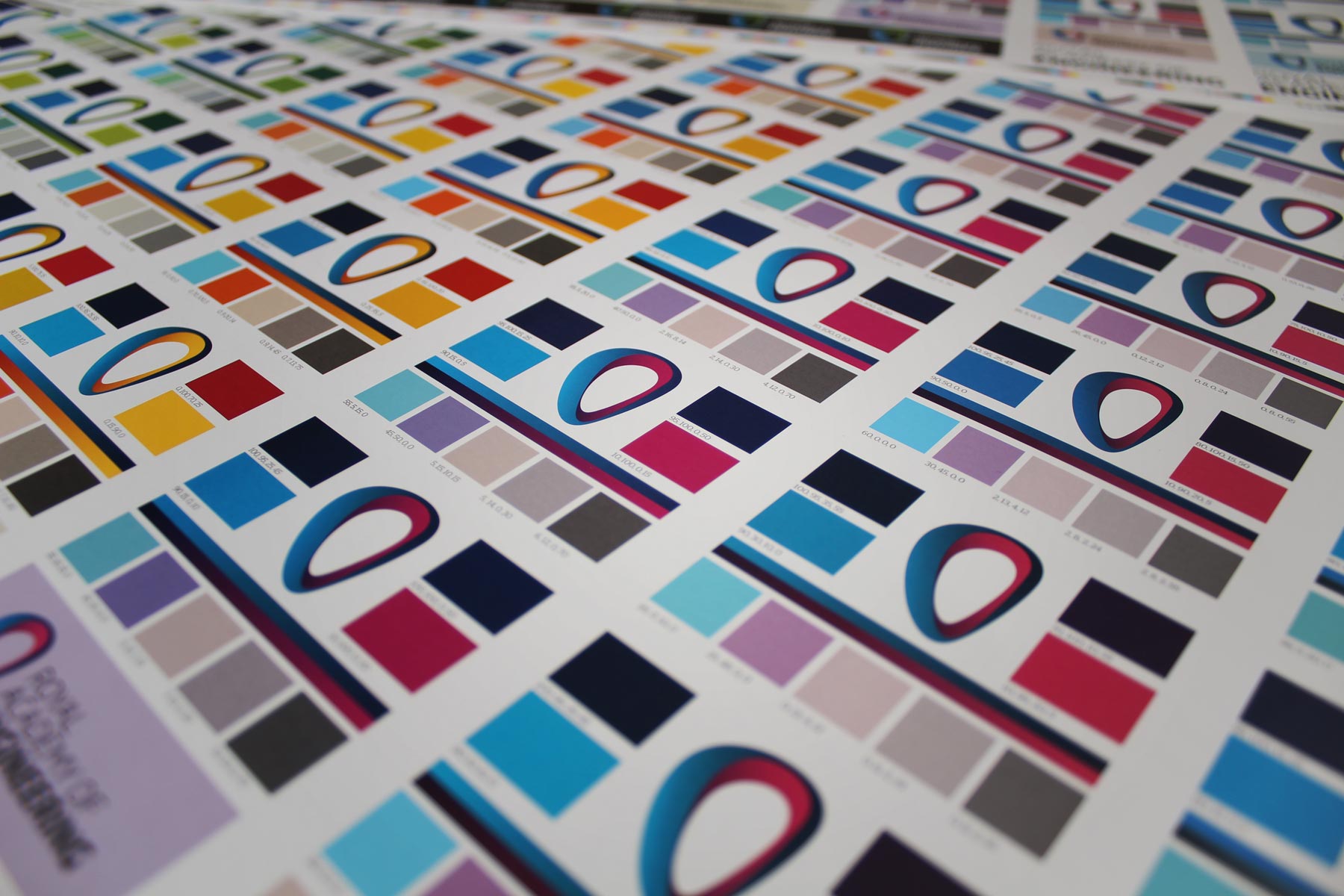
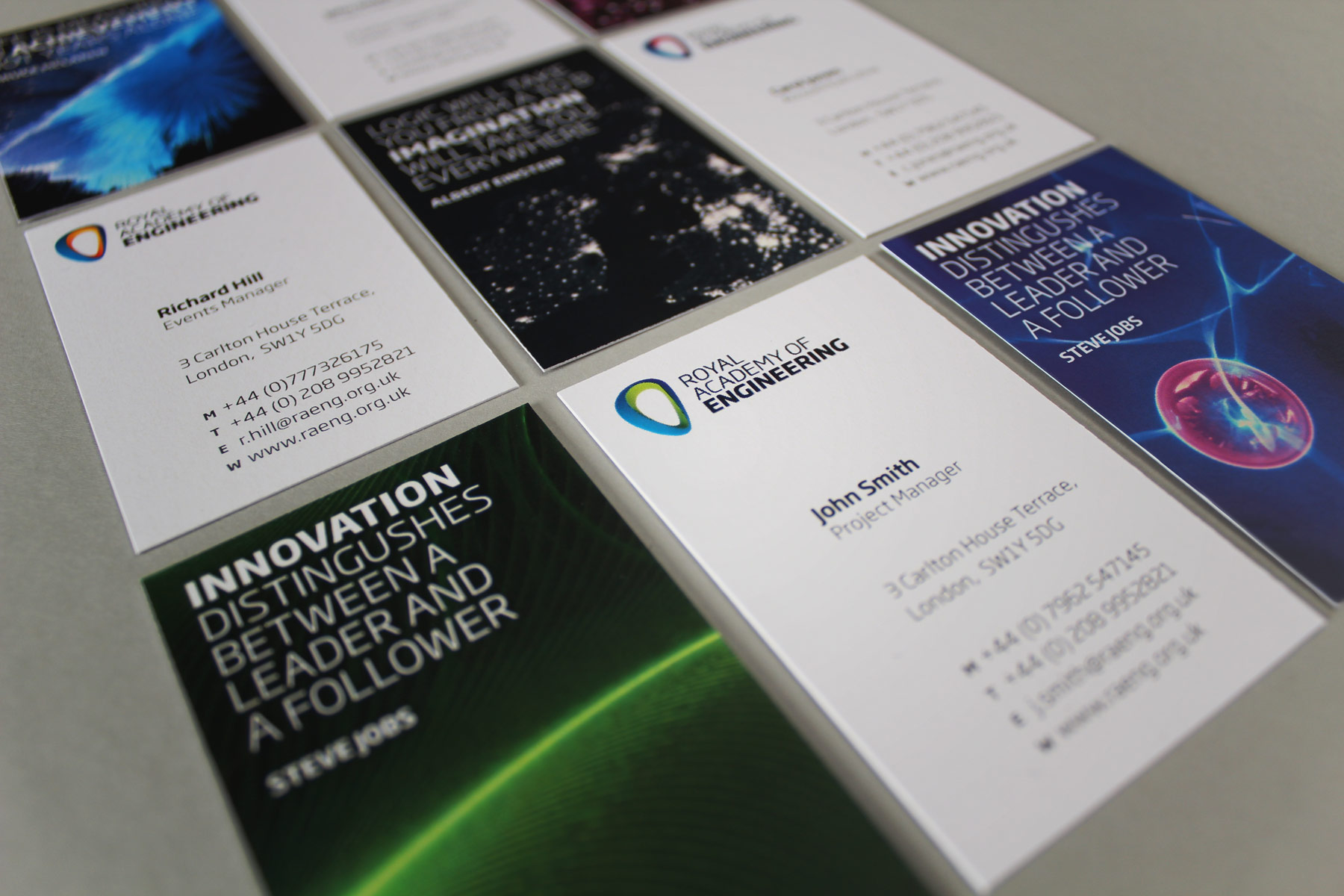
We liked the fact that the brand had a dynamic colour palette. Whilst we simplified it somewhat, we retained the inherent flexibility.
-
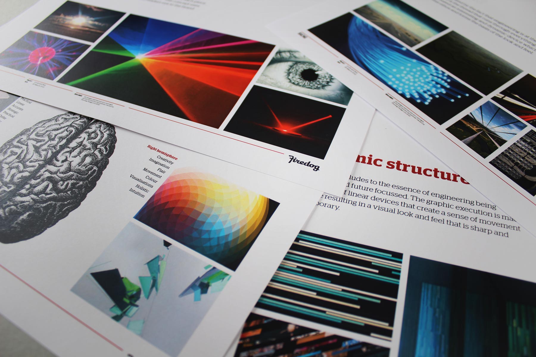
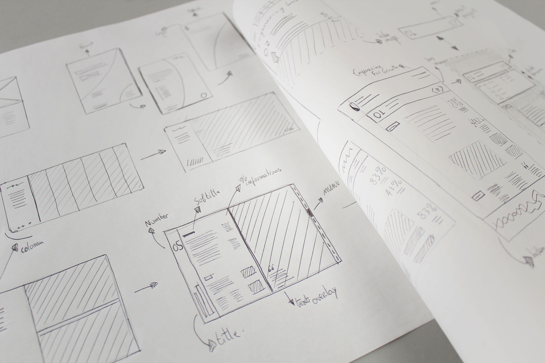
We wanted to develop a supporting visual language which carried the properties of the brand but also allowed for flexibility. Breaking the rigidity of the application controls of the past were implicit in the client brief.
-
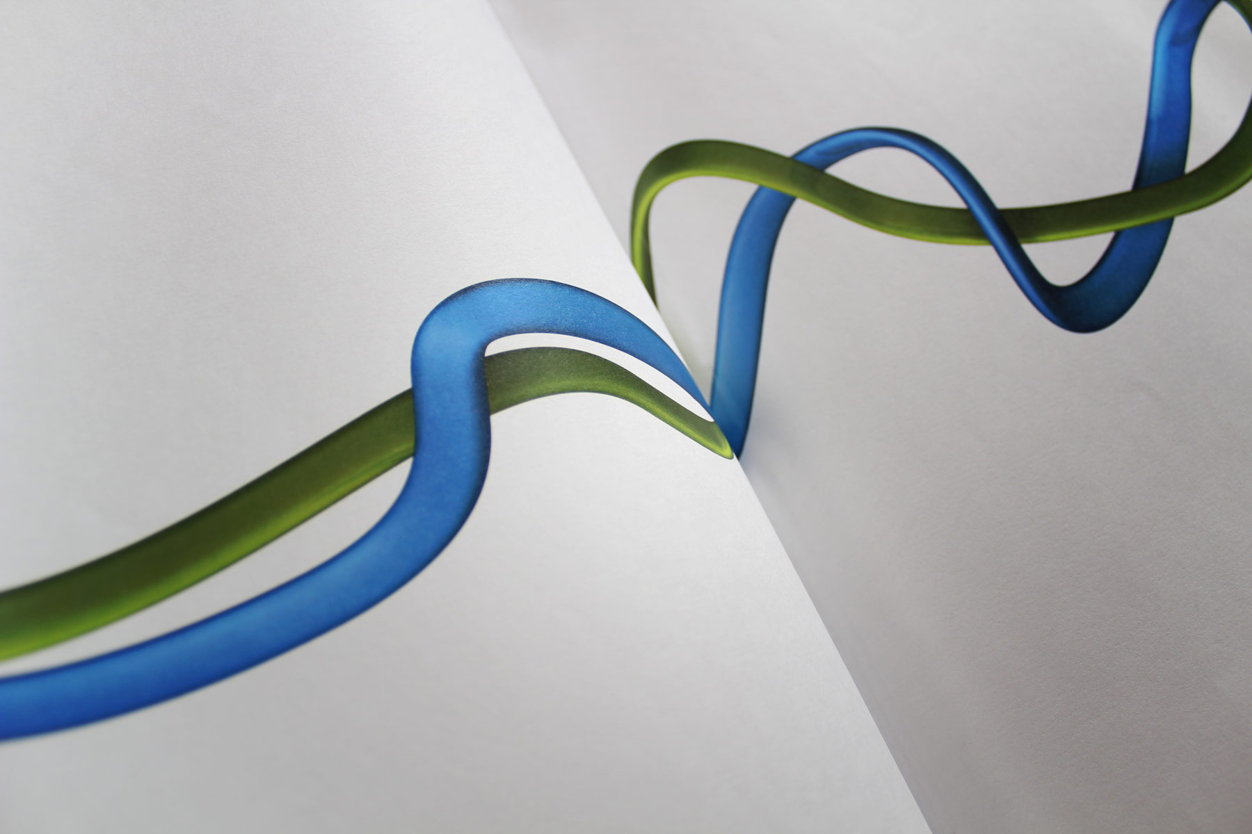
We created a flexible dimensional thread device which could be used in a myriad of ways. The idea being that should you cover up the brand, the visual look and feel would still convey its own unique identity.
-
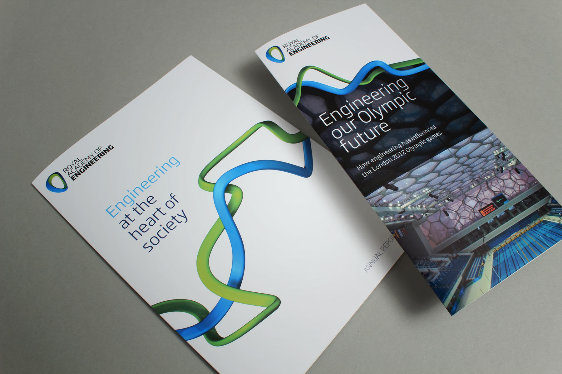
The thread device could be used on a plain white background or it could be used dynamically to hold colour and imagery.
-
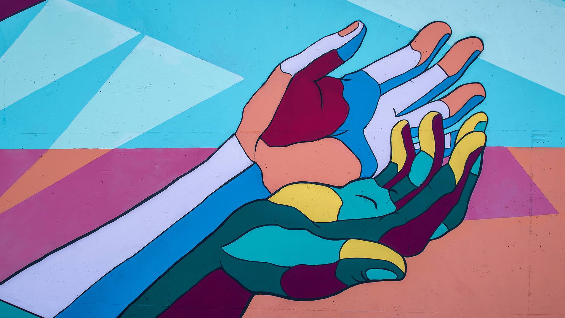
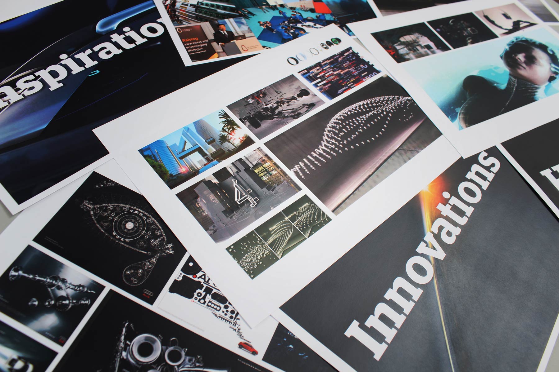
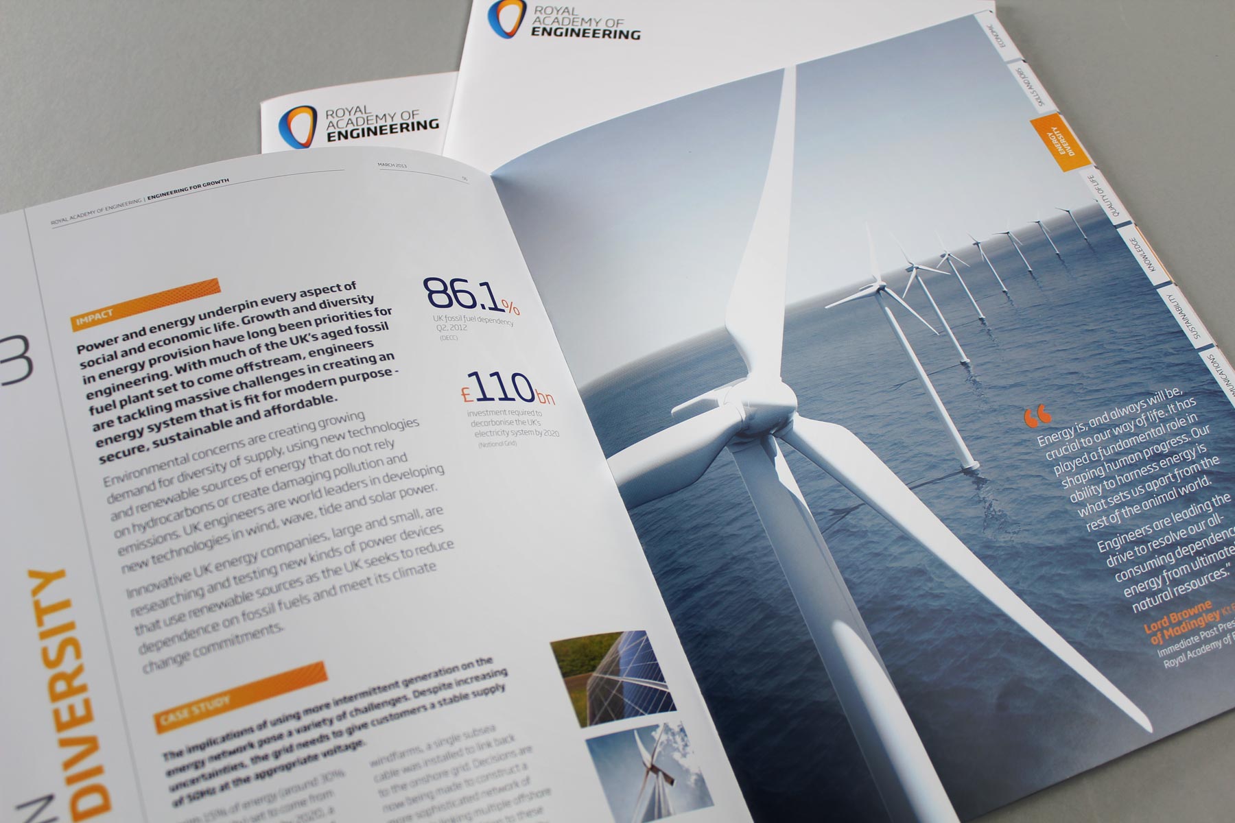
The visual identity used a combination of white space and vibrant imagery to communicate both the order yet excitement behind engineering.
-
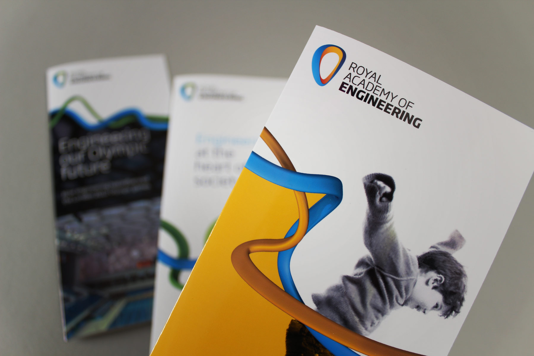
We used a primary colour palette combined with striking imagery so that the visual identity conveyed both order but also a bit of freedom.
-
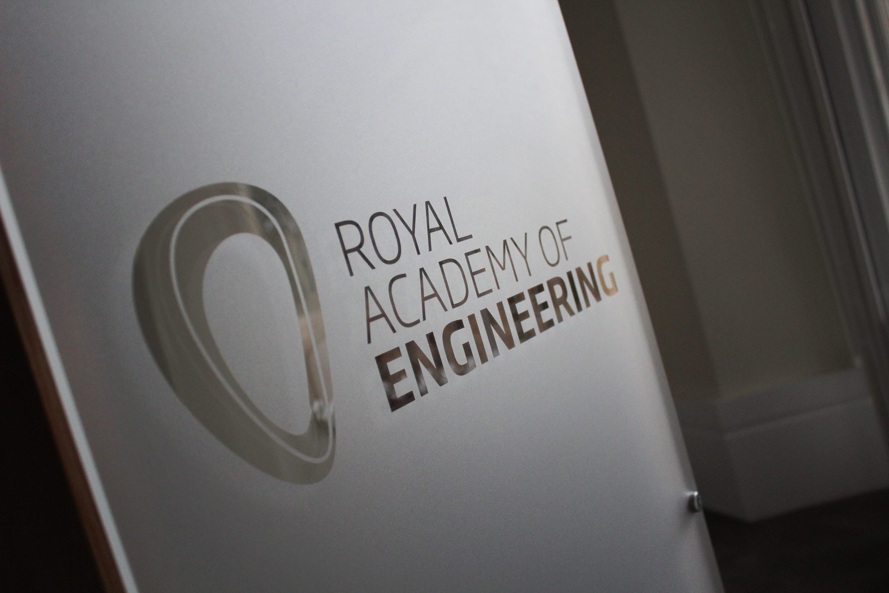
The mark has been applied to the interior of the London headquarters, using a custom die-friendly one colour mark.
-
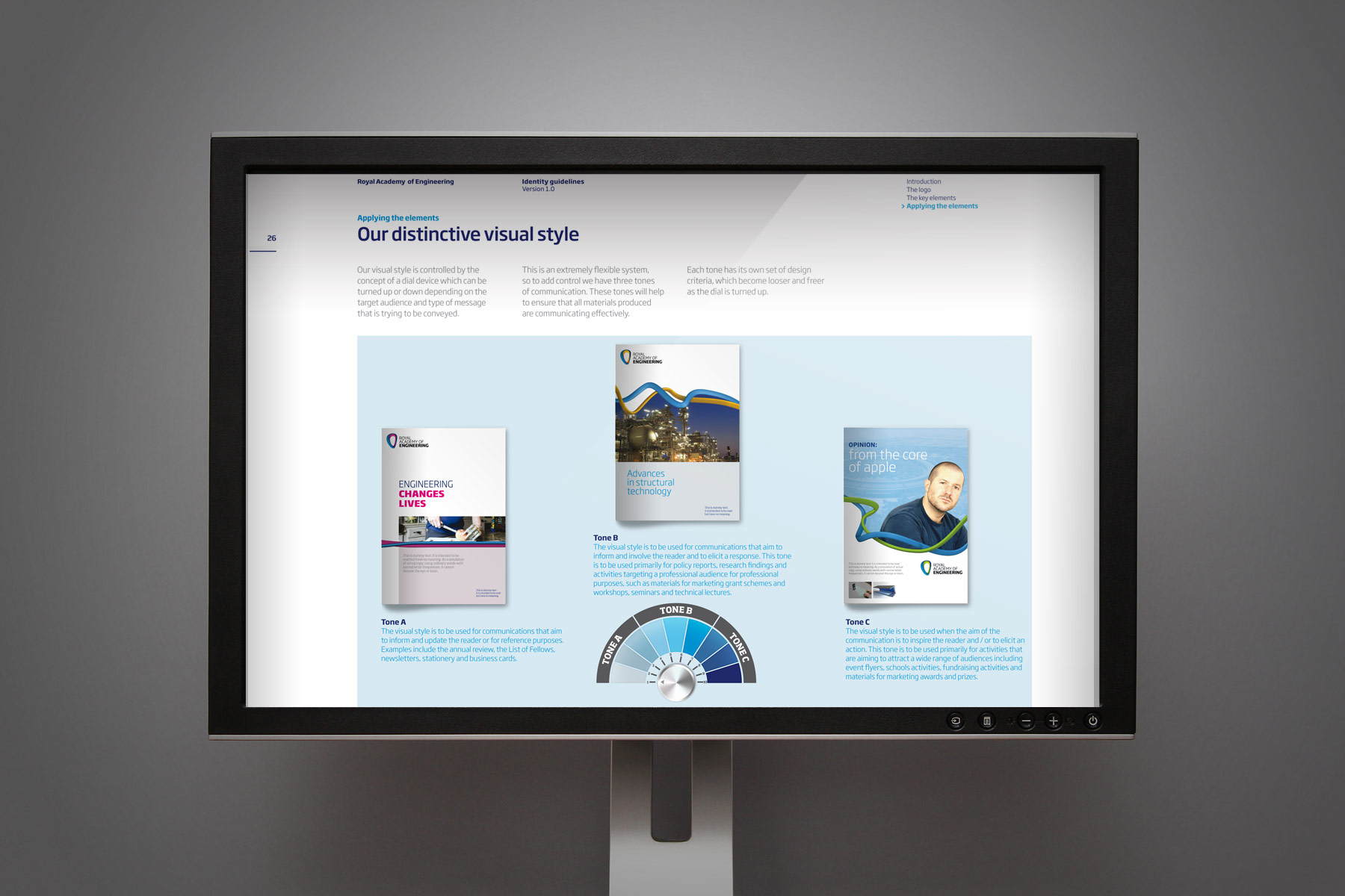
The development of the guidelines was engineered to allow the Academy to use a variation of the look and feel to speak to varying audiences. We used a graphic volume idea, whereby the dial amplified from conservative - for government perhaps - to full saturation - mostly for youth and education.
-
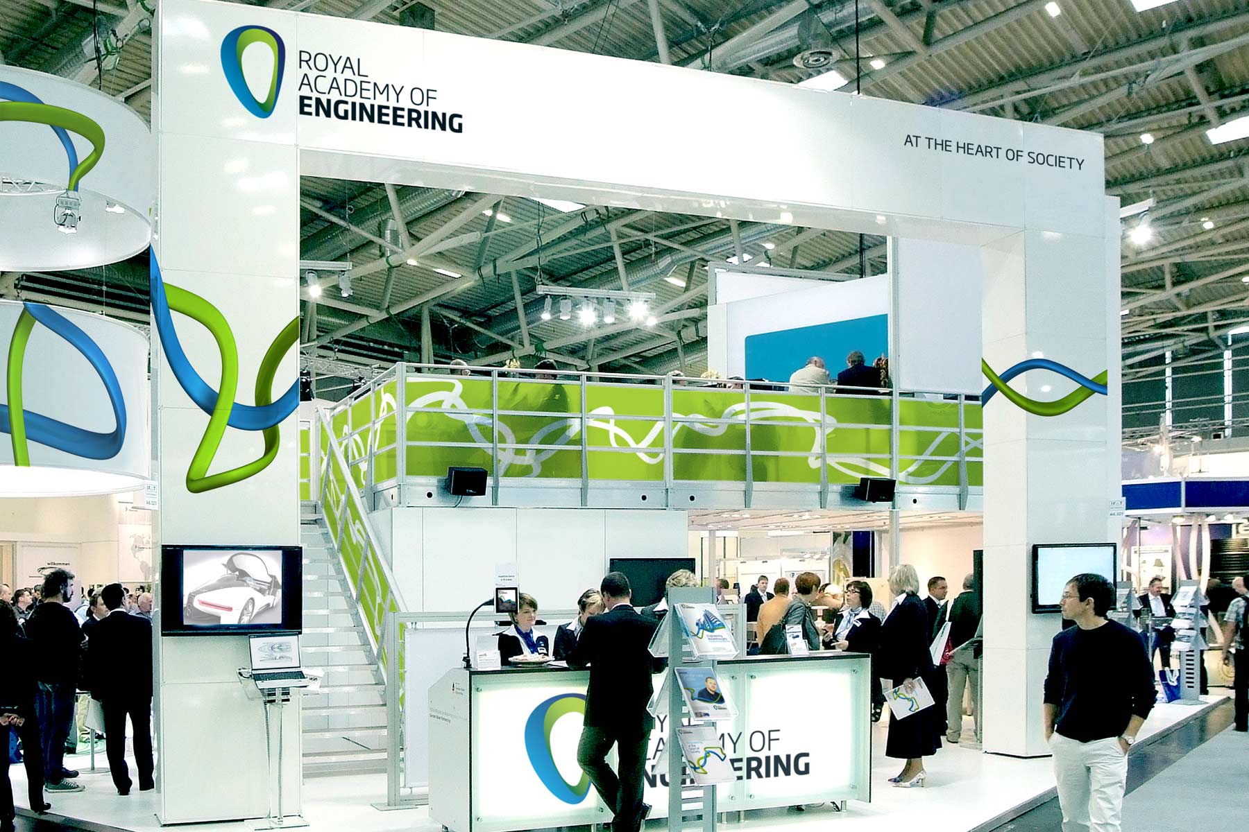
The development of the flexible system means that the visual brand identity adapts extremely well to the most variable of design surfaces.
-
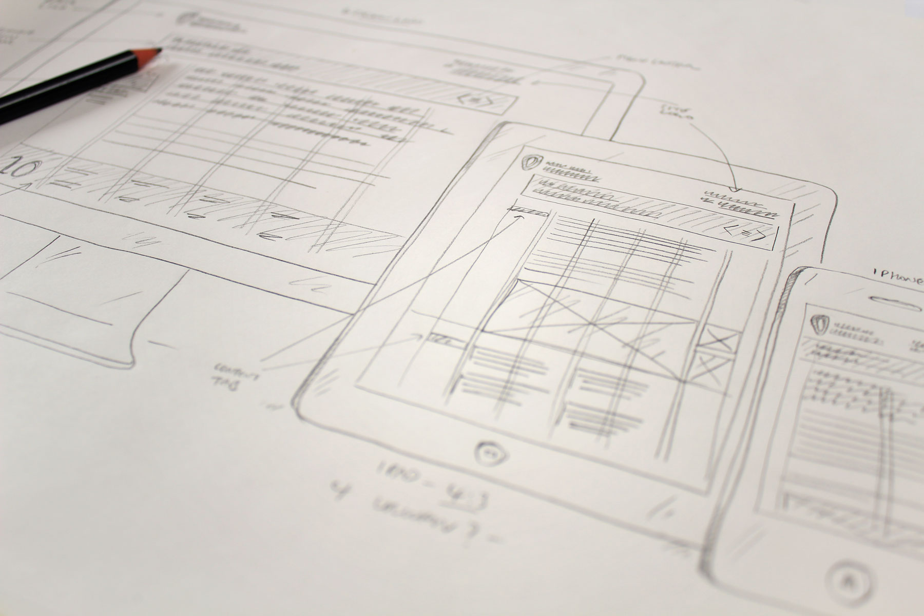
With the digital version, we wanted the site to be highly format friendly so we created a responsive design across all devices.
-
The campaign needed to work in both digital and print formats.
-
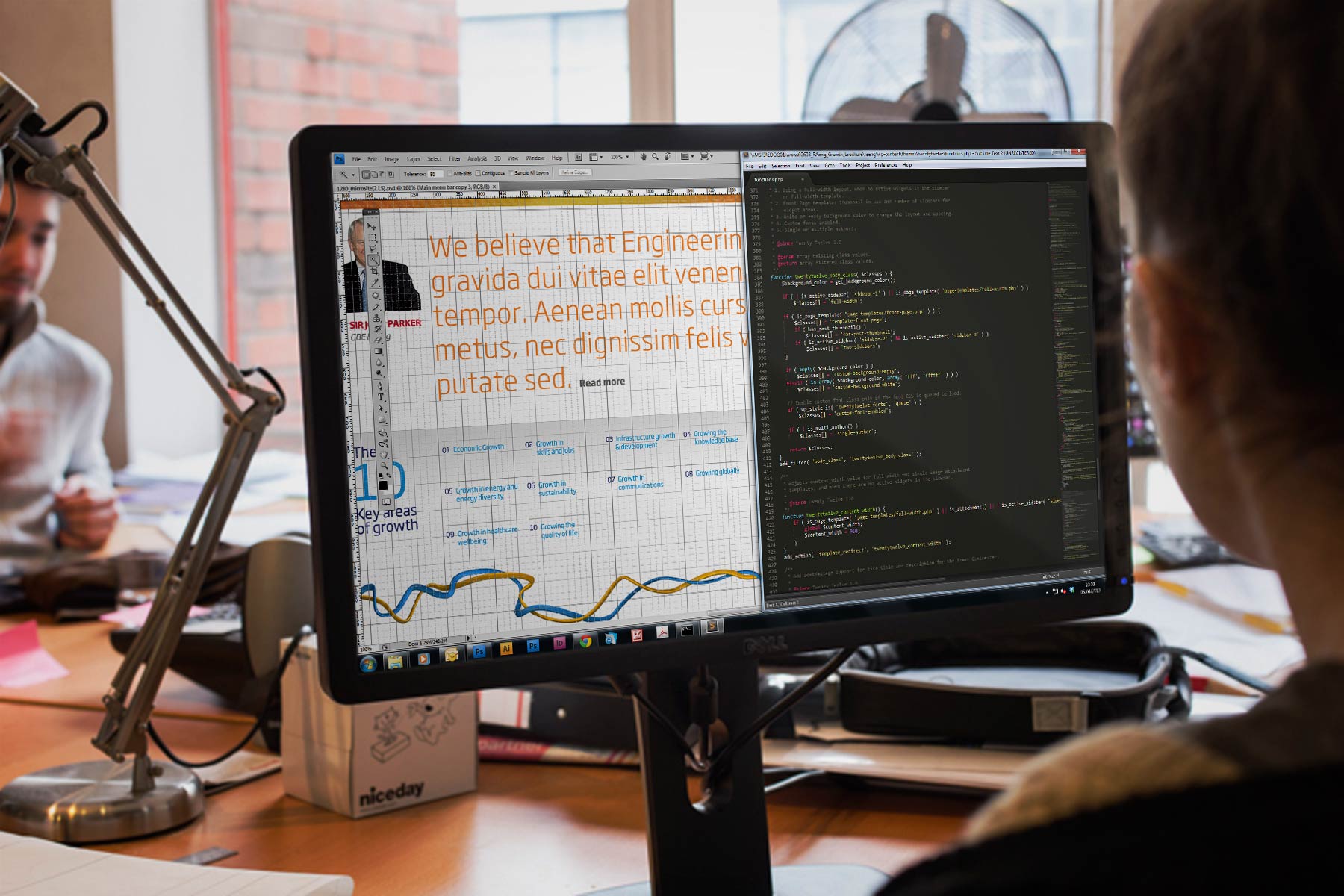
The primary usage behind the site was for the digital publication of vital information. We used editorial best practices to ensure the digital experience met these goals.
-
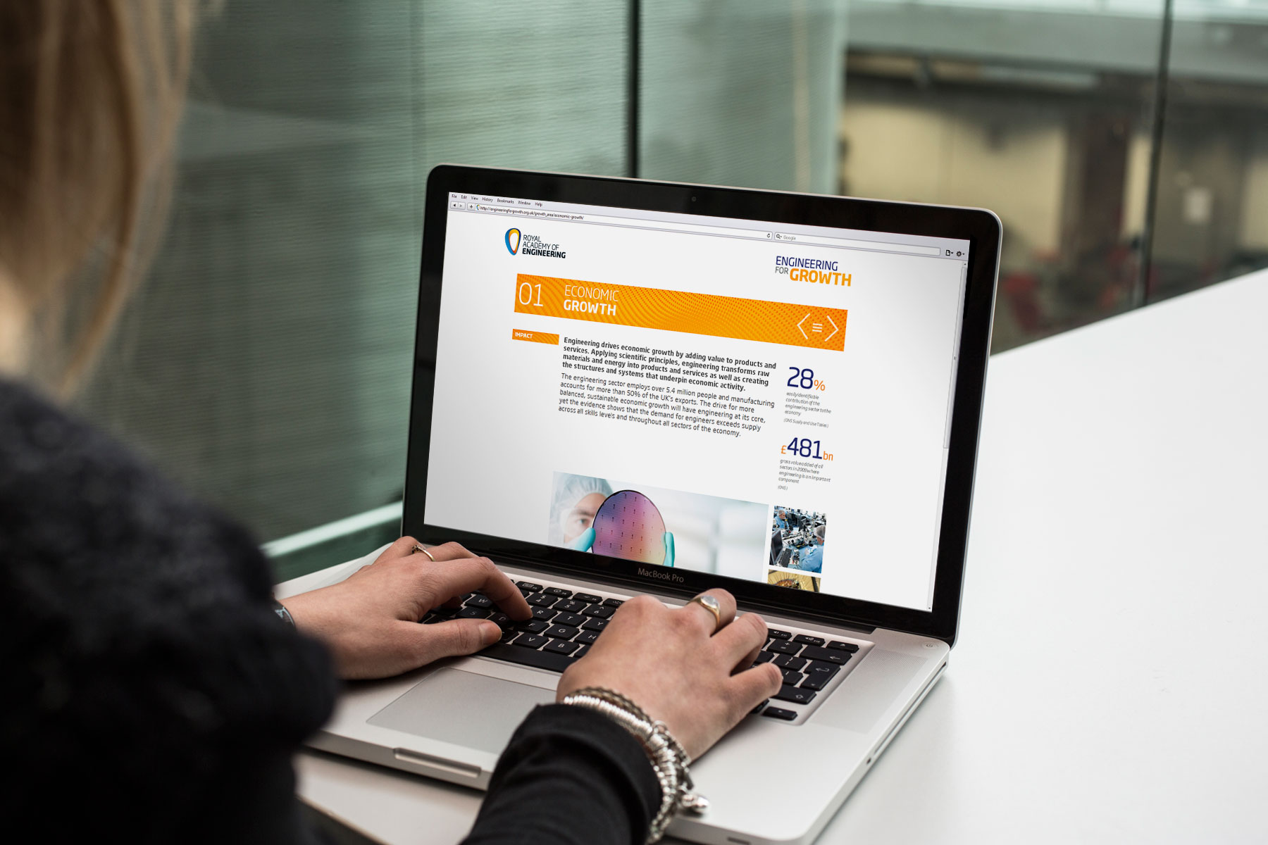
The structure and navigation of the publication ensured an easy to use site experience.
-
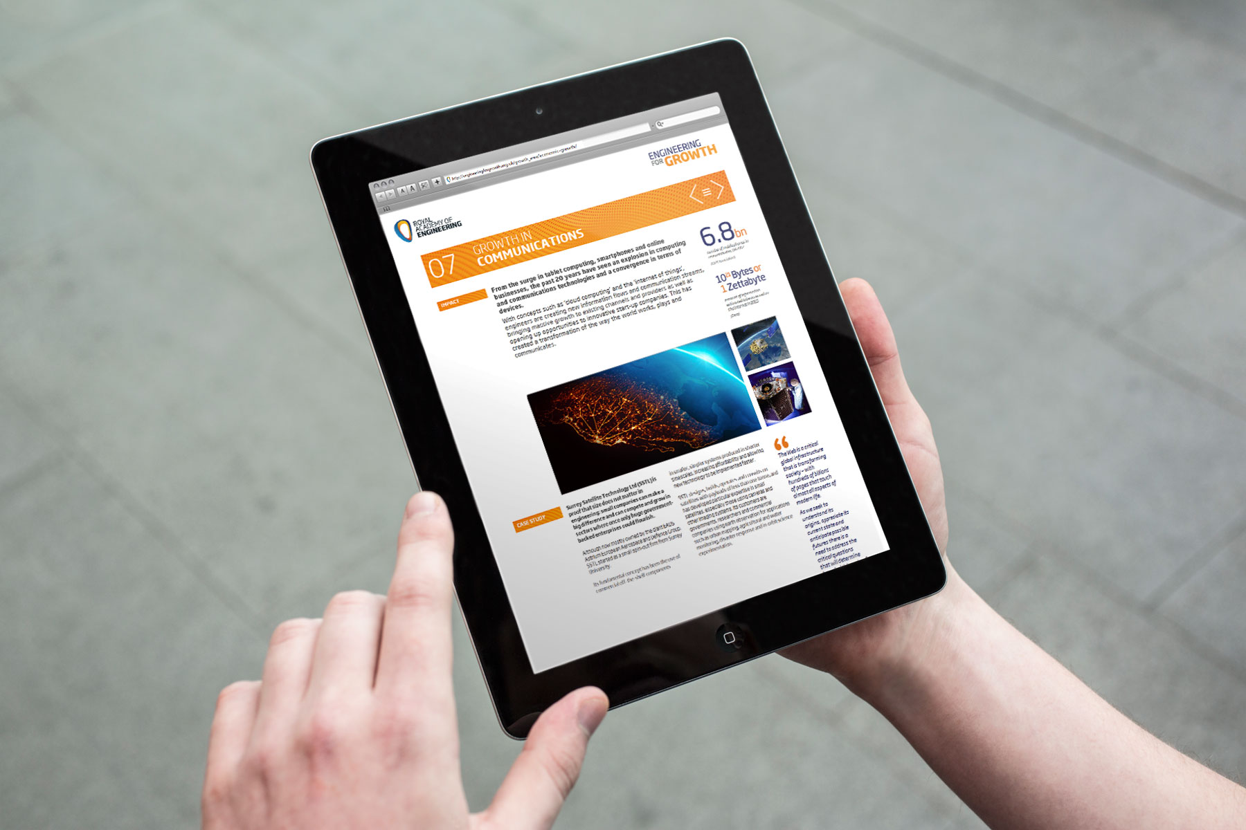
The layout style sheet responds to whether the reader is using their device in landscape or portrait orientations.
-
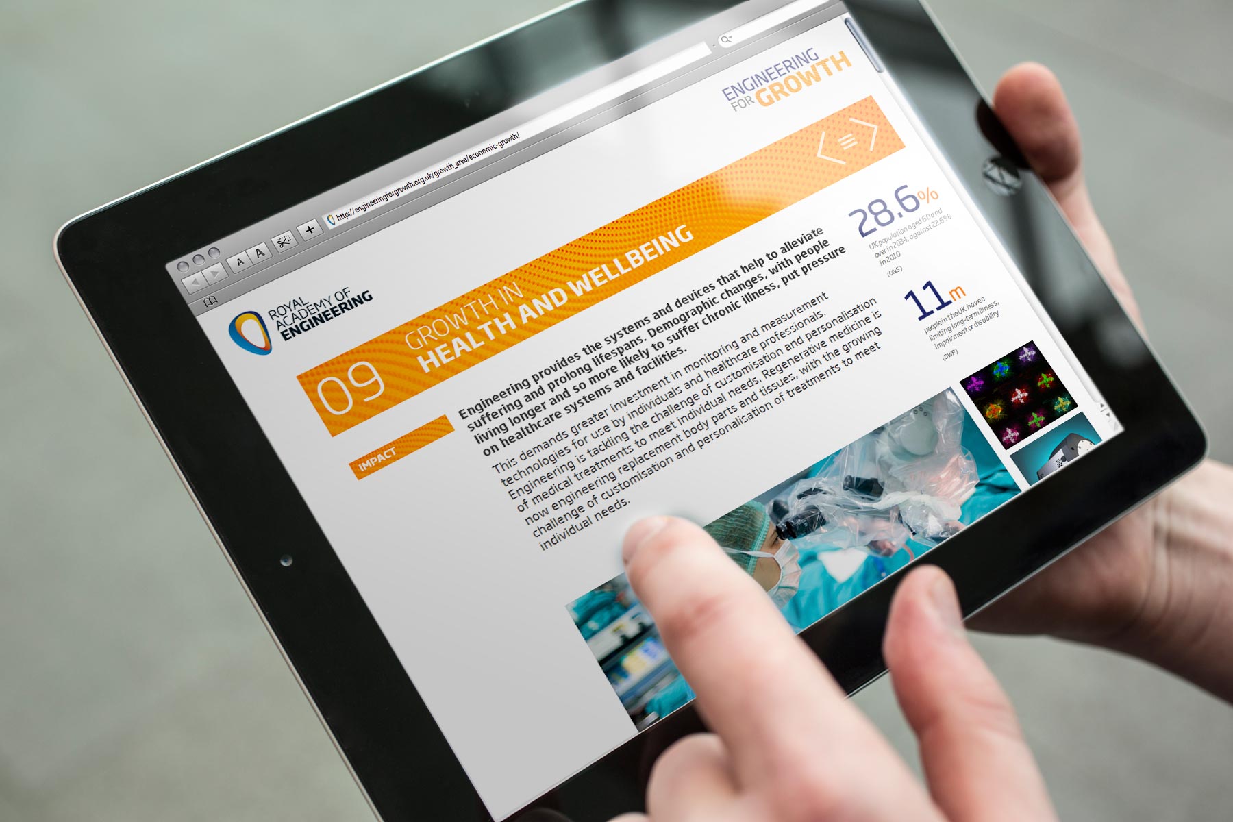
The restricted colour palette and clean environment makes for easy reading of content.
-
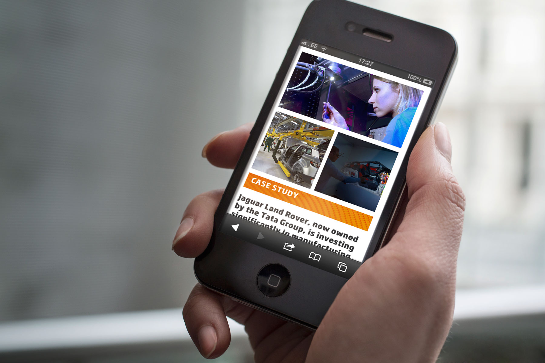
The style sheet adapts to single columns for smaller formats, ensuring legible text sizes.
-
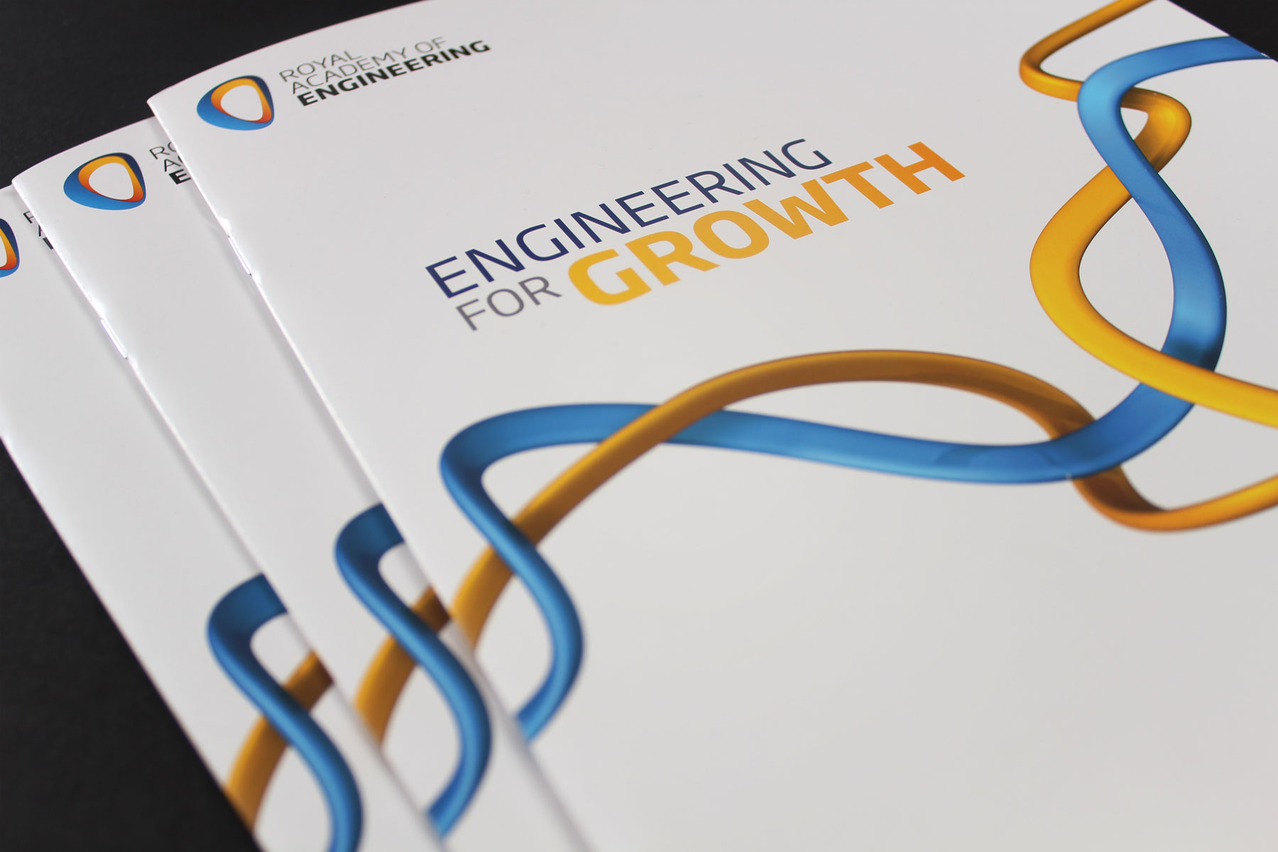
We created a print variation which was used as a direct media campaign.
-
Both the print and digital variations shared a very similar feel thus creating a strong campaign identity.
-
We used our own established brand visual identity that we had created for the Academy.