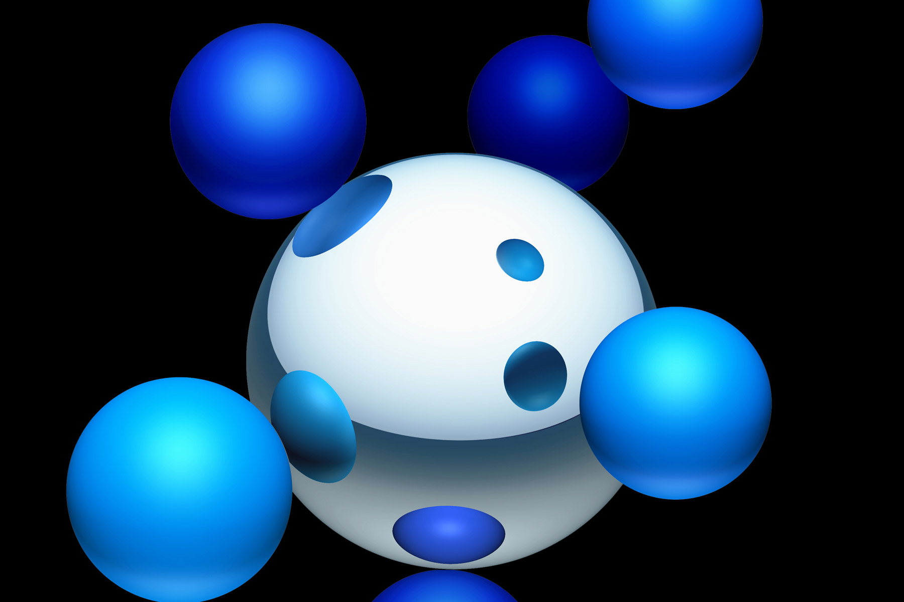
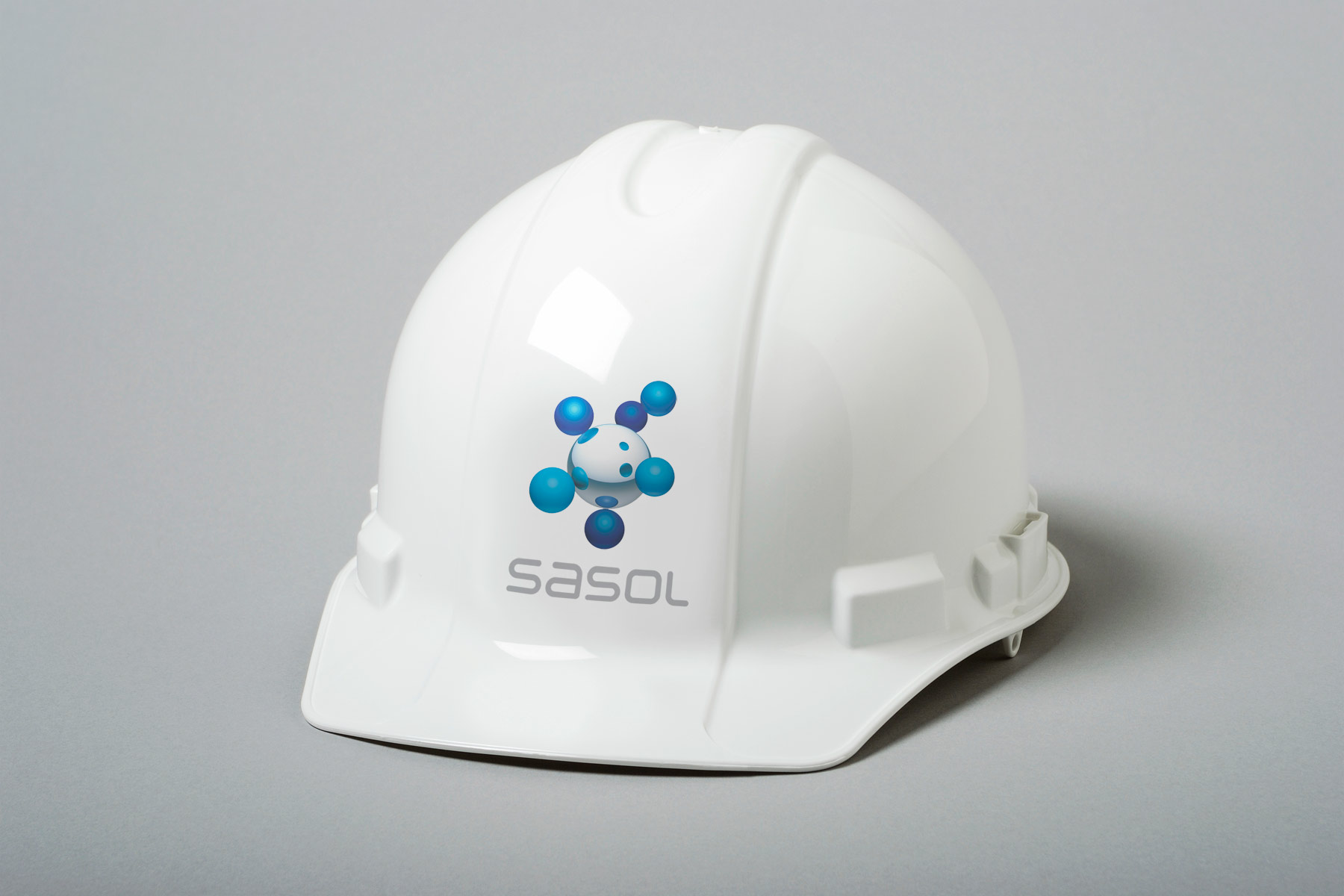
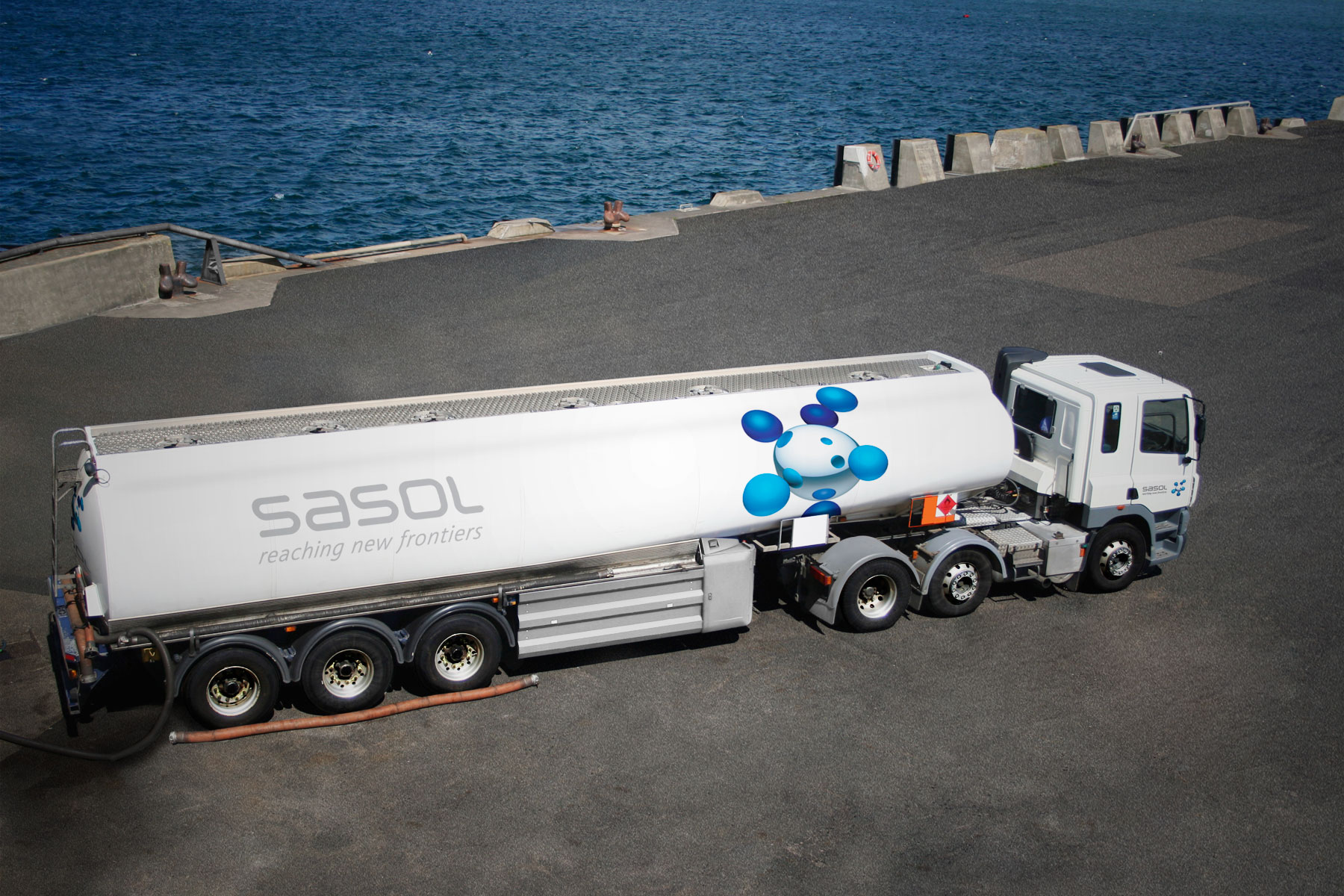
Branding • Design for print • Multi-national rollout
Full global re-brand from core level of conceptual design, through to the adaptation of the identity to the required business units. The delivery was to include the design of virtually every business touch point: Corporate communications, advertising, signage, livery and a raft of other deliverables all wrapped up in a 260 page brand guideline kit.
Firedog’s Creative Director, Clifford Boobyer, was the creative lead on this global re-branding project and was the designer responsible for creating this identity prior to starting Firedog Design. The new high-tech symbol created by Cliff reflects their core business. Its molecular structure represents a company engaged in petrochemicals and energy.
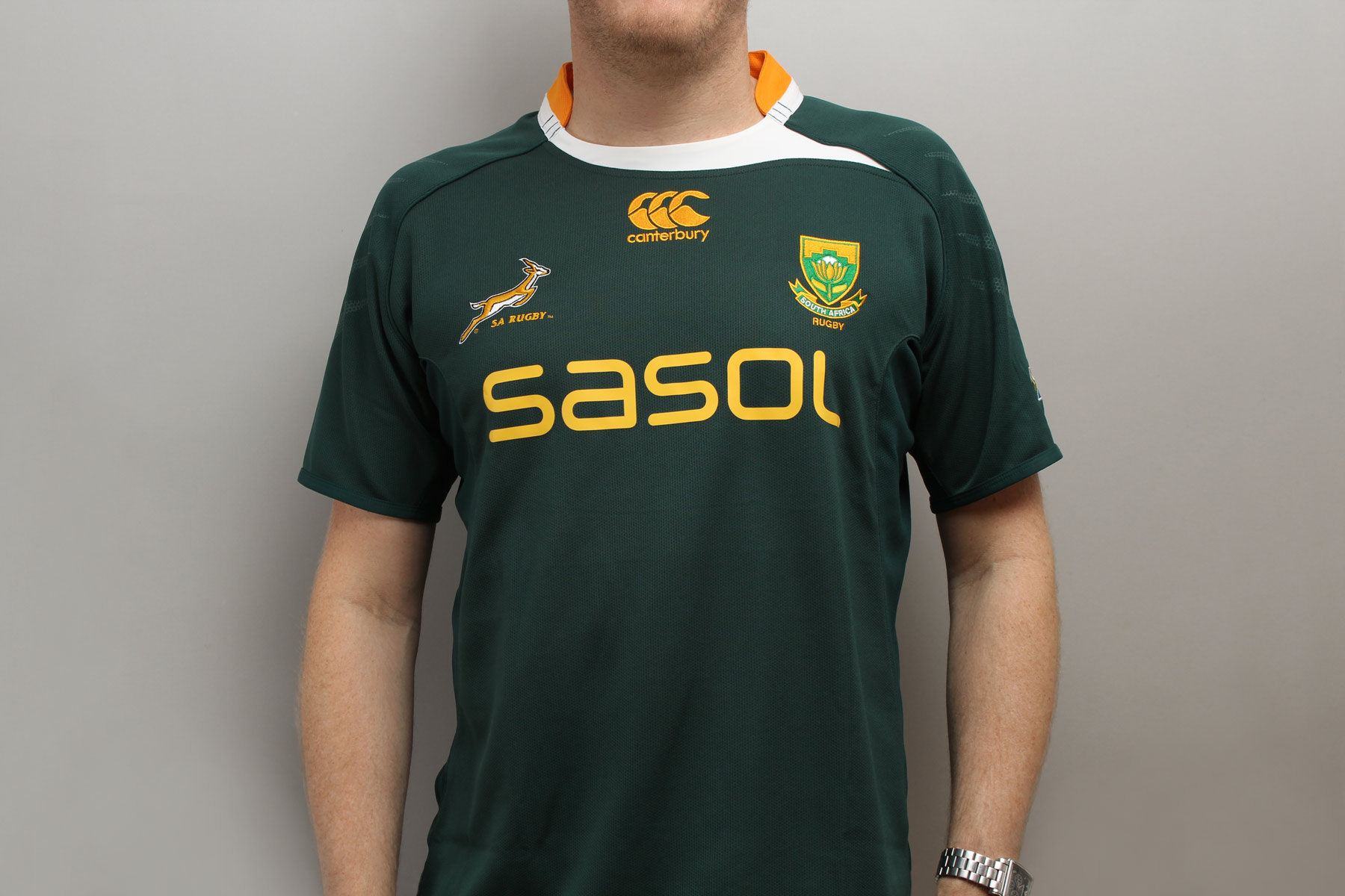
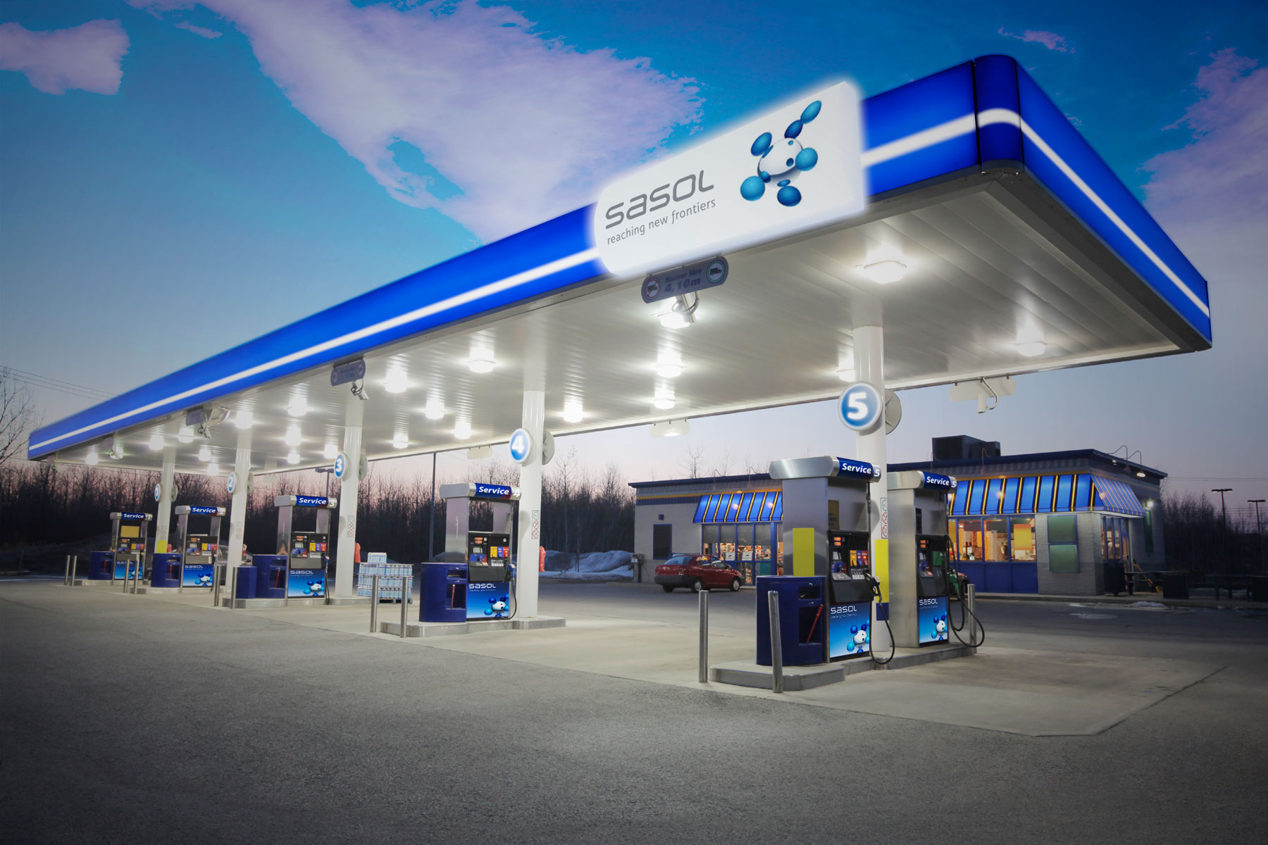
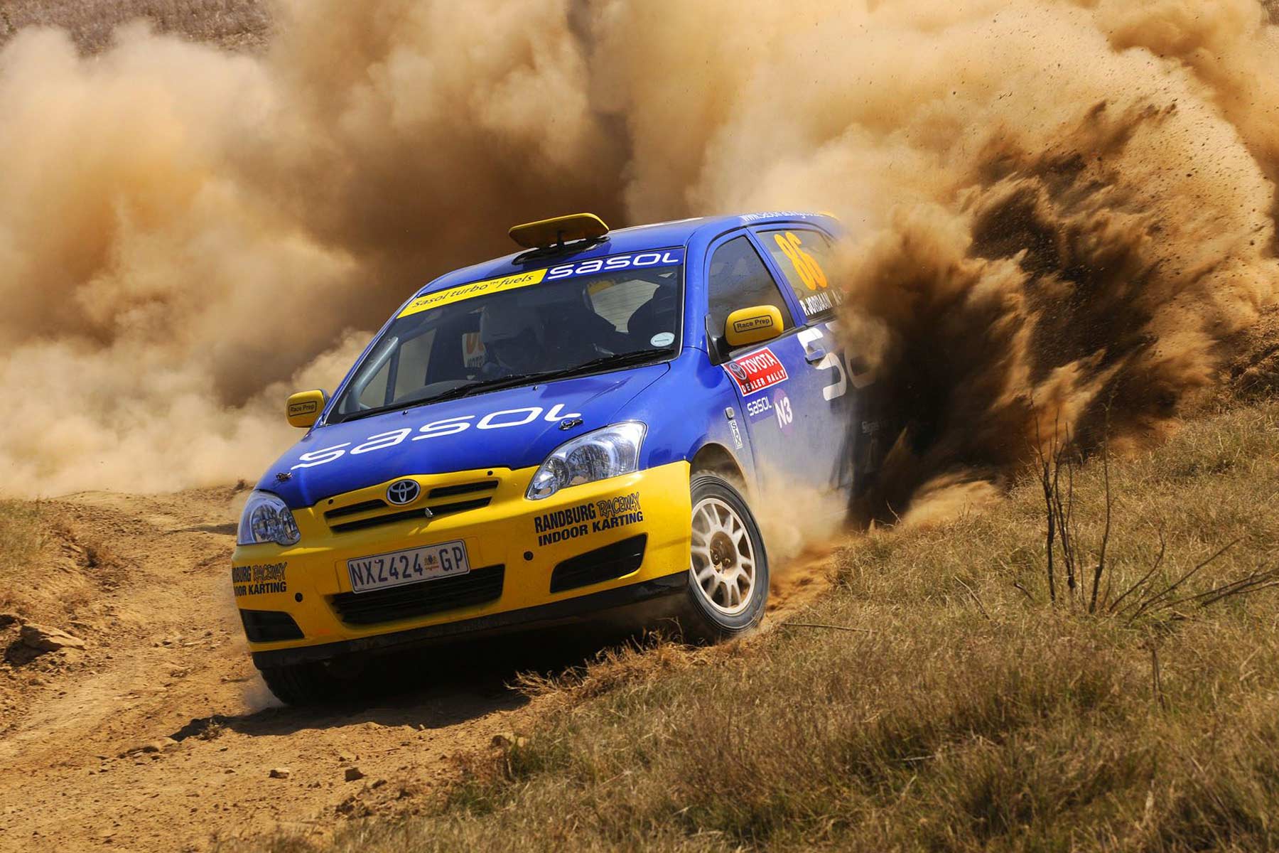
 The central sphere denotes stability with six rotating satellites suggesting strength through synergy. Its visual power will allow it over time to become a stand-alone icon without the need for typography to support it.
The new branding was applied across 27 Companies and divisions within the Group. It has been extremely well received by the marketplace and the design was awarded an international design award.
Sasol, reaching new frontiers and the molecule device are registered trade marks of the Sasol Group of Companies. All rights are reserved.