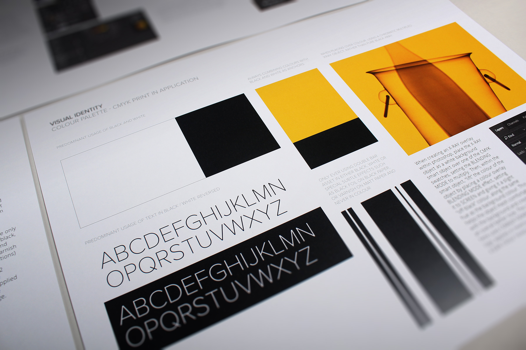
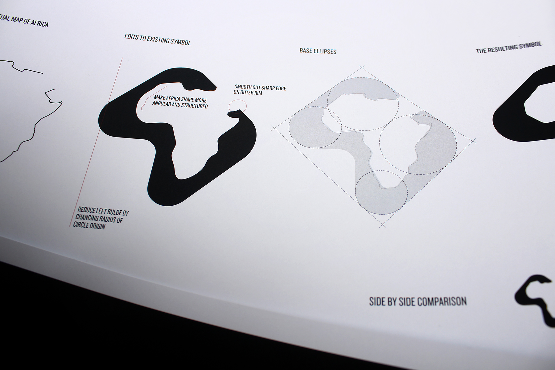
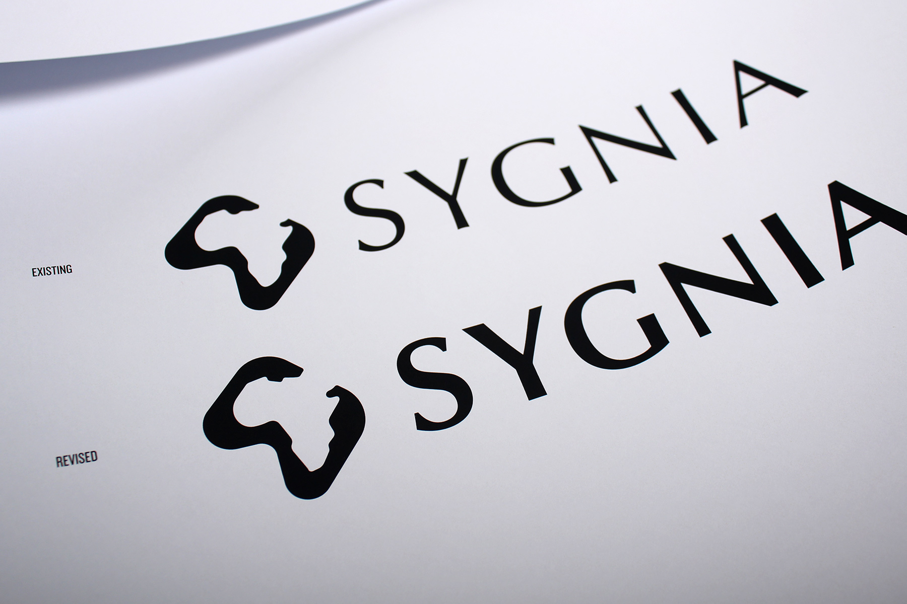

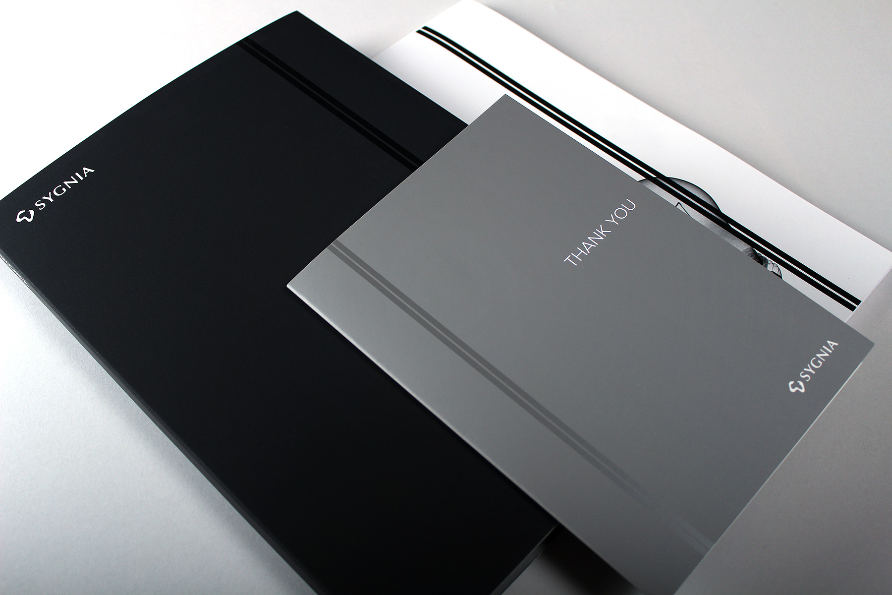
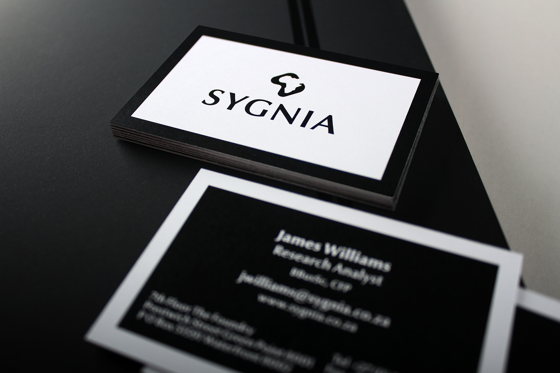
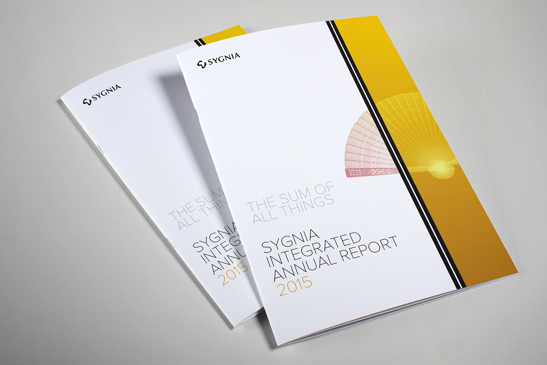

A brand which demonstrates both analytical agility and an elegant aesthetic.
Firedog were originally commissioned to originate a brand born out of South Africa yet created to be associated with European and North American markets. Sygnia wanted a brand that not only demonstrated their analytical methodologies, but delivered an elegant identity that would be confident on the world stage. Firedog in Cape Town continues to routinely deliver for Sygnia, looking after the majority of design and communications across brand, campaign and digital platforms.