Case Studies
Going viral with the Society for General Microbiology

SGM’s new brand mark
Revising both its vision and mission, the Society for General Microbiology deemed its existing branding to be outdated and uninspiring. Its aim was to build a strong, lasting and consistent brand that reflected the organisation’s forward-thinking approach to microbiology.
SGM is the largest learned microbiological society in Europe, with a worldwide membership based in universities, industry, hospitals, research institutes and schools. This prestigious status, however, was unfortunately being masked by outdated branding. SGM wanted to design a new brand icon and brand mark that successfully conveyed their identity as a professional, approachable and authoritative organisation.
SGM’s prestigious status was being masked by outdated branding.

Initial brand mark development focused on the circular, soft shape of microbes.
As digital advances, brand marks must be versatile and adaptable to both print and digital media. For this reason, the brand also needed to be scalable with a distinct favicon icon.
SGM’s existing brand mark failed to adapt to a digital domain; at a distance, it was virtually unrecognisable. The organisation further specified that the brand mark needed to be abstract in design so it wouldn’t disenfranchise any particular audience.

At a distance, the existing brand mark was virtually unrecognisable.

SGM’s existing brand mark was outdated and had serious legibility issues.
The existing brand mark failed to adapt to a digital domain
Our initial brand mark development focused on the circular, soft shape of microbes. Retaining the roundness of early designs, the brand mark evolved into an M device that subtly hints towards microbiology without being overly explicit. This abstract design serves to attract a wide range of people. Most importantly, the brand mark has very strong legibility. It is simple, bold and striking, making it highly suitable for both print and digital domains.
The new brand mark hints towards microbiology without being overly explicit.
We’ve developed the brand mark in a series of colour combinations, which adds flexibility and interest. Each combination has been carefully created to work harmoniously with the pale blue tones found within the symbol. As the brand mark will only ever be used on white or light tinted backgrounds, the end result consistently conveys a bright, approachable brand that retains a clean, professional feel.

The new brand mark conveys a bright, professional and approachable organisation.
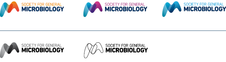
We developed the brand mark in a variety of colour options, enhancing flexibility.
DIN: a timeless, corporate and upright typeface.
SGM’s brand mark wasn’t the only aspect of the branding that needed a refresh, though. The organisation’s existing typeface, Rotis, was outdated and hard to read in digital environments. Sourcing a timeless typeface suitable for a professional and educational organisation, we opted for DIN Next Pro.
This is one of our favourite typefaces; it’s modern, corporate and upright without seeming imposing. The DIN typeface has been used for German signage and number plates since the 1930s because of its strong legibility. Although different versions are continually developed, the typeface always communicates confidence and authority.
As with the new brand mark, DIN Next Pro encourages flexibility; you can mix and match the normal and condensed typefaces together in applications that share the same character shapes.

DIN Next Pro is one of our favourite typefaces.
We juxtaposed visual identifiers of microbiology with sharp minds.
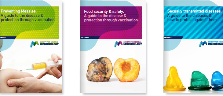
As well as updating SGM’s the brand mark and typeface, we provided the organisation with artwork for all print collateral. These templates juxtapose soft, organic shapes with hard, geometric ones. The soft shapes are inspired by the brand mark and are the visual identifiers of microbiology, while the squares and rectangles represent the sharp, analytical minds of the people who work in this domain. Combining the two distinct forms creates an interesting intersection and demonstrates the diversity of this field.
We also developed a series of graphic textures which can be used throughout the visual executions of the brand to add more depth. These patterns again combine the diverse structures discovered under a microscope with the analytical, precise work of the microbiologists.

The soft shapes are inspired by the brand mark and are the visual identifiers of microbiology.
The graphic textures on SGM’s refreshed print collateral.

The new brand is now highly legible across all media platforms.
Much of the artwork supplied will be used for SGM’s magazine Microbiology Today. The photography we chose for the magazine mixes imagery of people, objects and microbes. One thing remains consistent, though: this photography is always positive, bright and clear. SGM wanted to focus on scientific advancements and the readers’ fascination with microbiology, as opposed to a negative depiction of germs and illnesses.
While results of the rebrand are yet to be established, the SGM team are extremely pleased with the new look and feel that has been created. The branding is fresh, professional and legible, propelling SGM into the digital realm with a brand that truly conveys their core values.
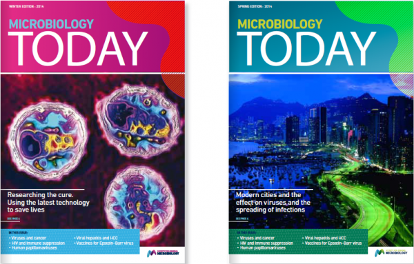
The refresh of SGM’s Microbiology Today magazine gives a bright, clear look and feel.