Kaboodle Brand Identity

Kaboodle from Freedman

Software, with oodles of personality.

Freedman International is a media business working with leading brands wishing to streamline or centralise their marketing activities. Their core business capabilities include global campaign implementation, marketing operations consulting and technology platforms. Our remit included naming, strategy, positioning, messaging, branding and visual identity, website(s).

The final brand mark is both minimal and invigorating. The starkness of the black backdrop and clean type is offset by a bright and contemporary symbol.

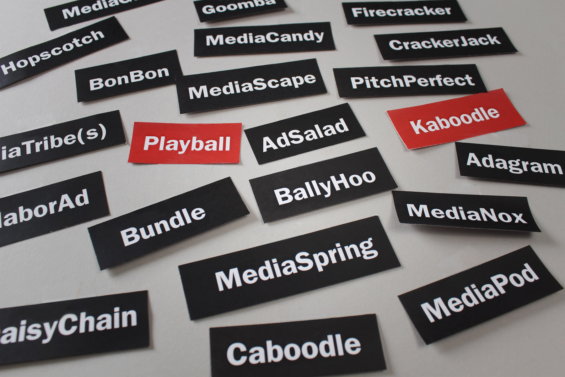
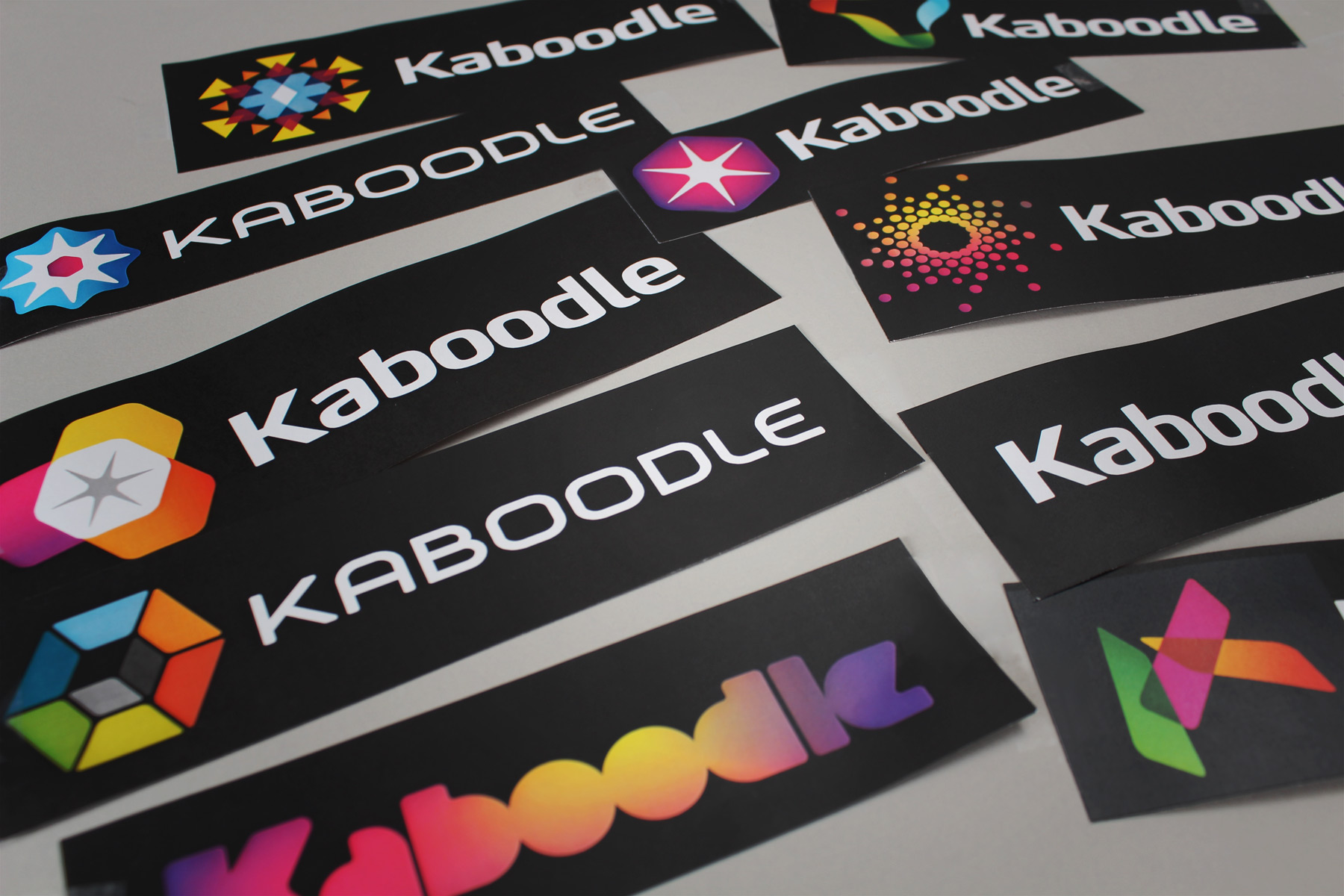
There are similar systems out there, but what made this one unique is its simplicity.

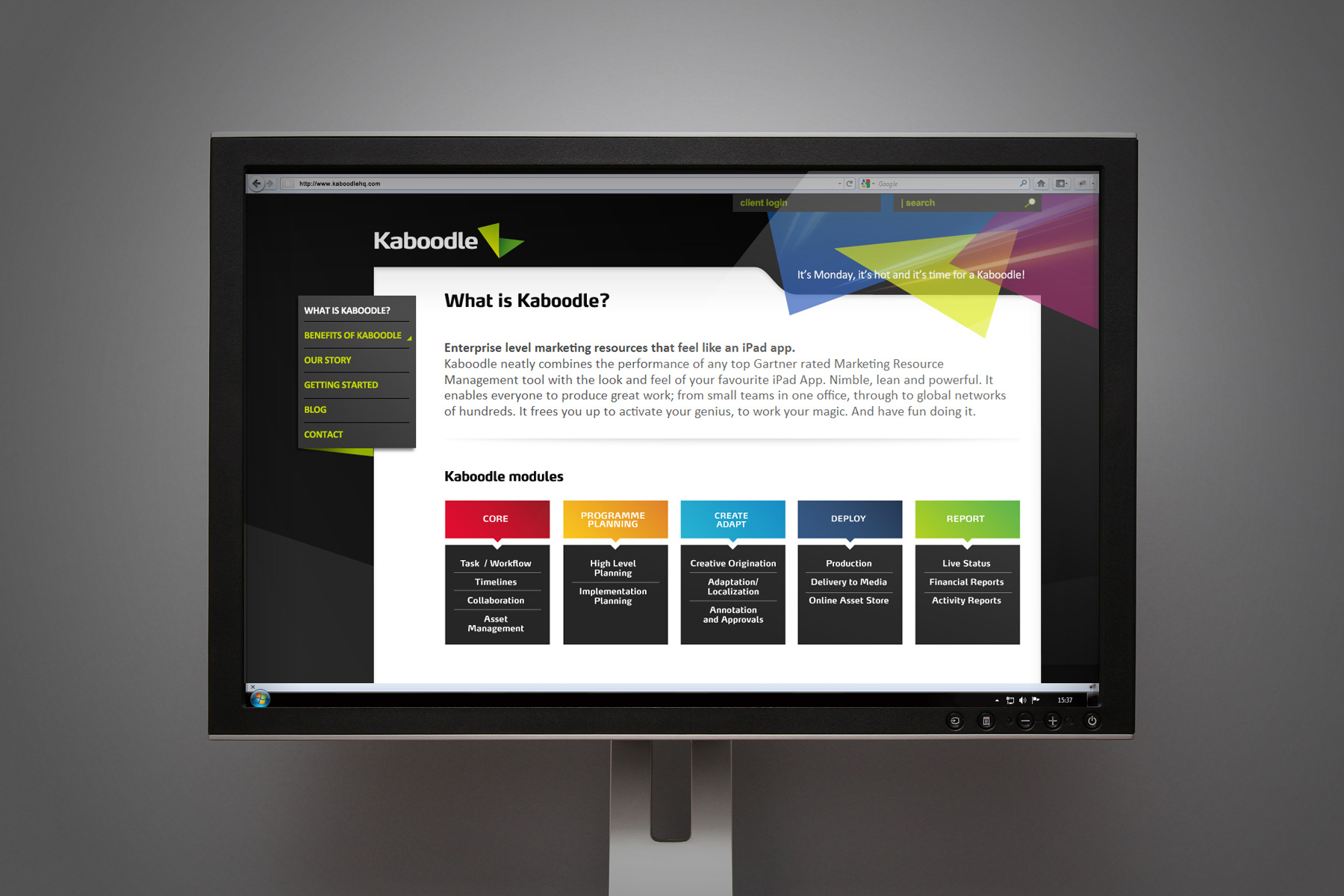
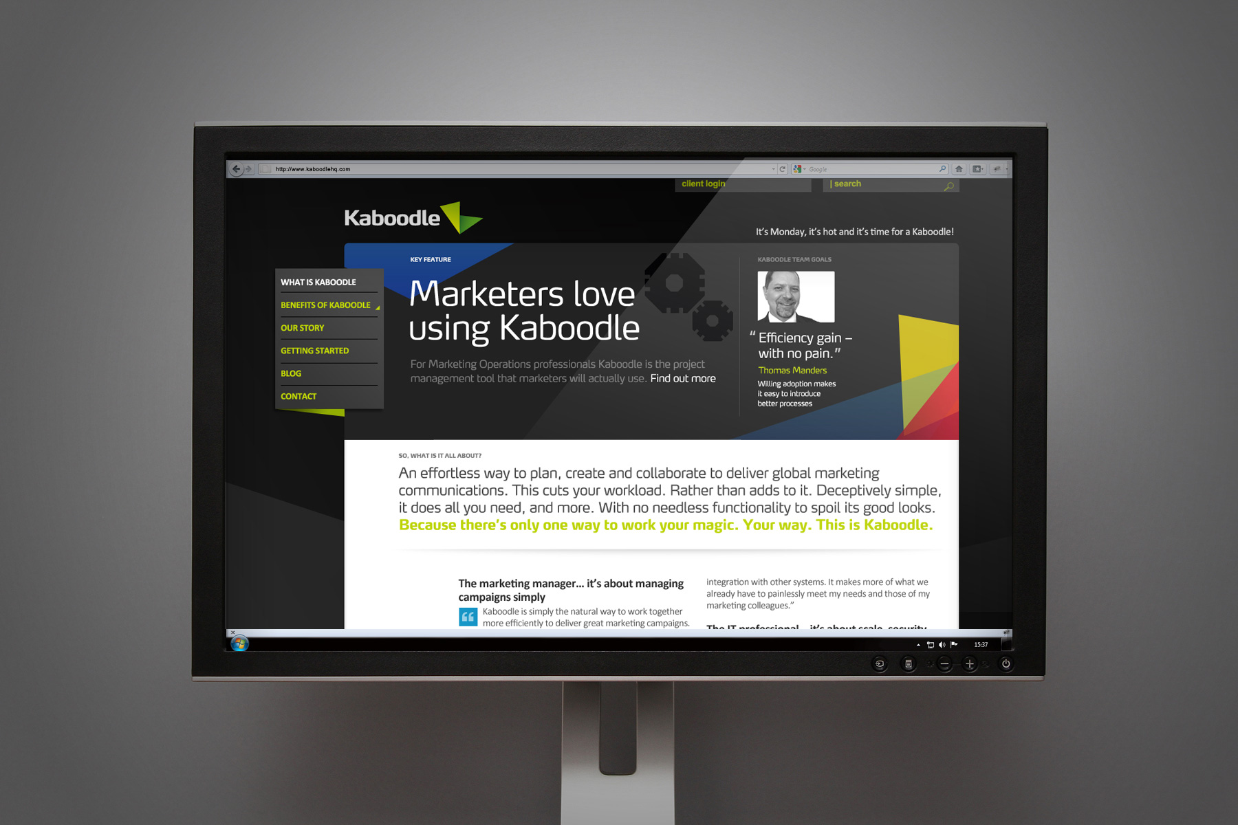
Freedman have created a cloud based, global collaboration system whereby multiple and diverse marketing teams can more easily communicate with each other, in the production of advertising campaigns across the globe. The software needed naming, positioning, a digital brand and a website to build brand awareness and reach. Extensive research undertaken by Firedog made it clear that there were similar systems out there, but what made this one unique is its simplicity. It allows the user to control the way that the system works rather than the other way round.

We developed conceptual avenues around collaboration and created a number of naming strategies for the branding of the software product.

Inspired by the vibrancy and transparency of the product, the visual look and feel is comprised of a bright colour palette and translucent shapes.

With naming and branding we explored two routes: “technology slick” vs. ” fun & engaging”. The end result was a mixture of the best values from both. Inspired by the vibrancy and transparency of the product, the visual look and feel is comprised of a bright colour palette and translucent shapes. Smooth lines are also incorporated, reticent of the clean and simple-to-use technology. For a technology product, web presence is vital for success. A holding page was created to enable prospective clients to sign up to receive updates while both the product and the website were in development stages. A name, brand and website that showcase the vibrancy and simplicity of the product offering. The website went live on 10th November 2011 and the sales lead generation and online goal completions have increased exponentially since.

The combination of a minimal black environment and highly saturated brand assets creates a brand with real visibility and recognition.
Sign up for our Firedog Newsletter
* = required field