-
-
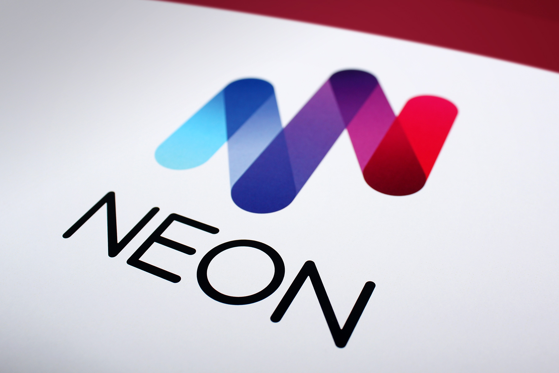
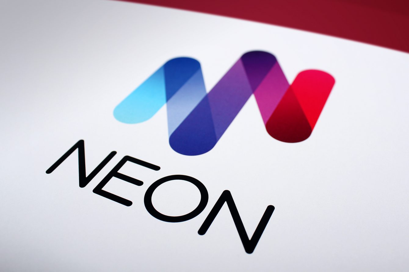
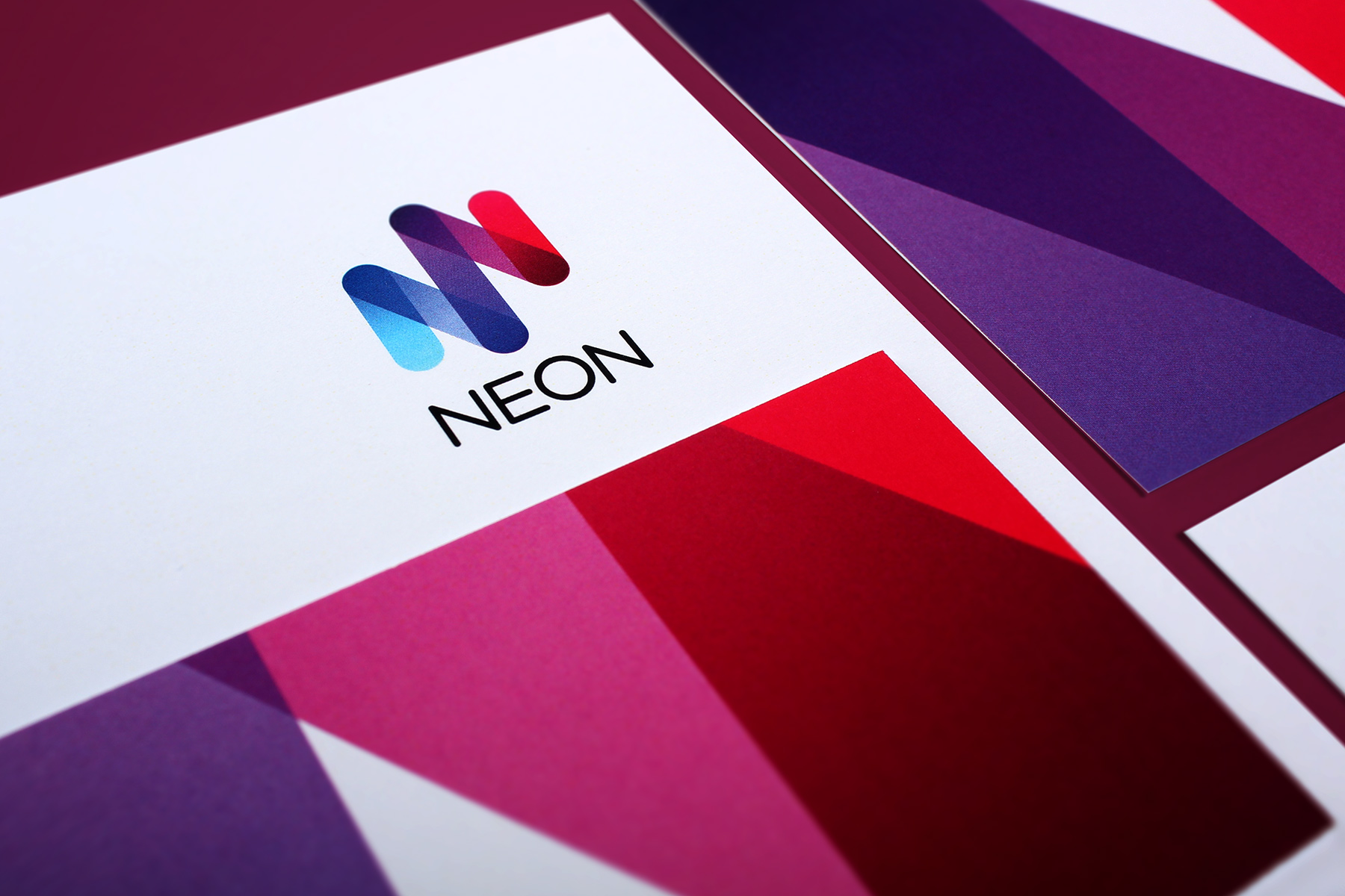
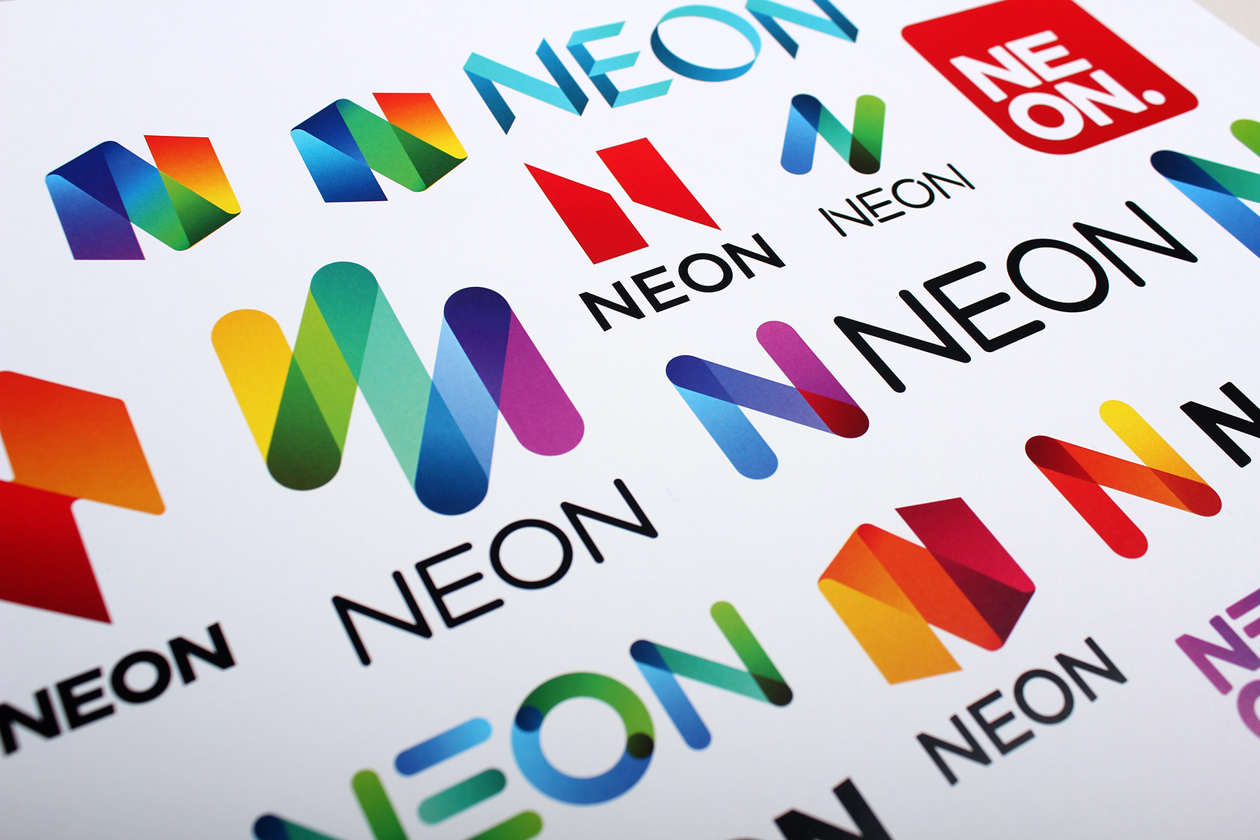
The final brand mark relies on hand cut rounded type, combined with a symbol which both reflects the initial N character as well as the tubular nature of Neon bulbs.
-
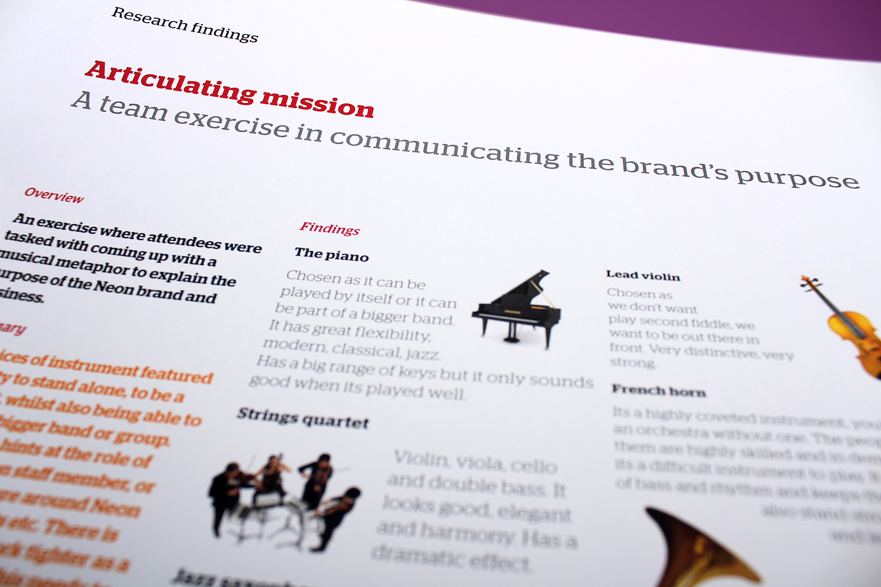
Brand workshops, one to one surveys and staff research kicked off the process, culminating in an extensive strategic framework.
-
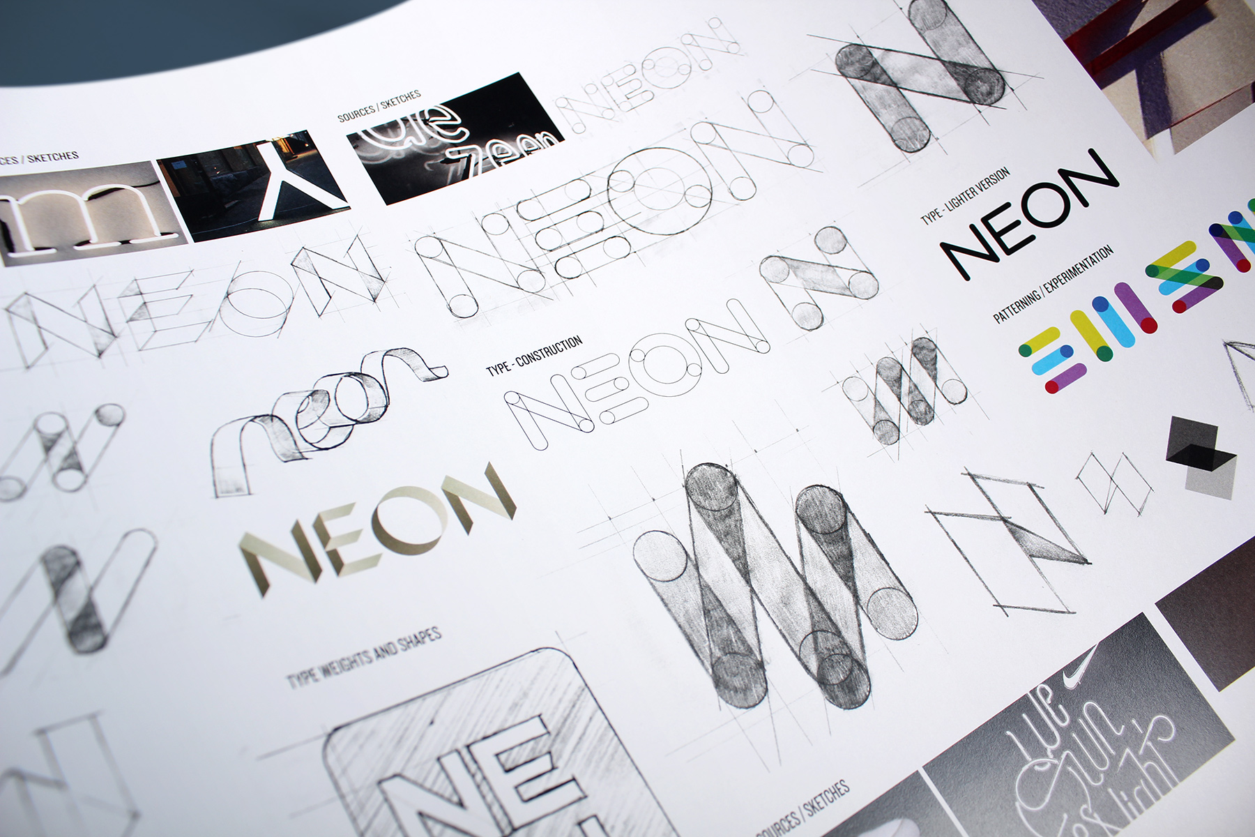
Neon is a wonderfully simple name, connected to an entire world of properties and meanings. We wanted to express its exuberant nature through hand cut type and icons.
-
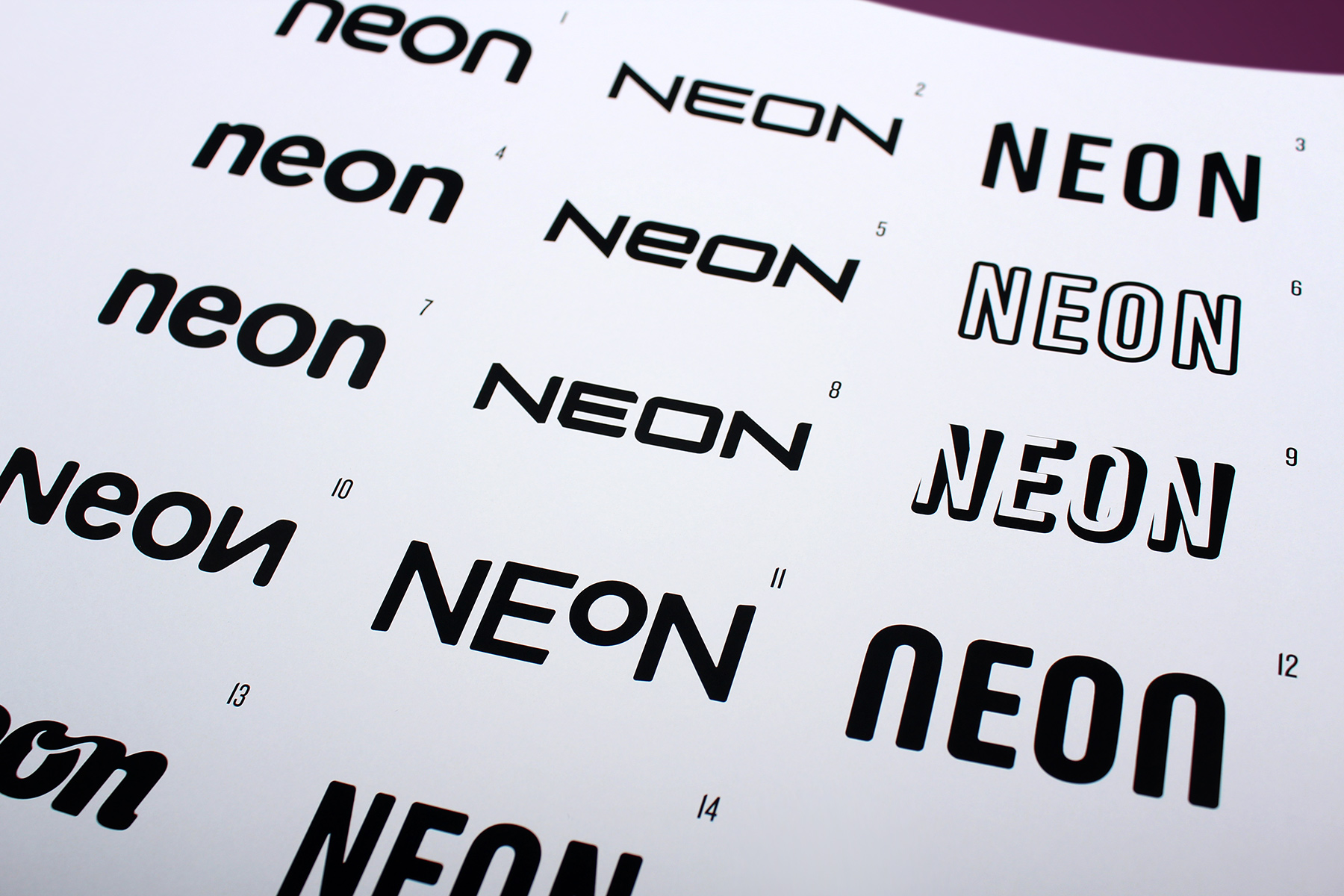
The client was quite keen on using a combination of icon and typography. We explored various styles of type and form.
-
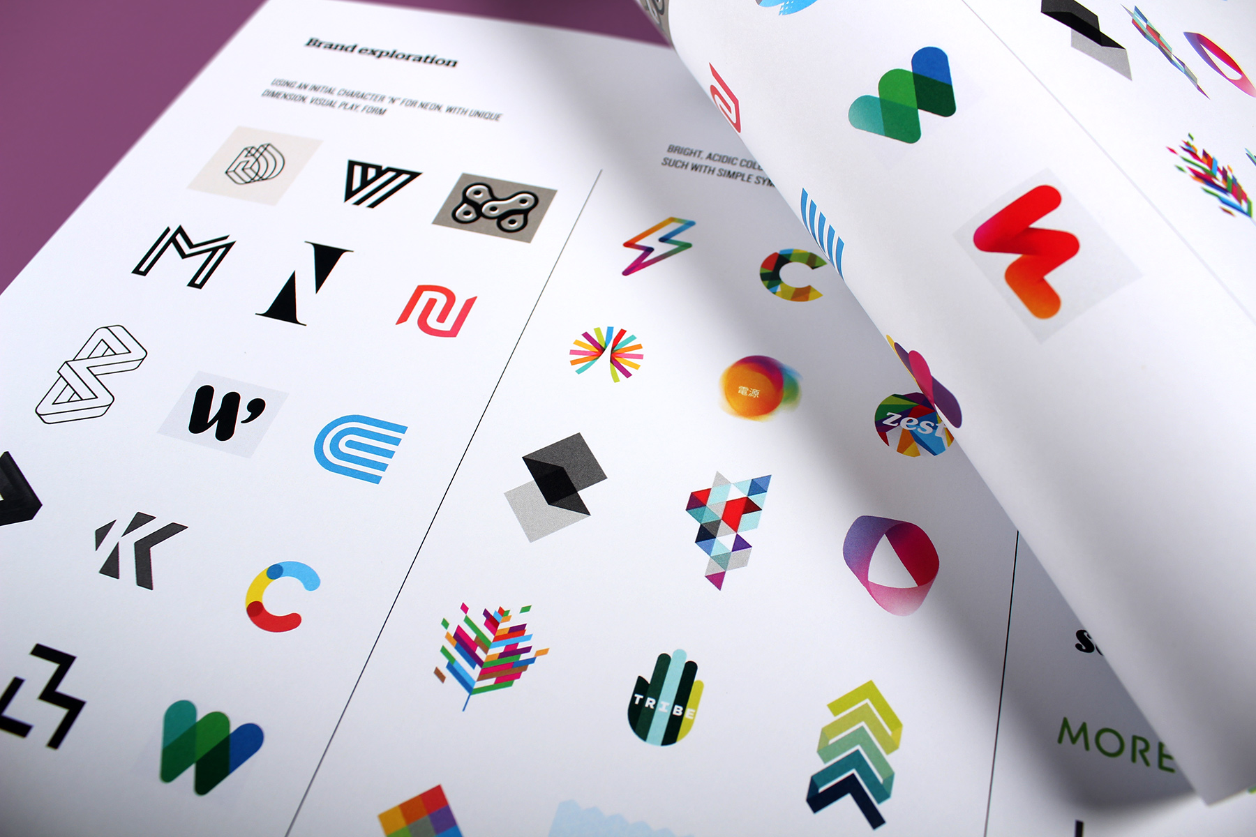
Our brand mood boards focused on usages of iconic, simplistic, bold and colourful symbols. Standout was our key objective.
-
The creative brand concepts became all linked to a bold, striking aesthetic.
-
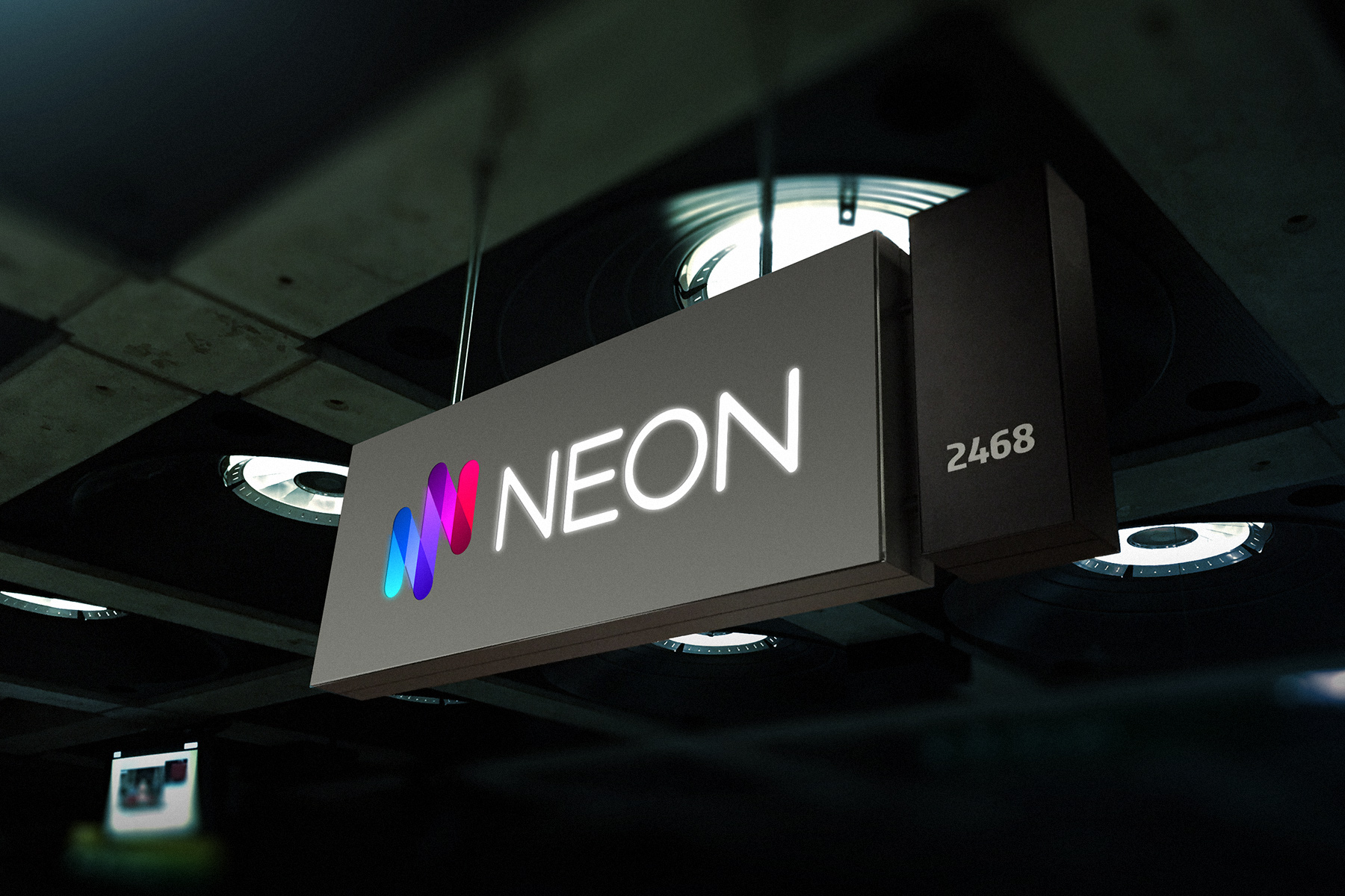
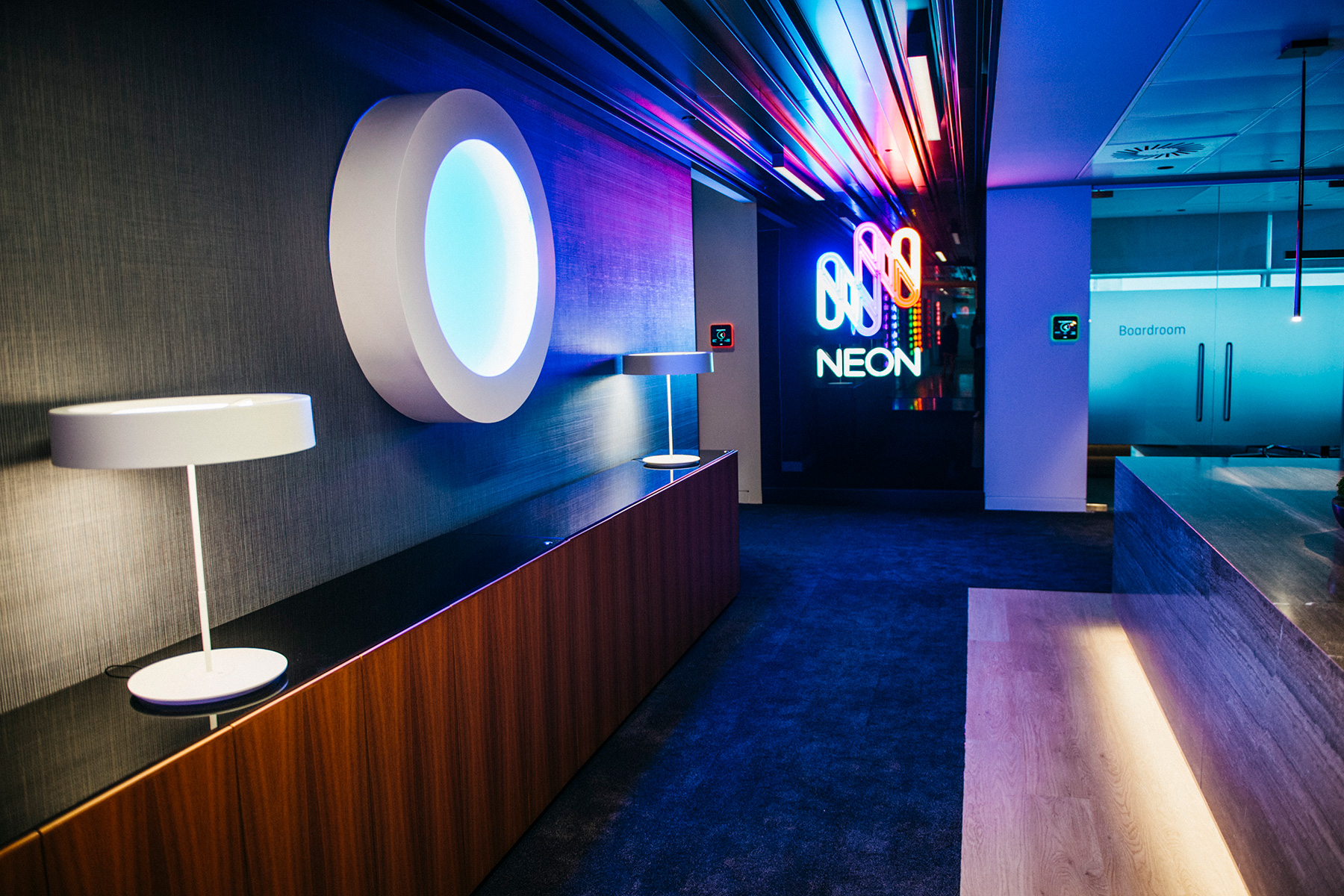
A big part of the core briefing was to create physical standout in the crowded Lloyd's marketplace. Here is the sign on the trading floor in London.
-
The subsequent visual identity utilises the core nature of the brand mark yet extends it into a flexible and dynamic system.
-
A single colour version of the mark was created afresh, to be used for etching, merchandising and single colour print.
-
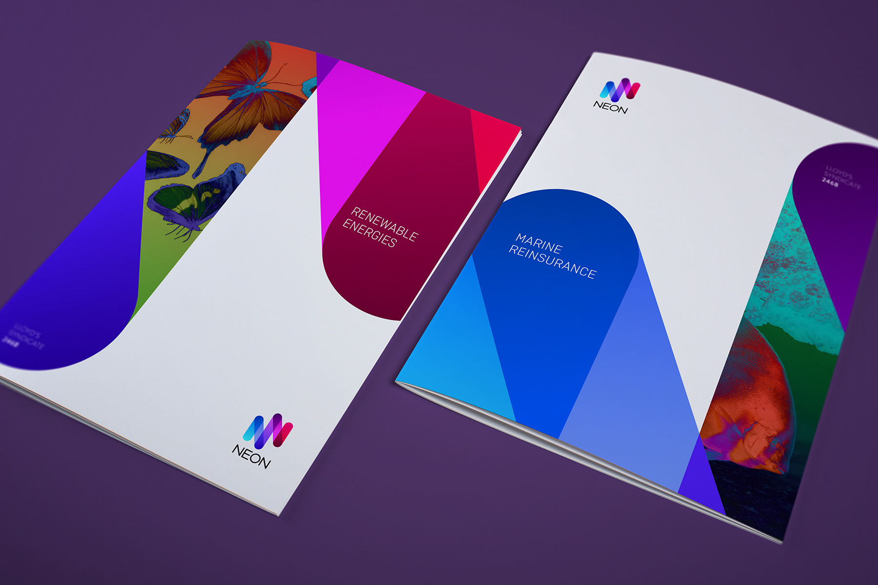
The graphic devices can be used on their own, or they can also be used dynamically to hold various treated imagery.
-
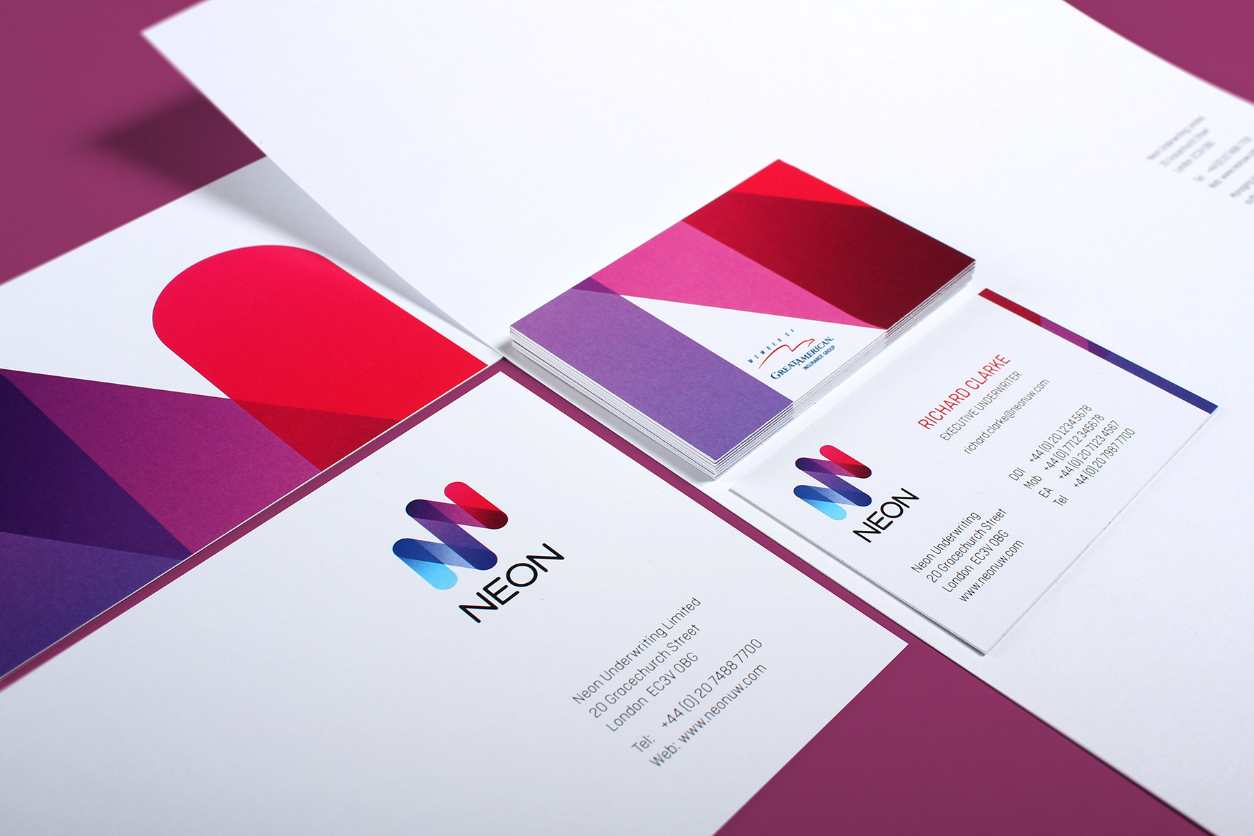
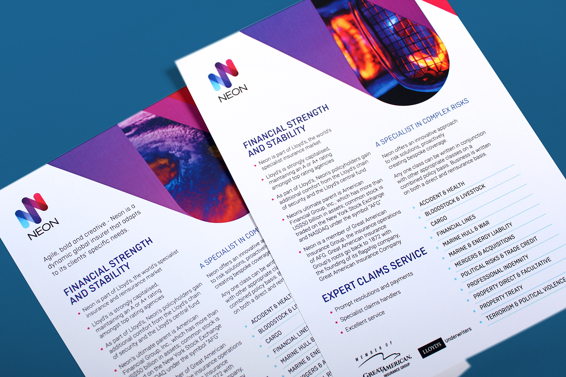
The print and stationery look and feel is simple, bright and bold. We utilised a contemporary rounded germanic font to add to the overall feel.
-
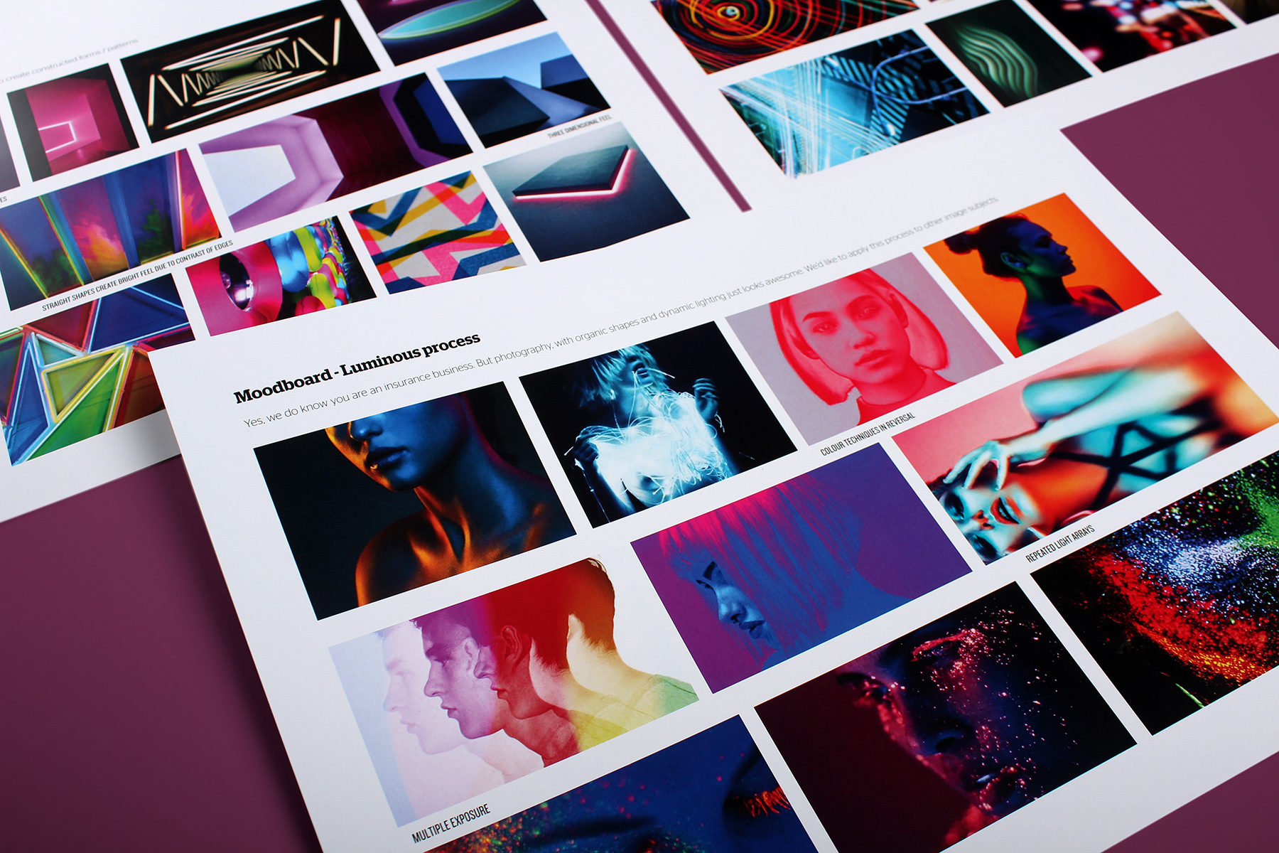
We wanted to create a unique image treatment for the brand. We became fascinated with imagery where the photographer had distorted colour channels to create unique effects.
-
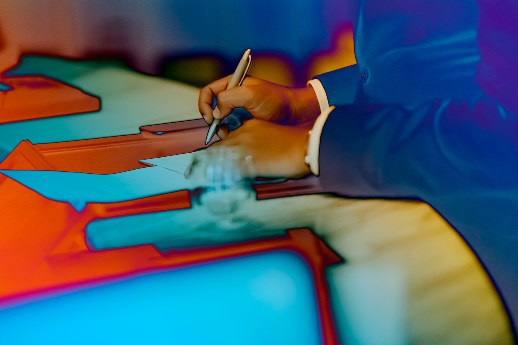
As with most brands on a budget, Neon were reticent to spend money on a shoot. Therefore, we created ownership of basic stock imagery with a unique 'Neonised' treatment.
-
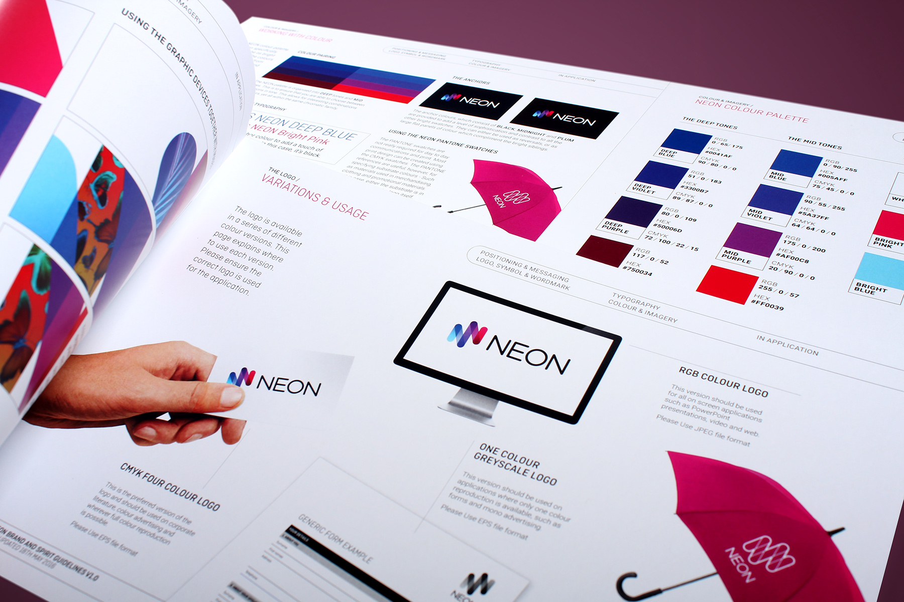
The branding process was supported by a comprehensive brand, spirit, communications and digital guideline kit.
-
The identity utilises a combination of bright acidic colours, combined with plenty of white in order to retain a contemporary yet controlled feel.
-
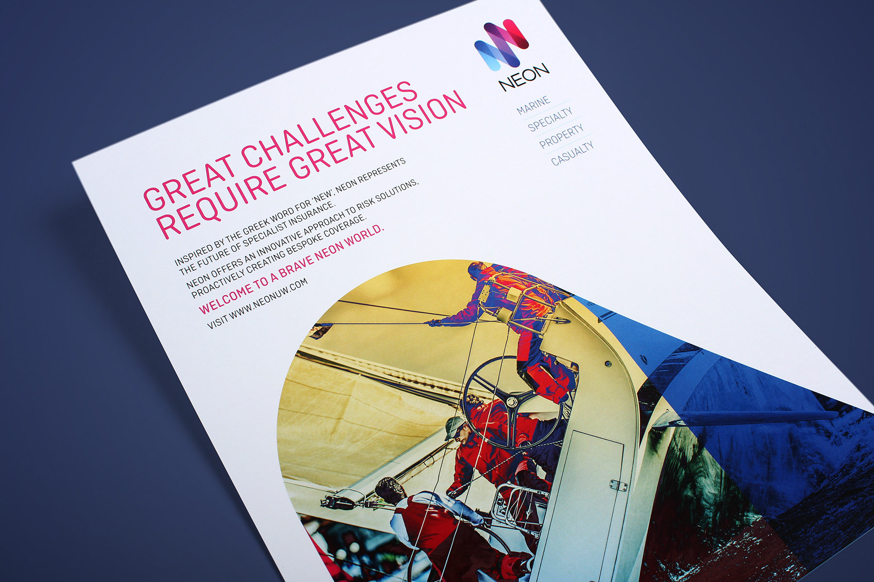
We have been working together with both London and Bermuda offices. Here is an advertising campaign for the America's Cup sailing event.
-
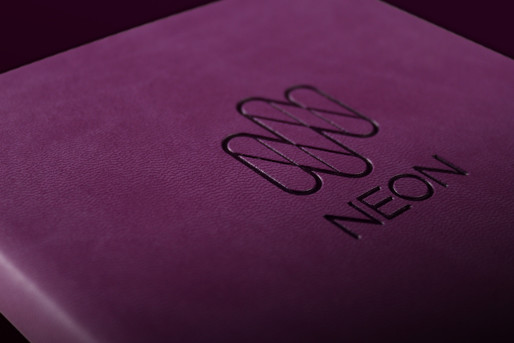
The single line version of the identity has been used extensively, embossed on bright primary coloured merchandising.
-
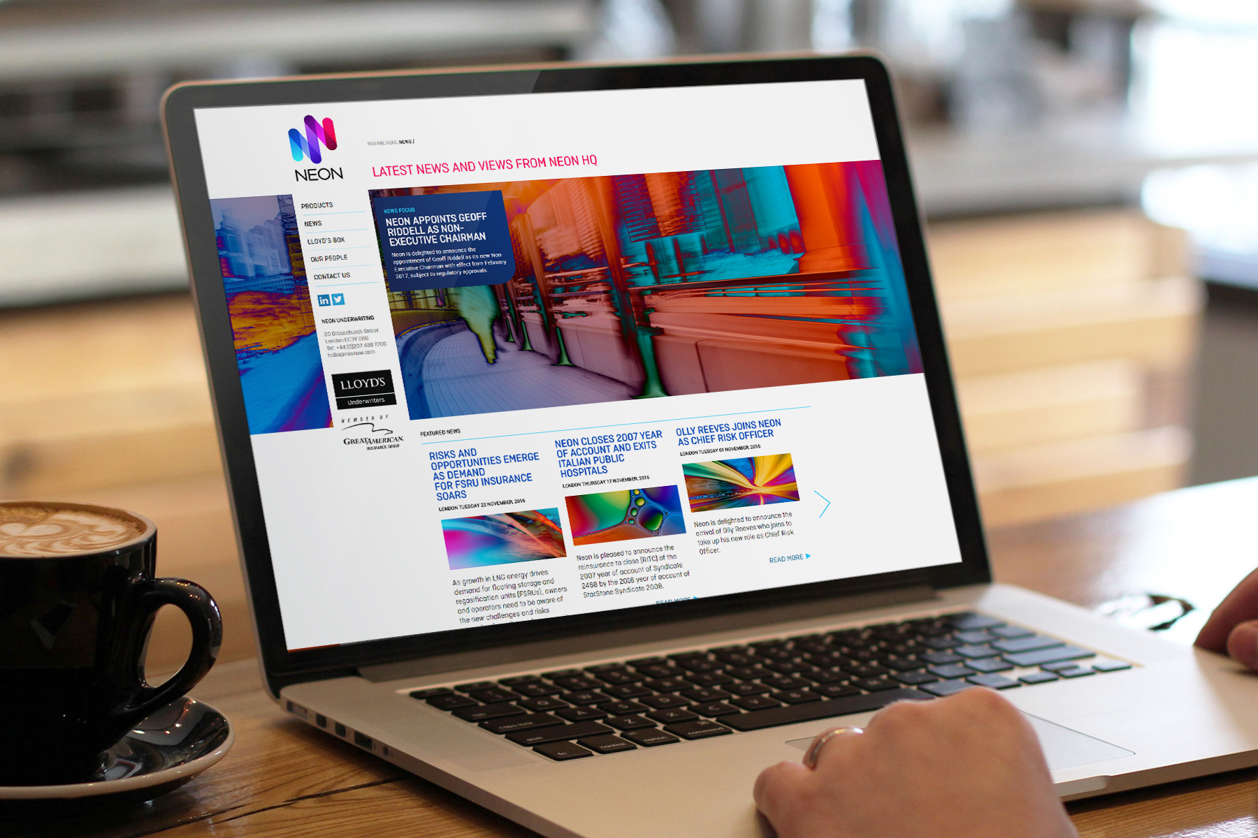
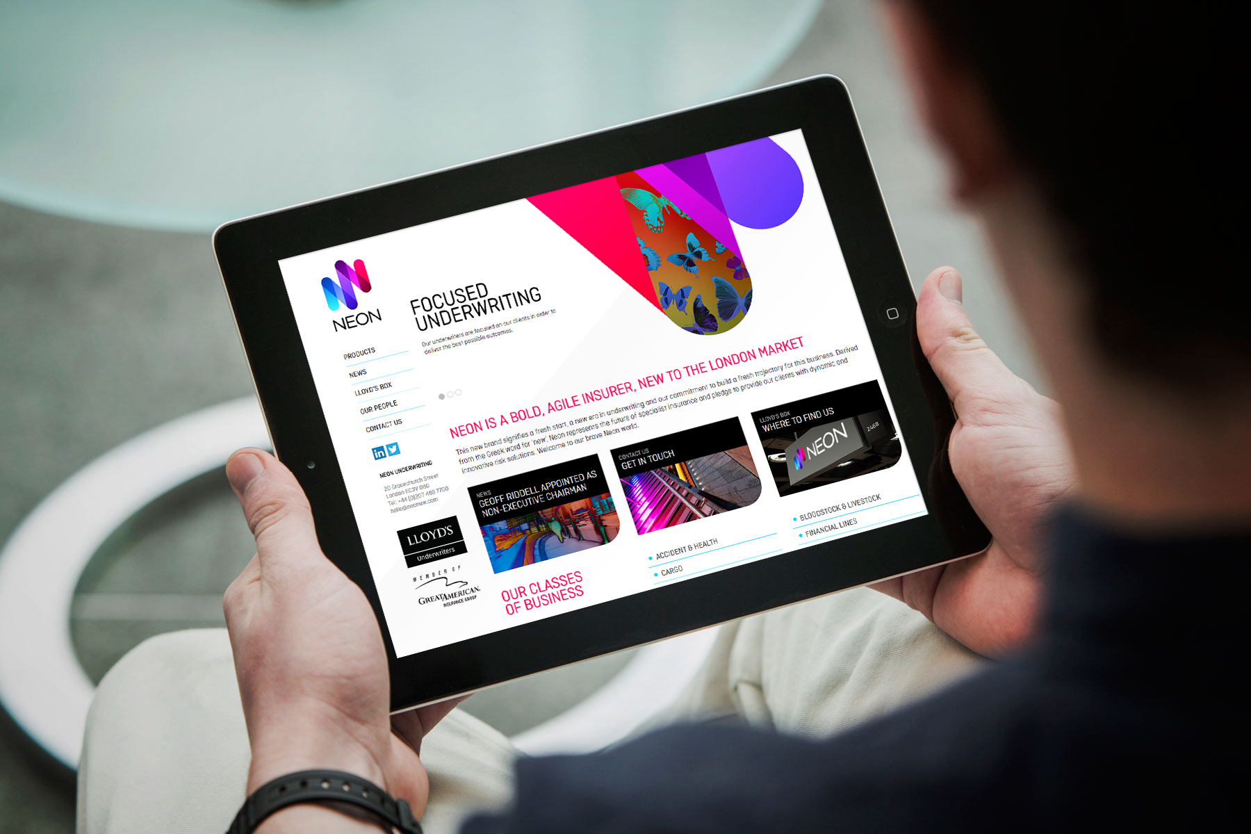
The digital channel for Neon is cohesively linked by usage of the dynamic imagery and clear, bright typography.
-
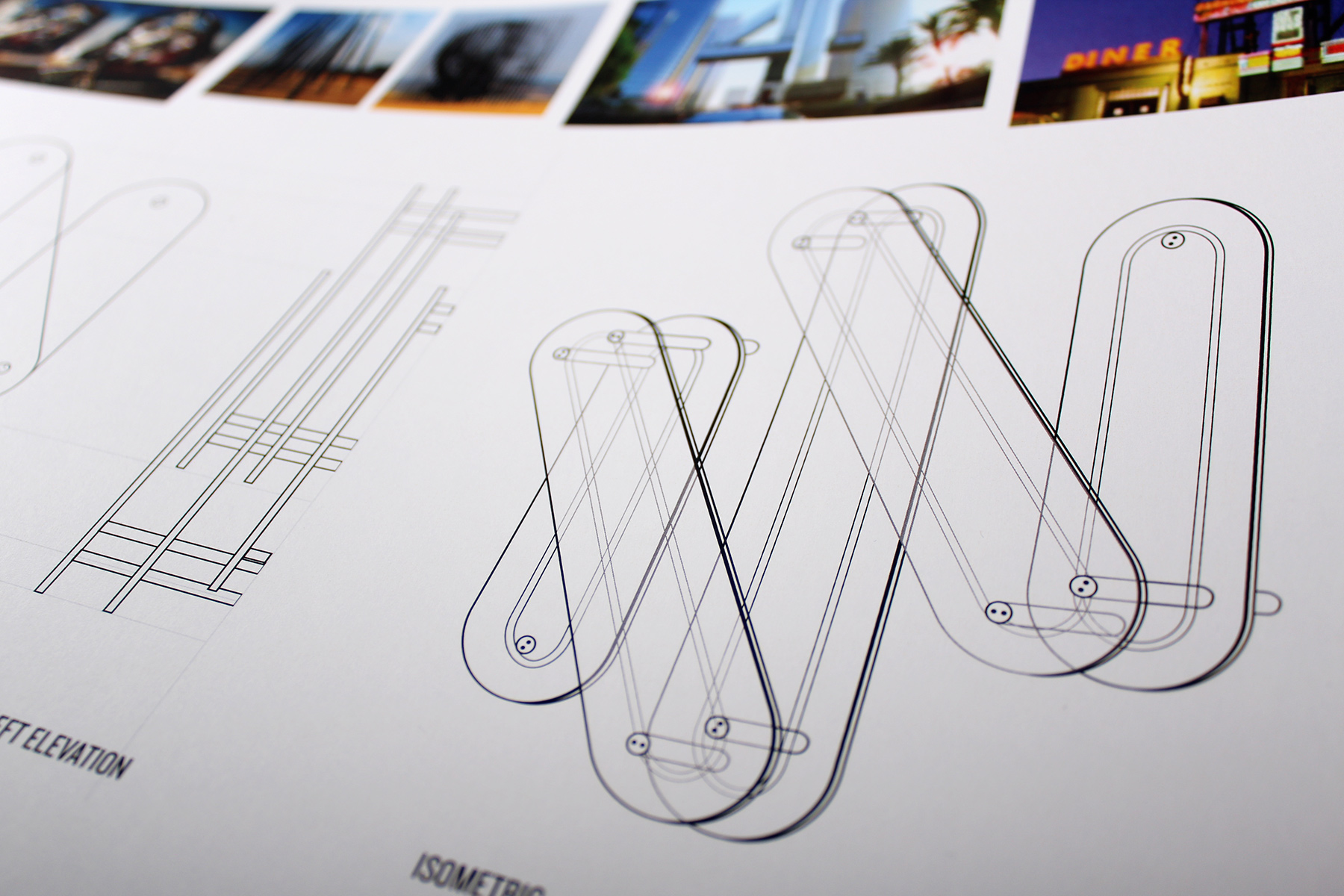
We created the symbol in three dimensions, for usage in signage and wayfinding. In this way, we could replicate the transparency in the static mark utilising overlapping planes.
-
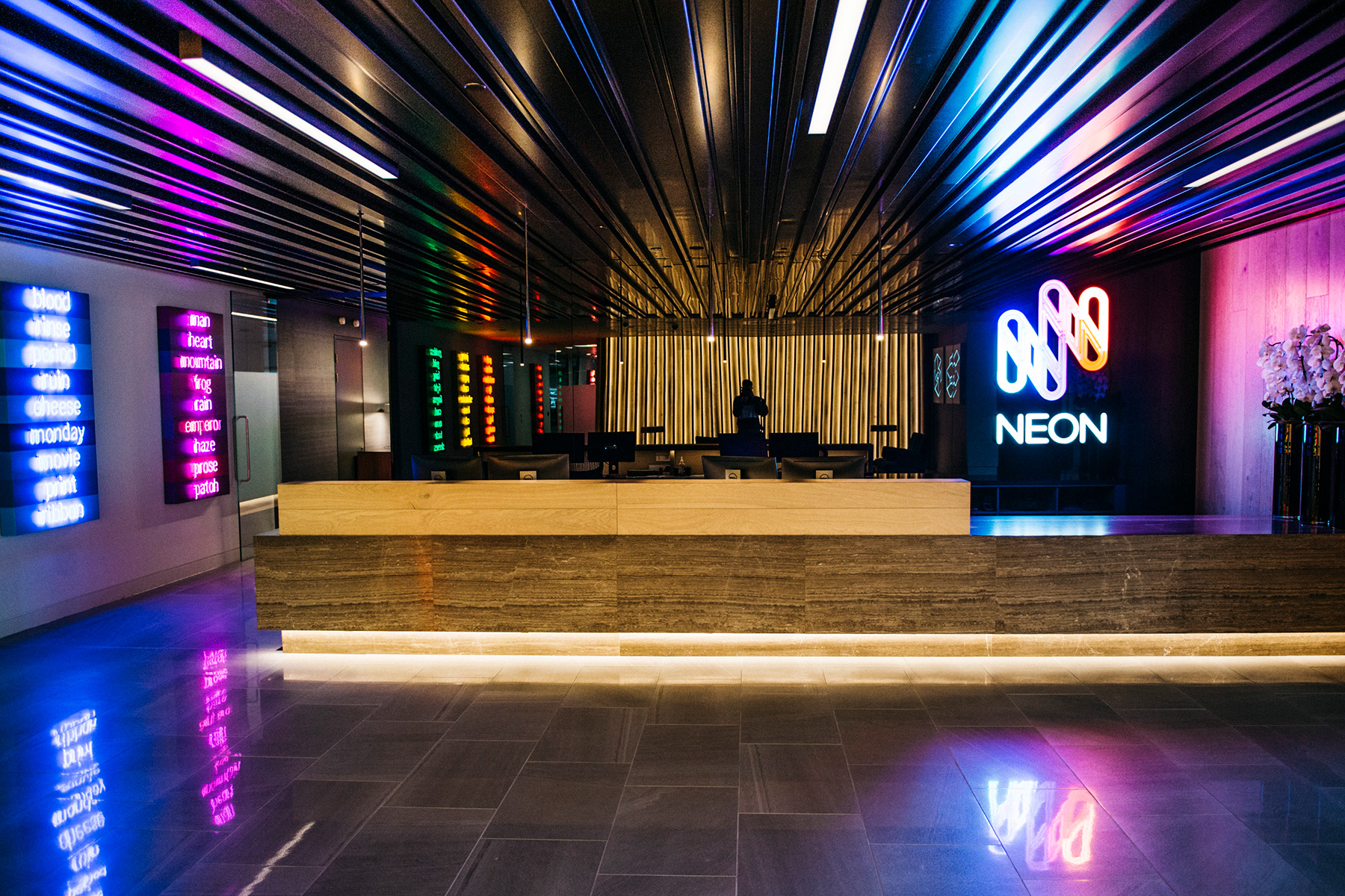
The combination of Neon branding and complimentary bright Neon artwork creates a bright and inspirational workplace.
-
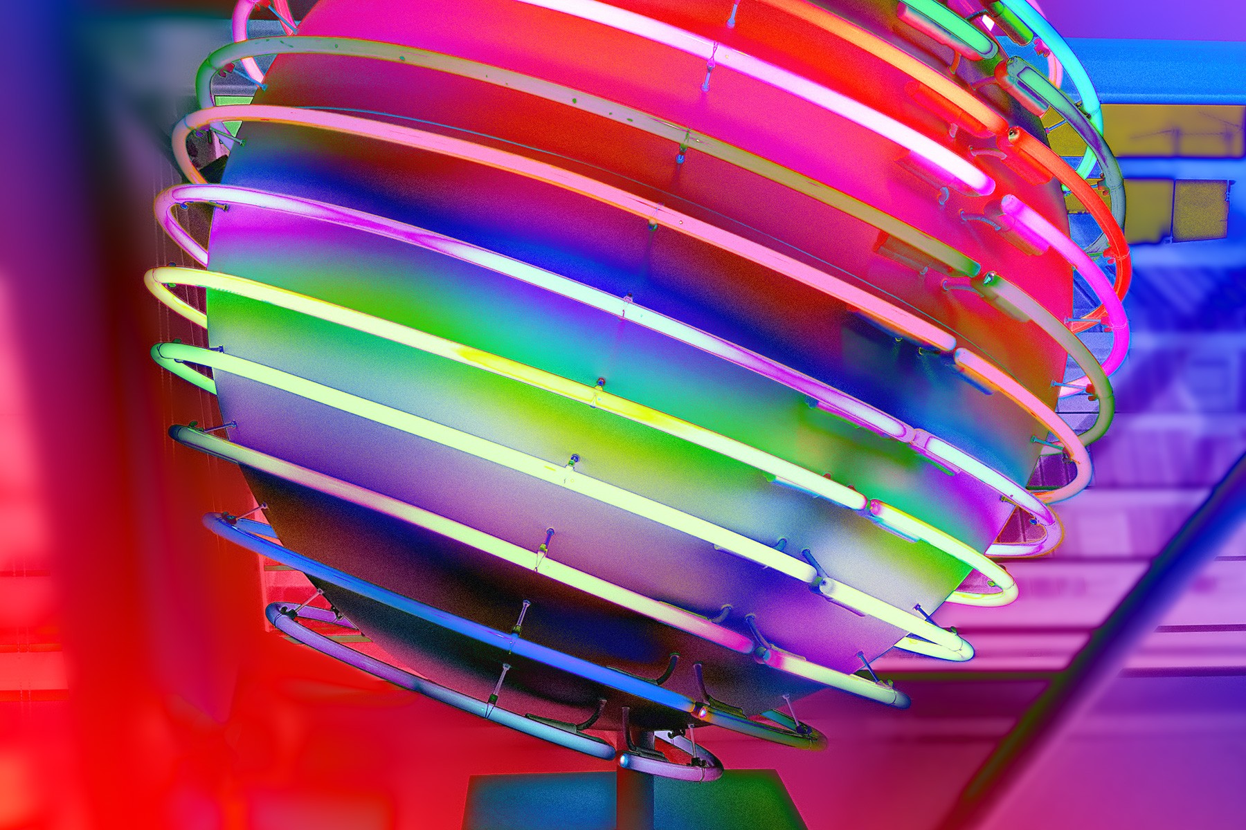
A fibreglass ball featuring 14 neon rings approximately 120cm in diameter. The artwork mirrors the axial tilt of the earth and rotates slowly on this axis. Credit: Rob and Nick Carter.
-
The artwork mirrors the brand values and thus gels incredibly well within the enviromental office design.