-

-
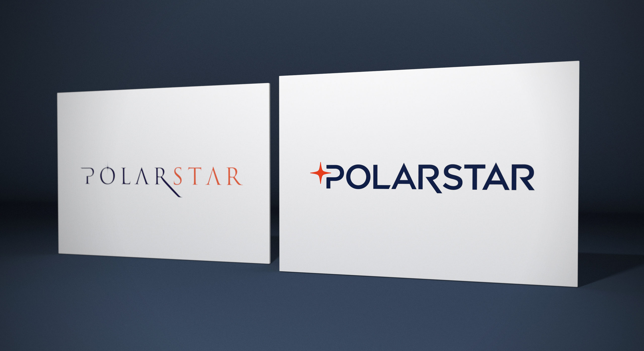
The incumbent brand identity lacked punch and cut through. As part of the creative process, we redesigned the brand mark to convey strength and consistancy.
-
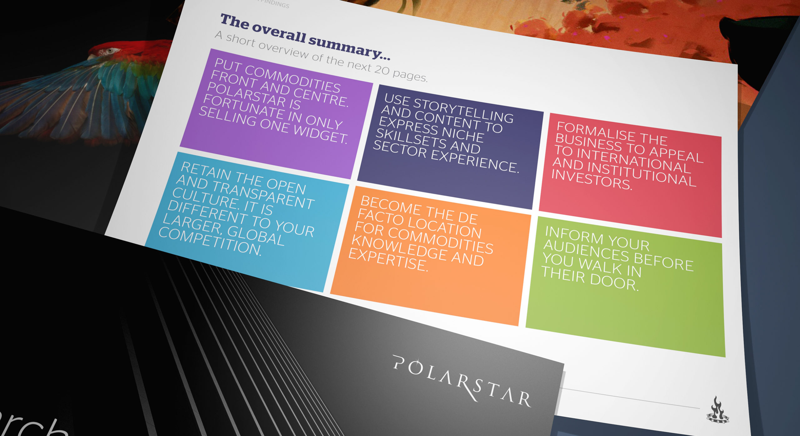
We unearthed existing positive brand attributes and refined them into strategic pillars of reason.
-
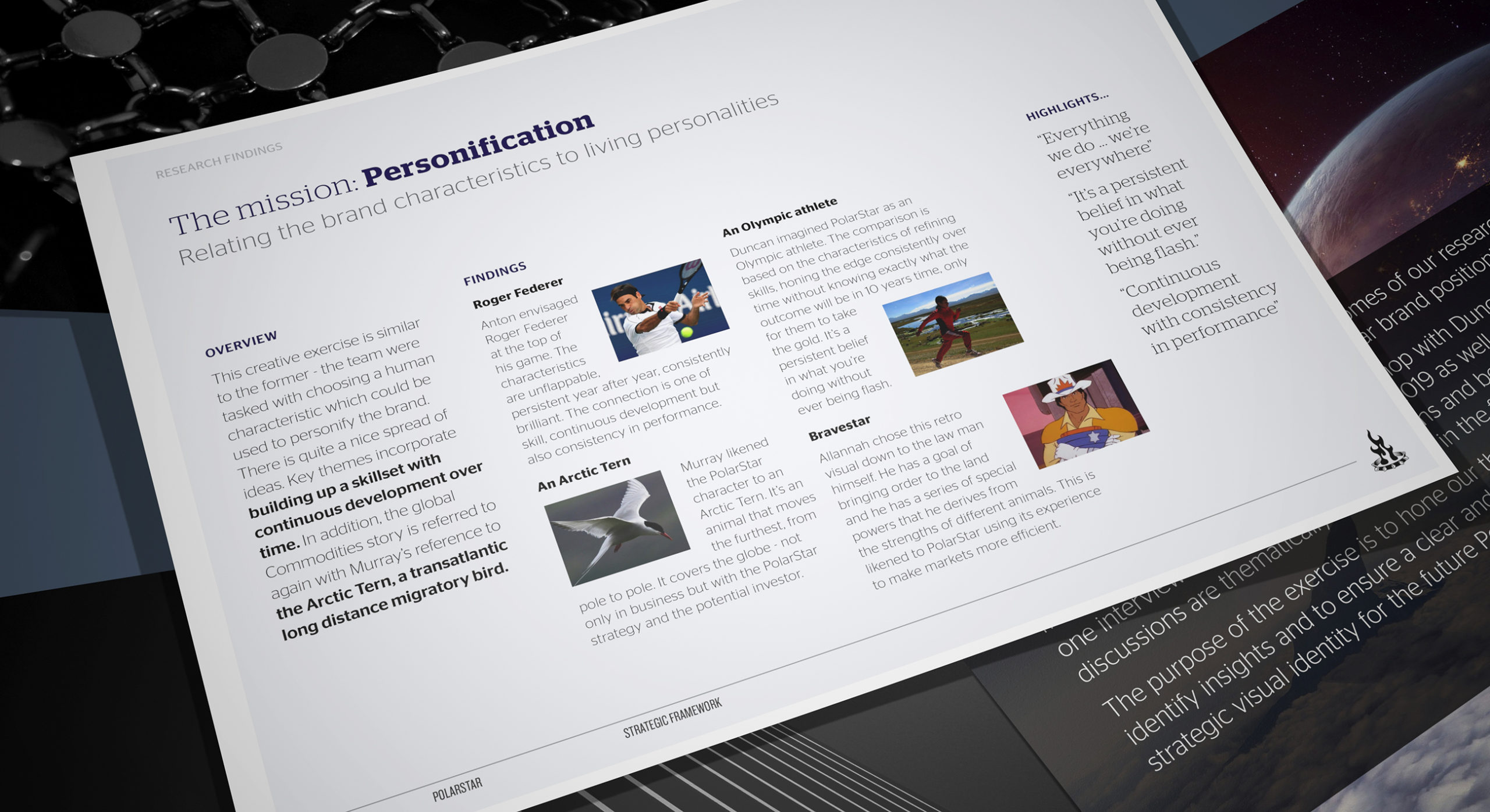
We established key personalities and brand archetypes which informed the overall creative direction.
-
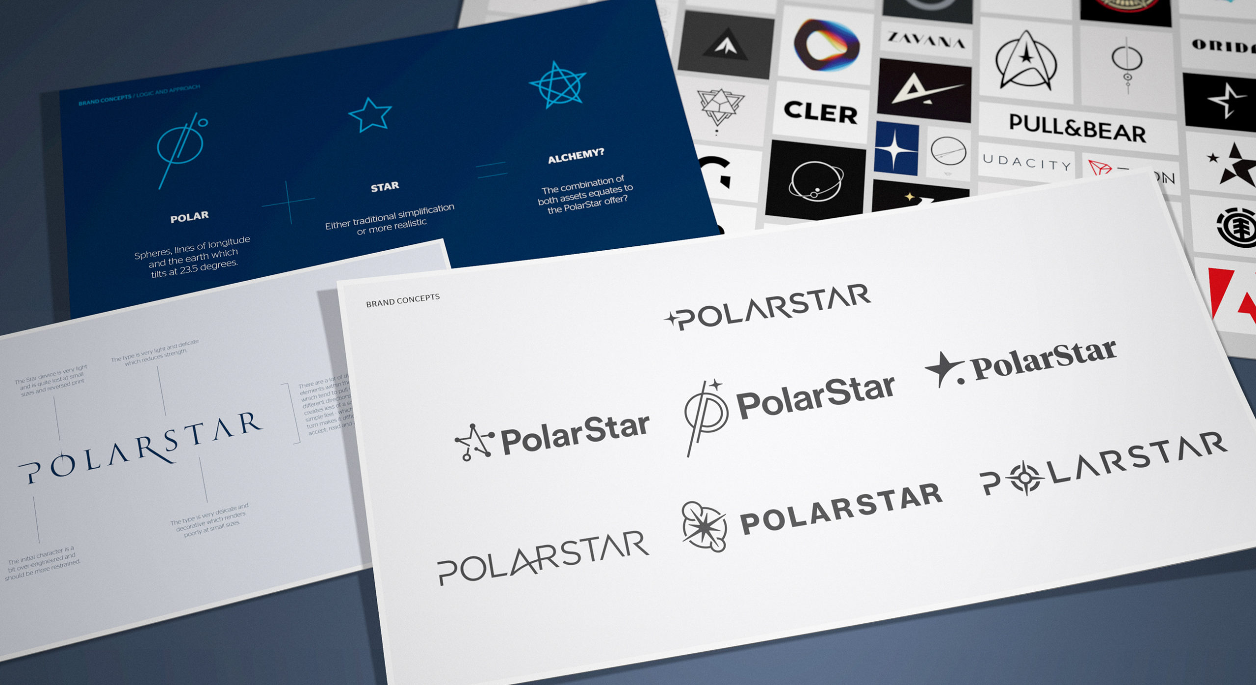
We tackled the design of the brand mark by retaining a focused strategic narrative, informed by the two name elements as well as the core business offer.
-
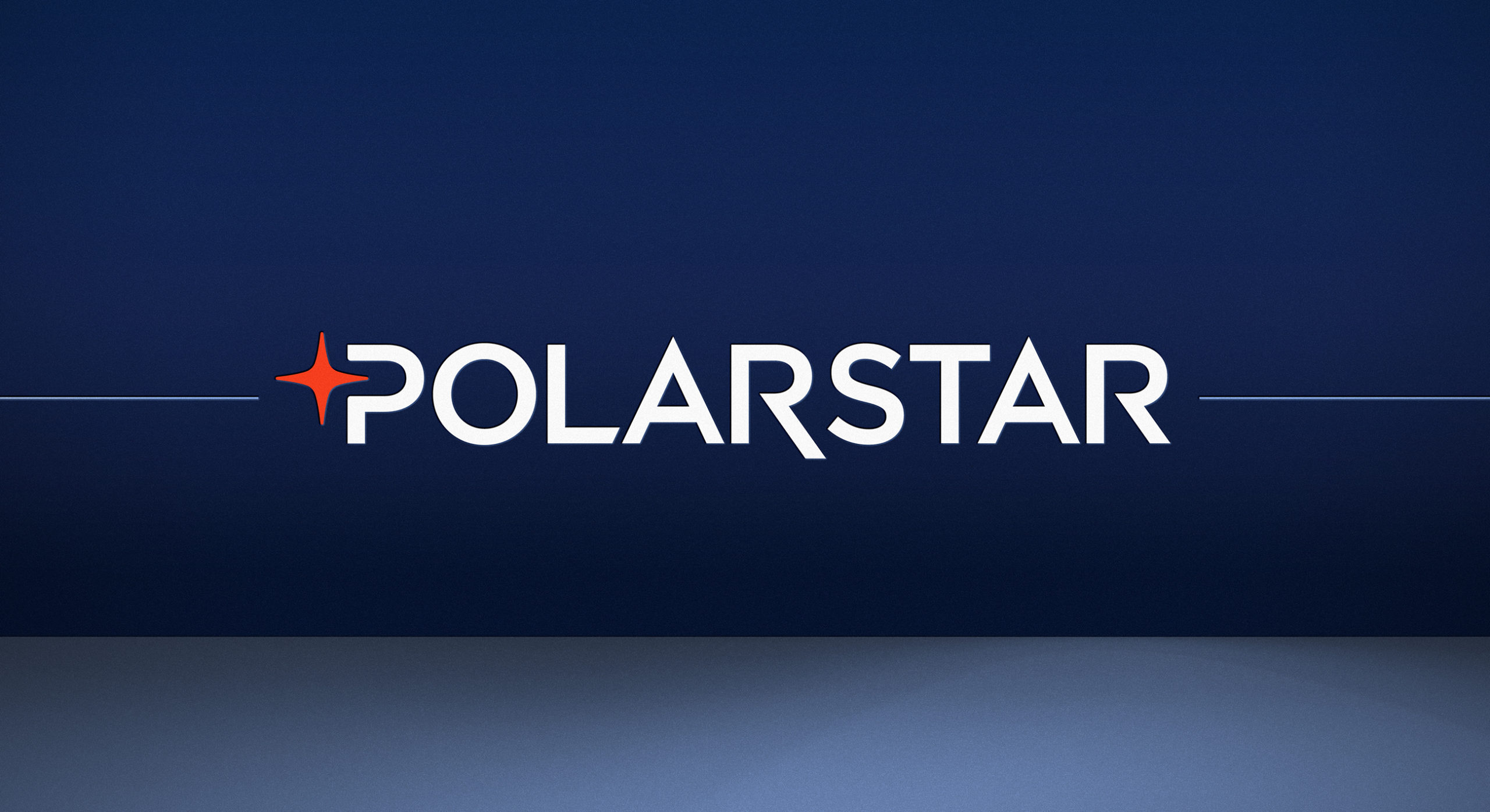
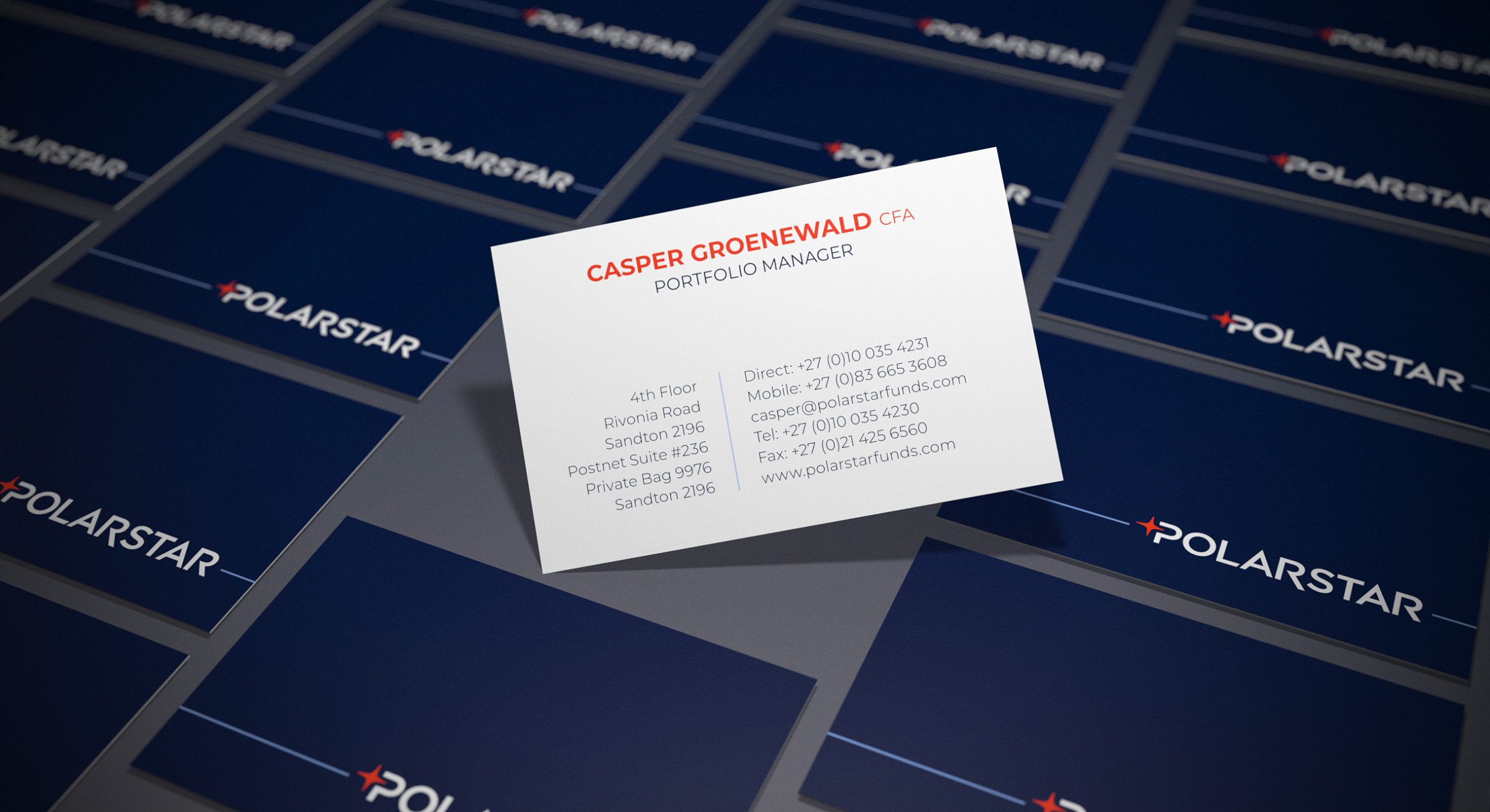
The brand logotype consists of a red star device nested neatly within the negative space of the initial character. Whilst we had created a wide number of options, we deliberately went for a classically minimal treatment.
-
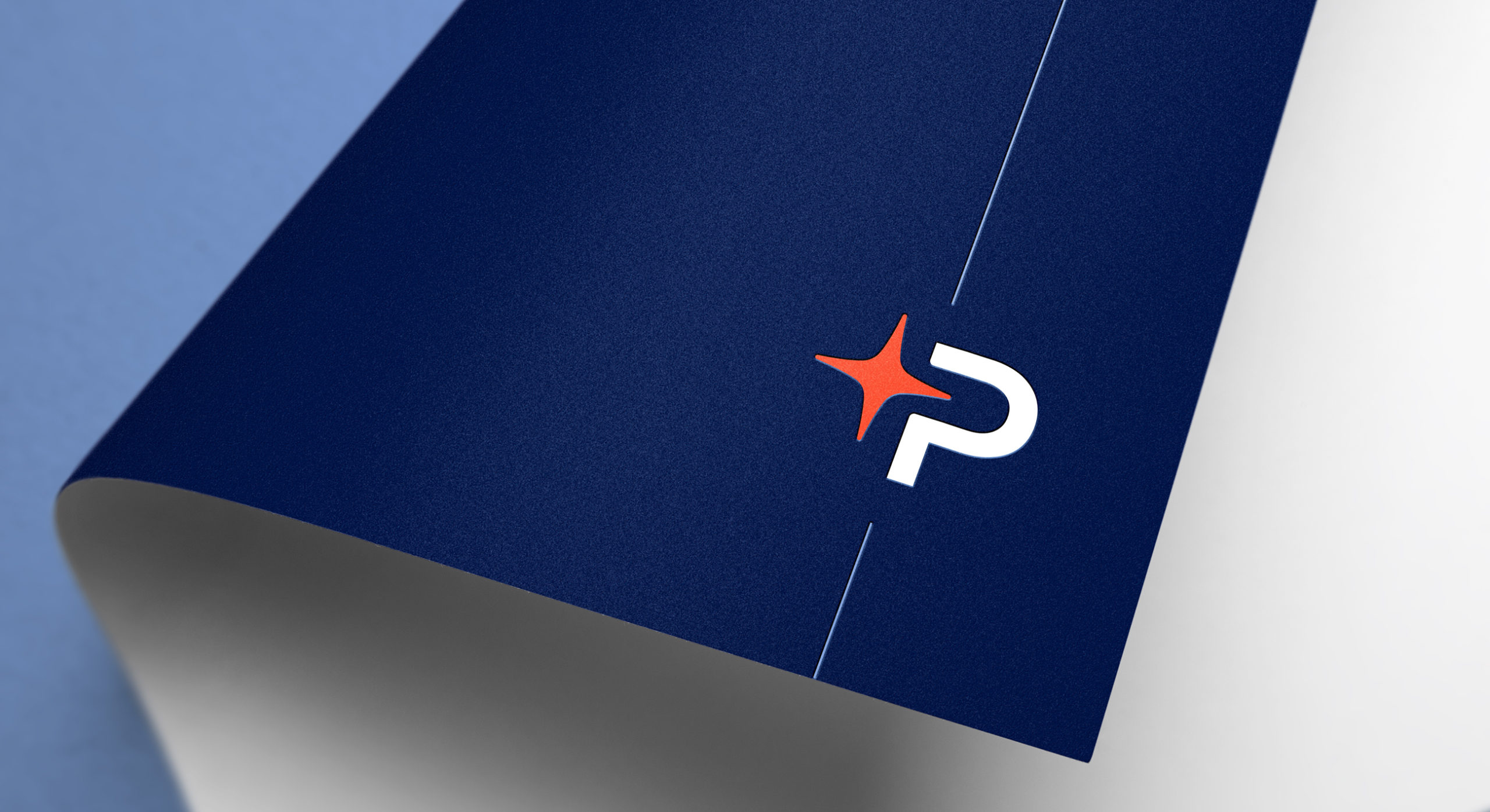
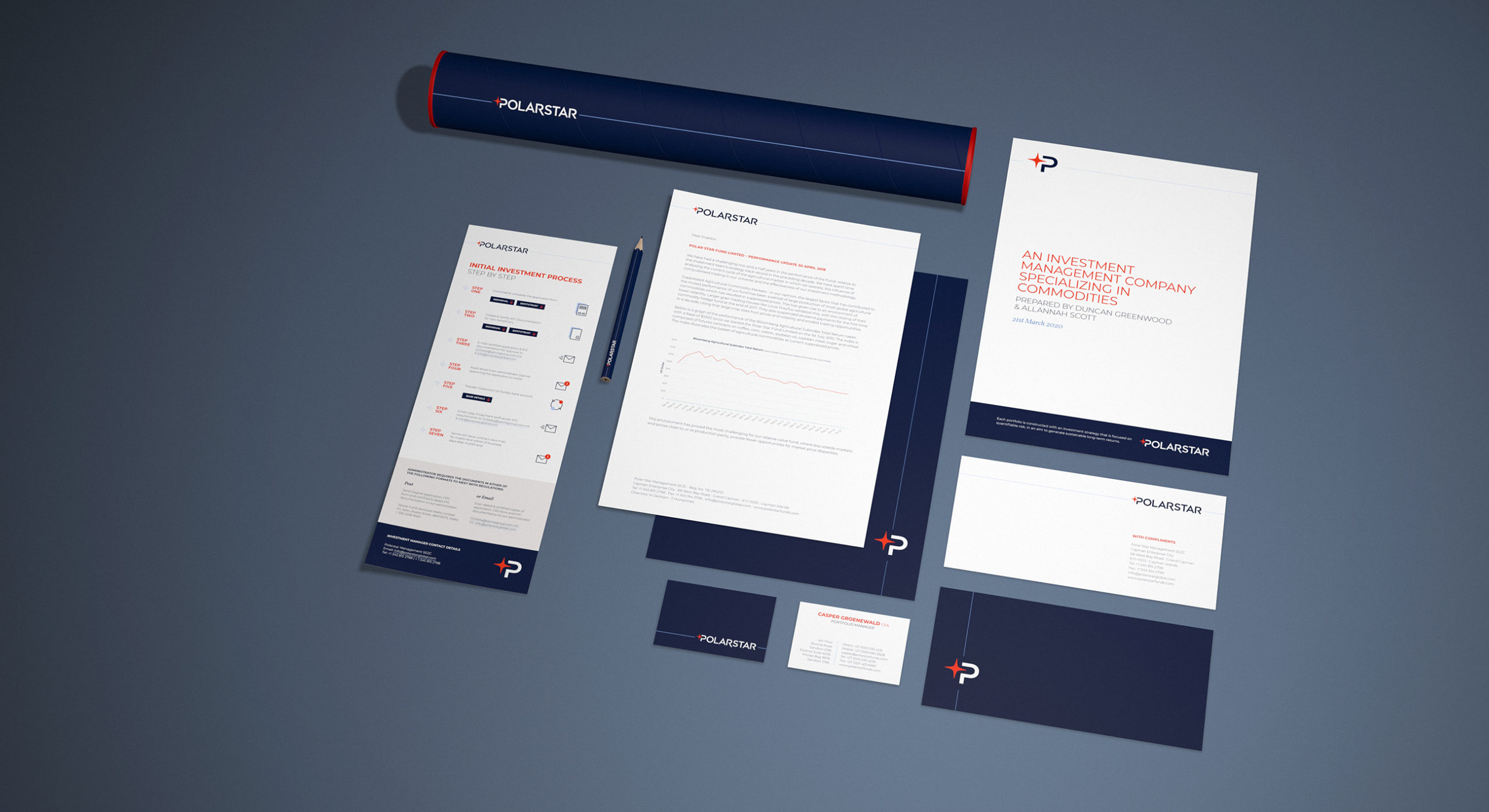
The branding can also be used as a decorative device whereby only the P initial and star element is used in conjunction with a blue line which anchors the element to page margins.
-
The brand look and feel is comprised of bold colours, interesting imagery and contemporary typography.
-

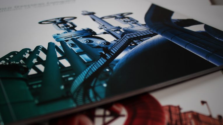
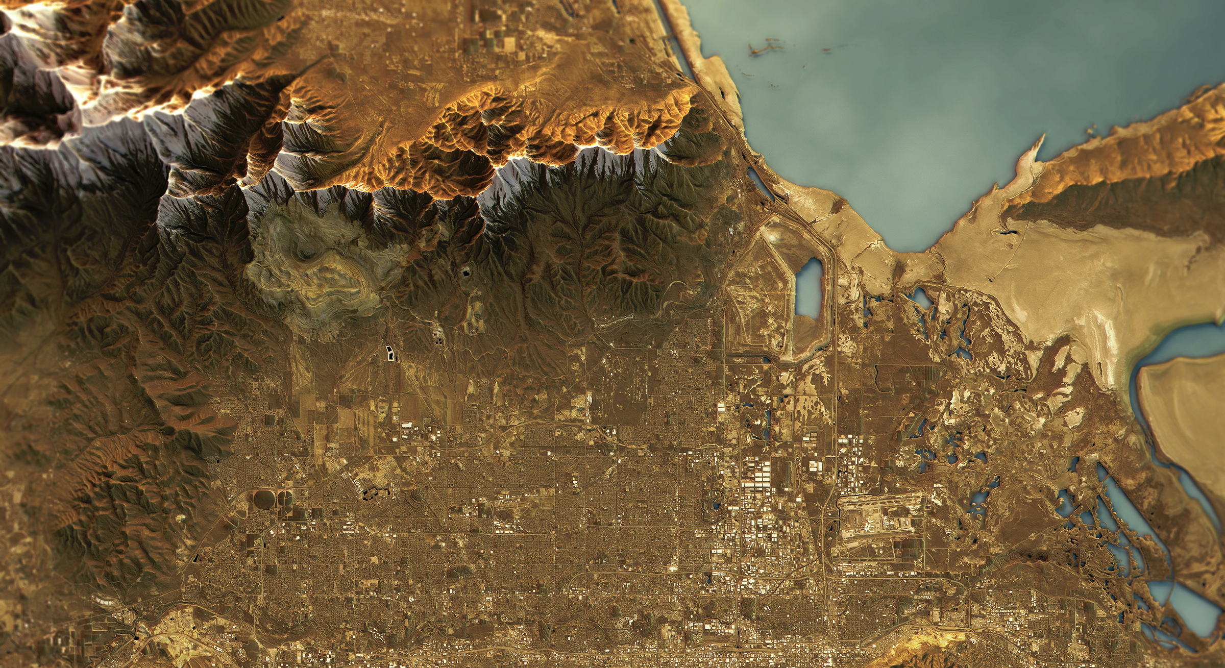
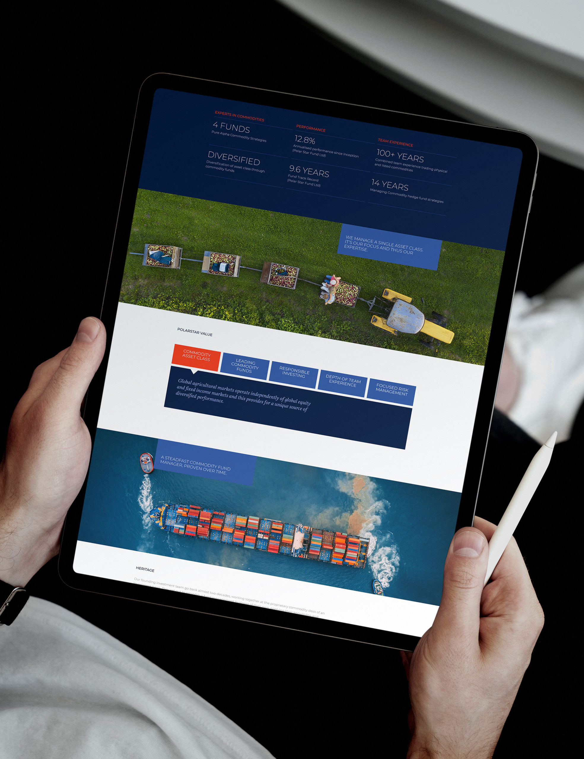
The chosen image identity utilises dynamic aerial and birds eye photography which conveys a real strategic feel.
-
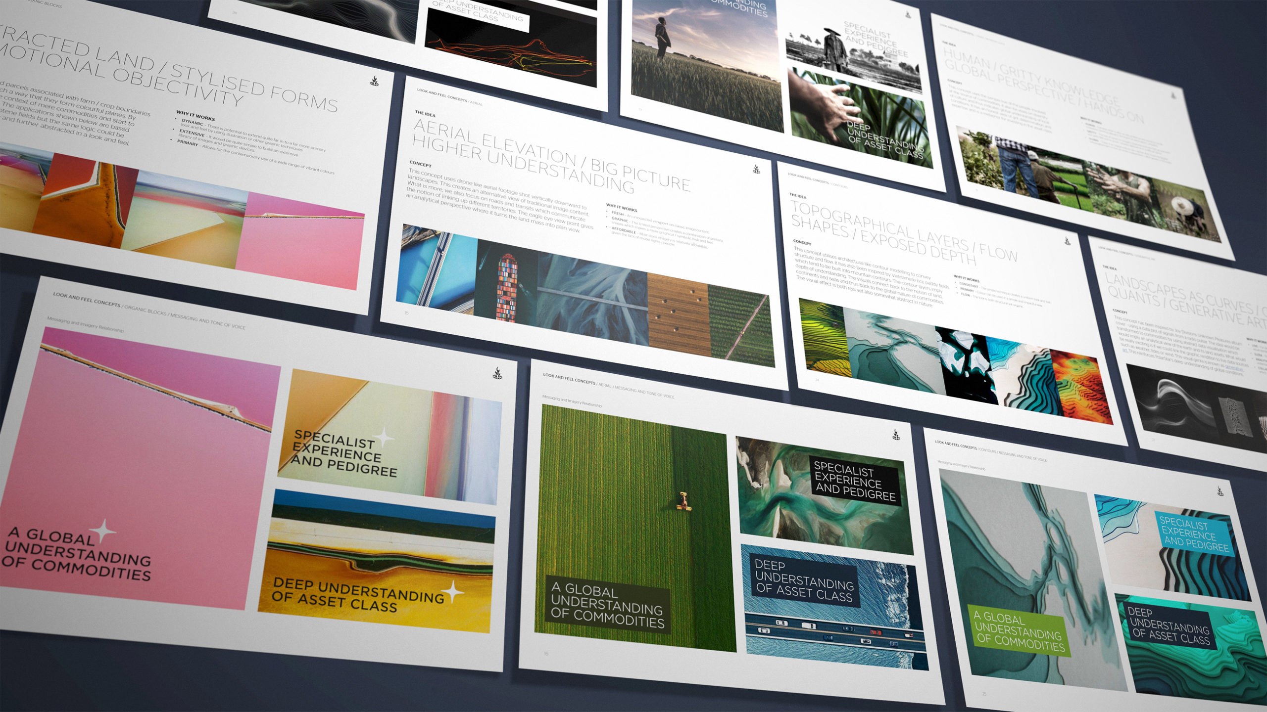
We explored a number of conceptual approaches to the visual identity - mostly exploring abstracted earth elements.
-
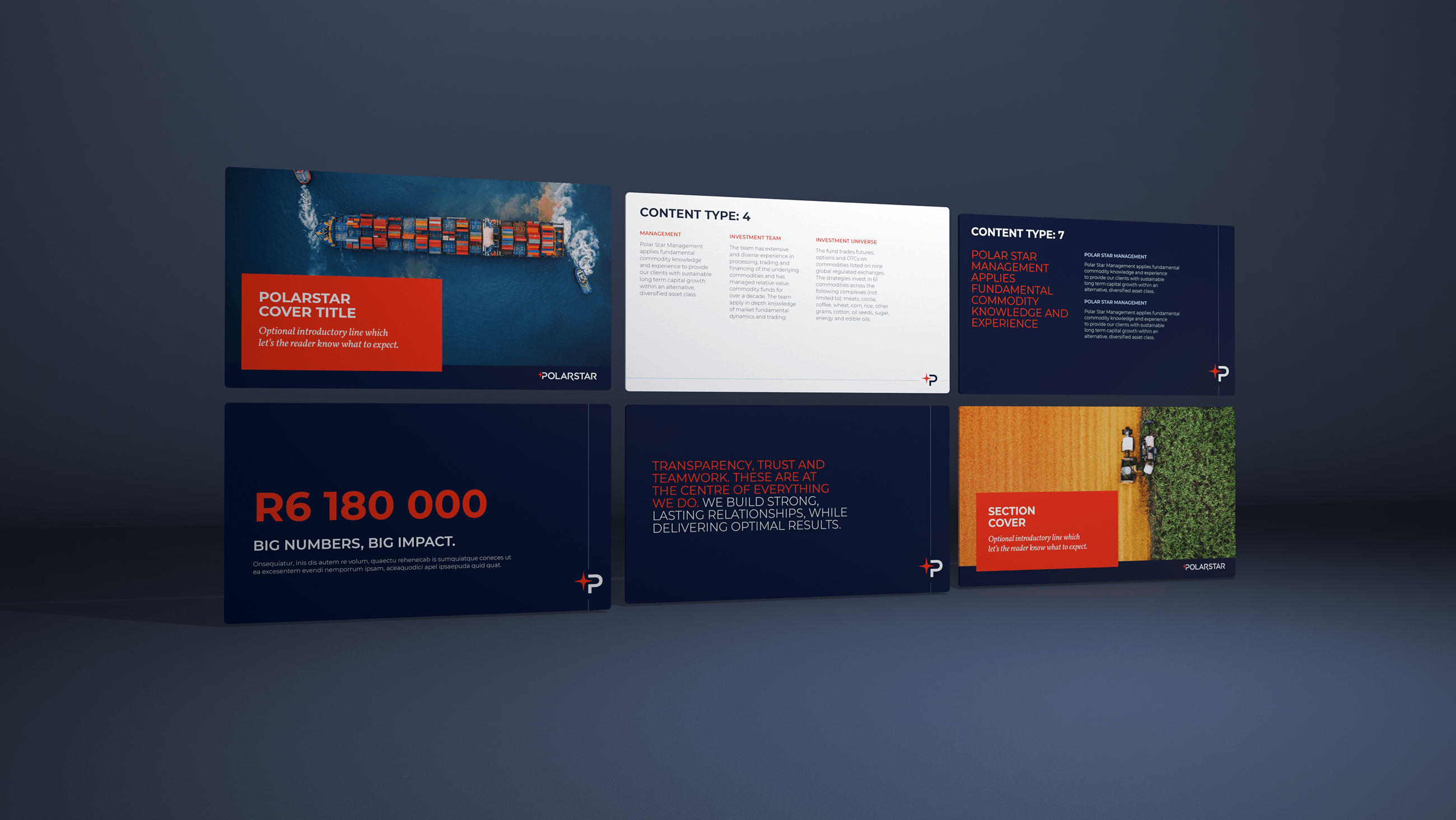
When it comes to corporate application, the brand is represented in a classically clean layout system. The linear device is used to add a light touch of detailing.
-
The stationery uses the punchy combination of dark blue, red and white to create a primary elemental feel.
-
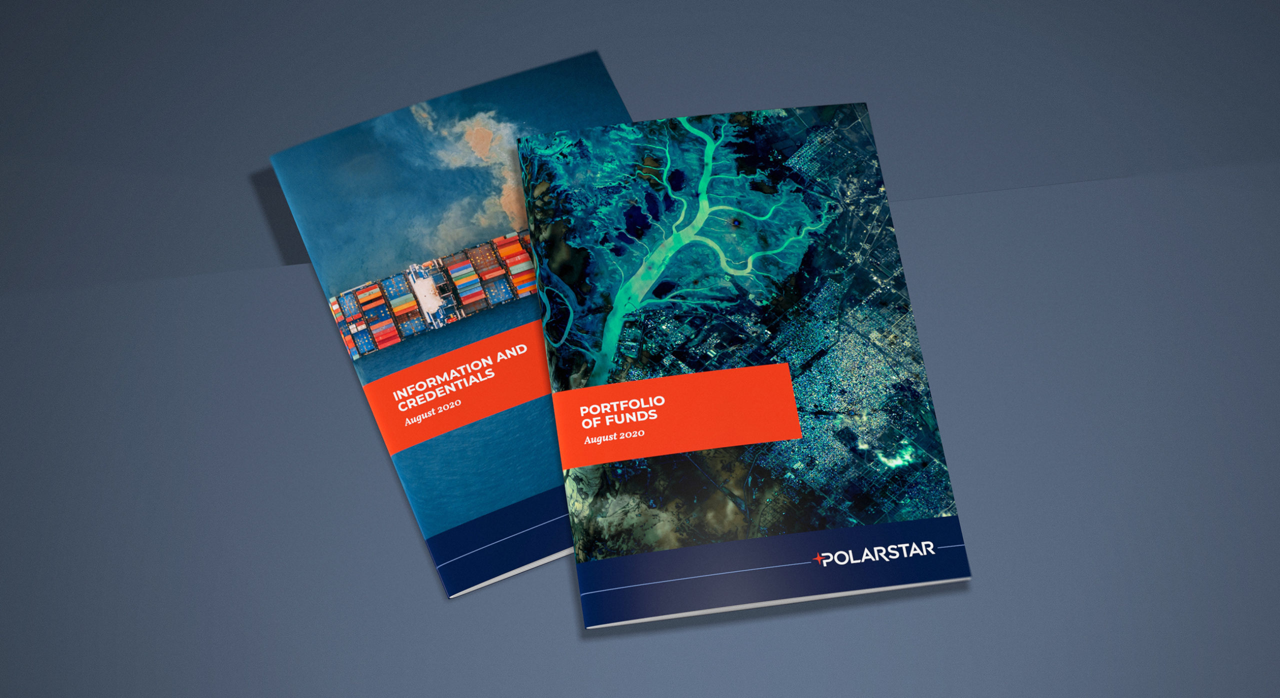
Even though all the imagery has an aerial perspective , it still allows for much variety in the branding.
-
The use of aerial imagery conveys an analytical and methodical feel. This links to the notion of using quant methodologies in ascertaining planetary conditions.
-
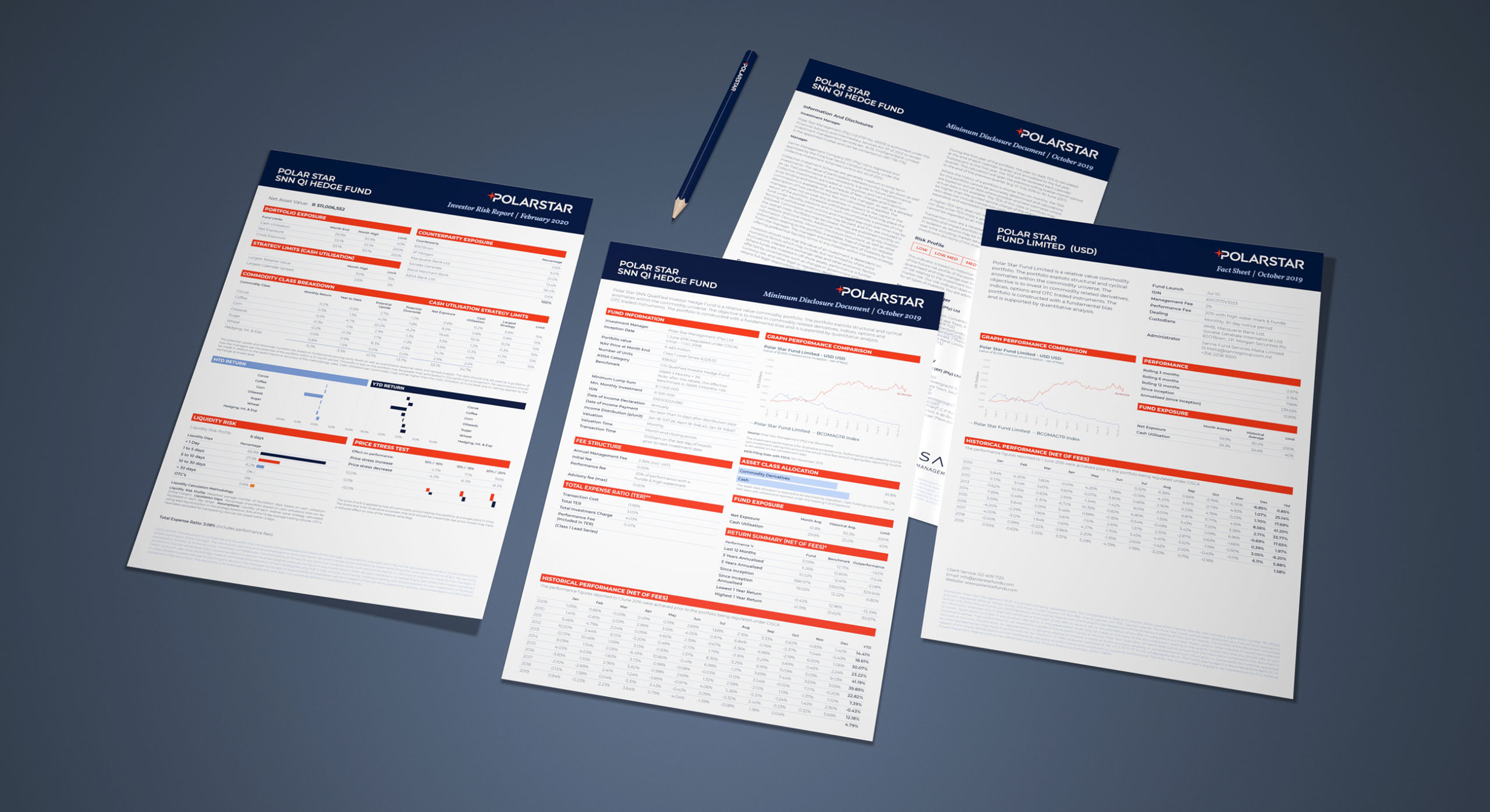
We provided extensive support in the design of corporate and fund based client reporting. A number of Microsoft templates were provided as workable publishing assets.
-
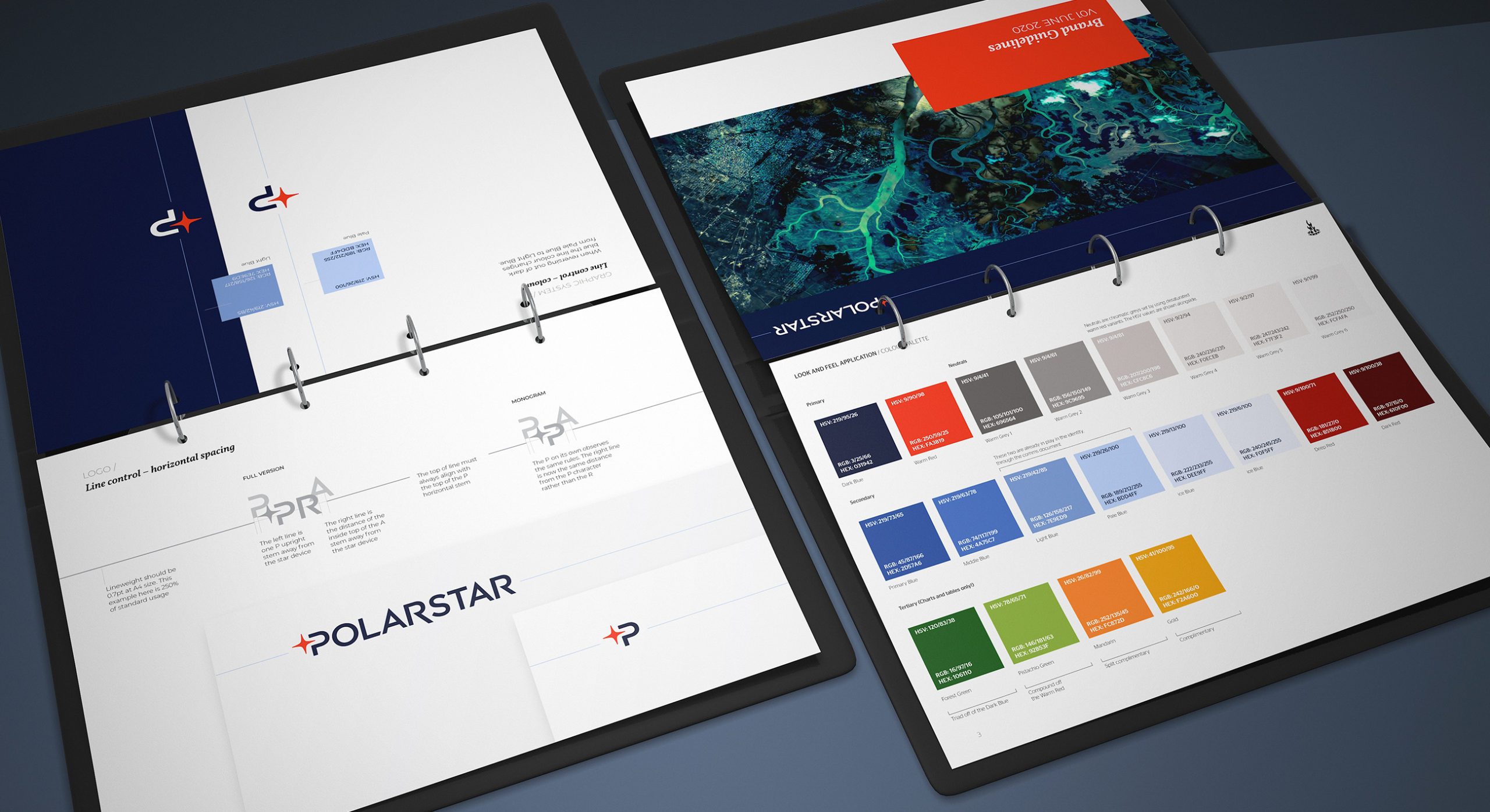
The resulting brand is systematically controlled by an extensive brand spirit and design guideline kit.
-
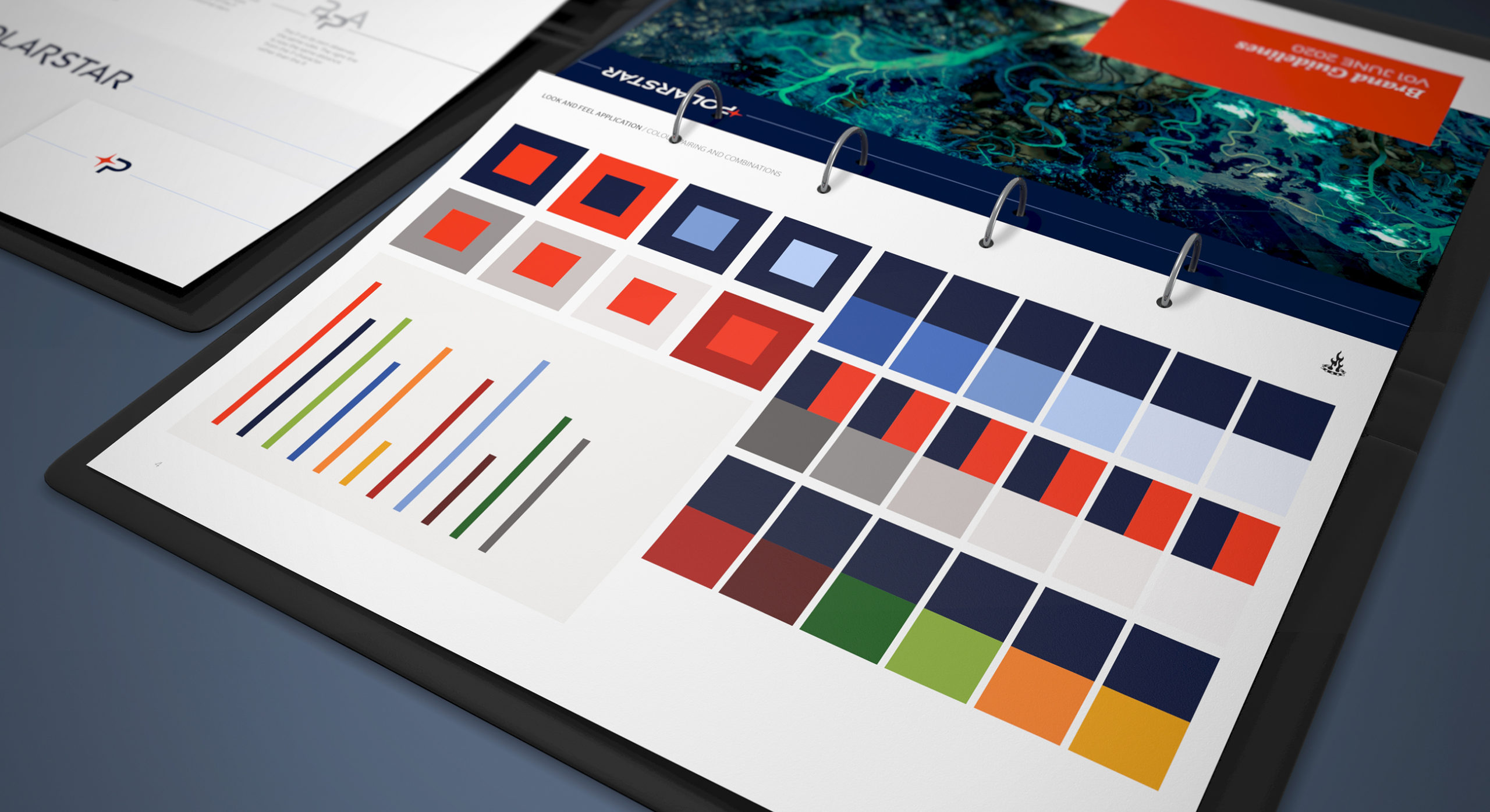
The primary brand colours are always conservatively rendered in order to keep the brand looking clean and simple.
-
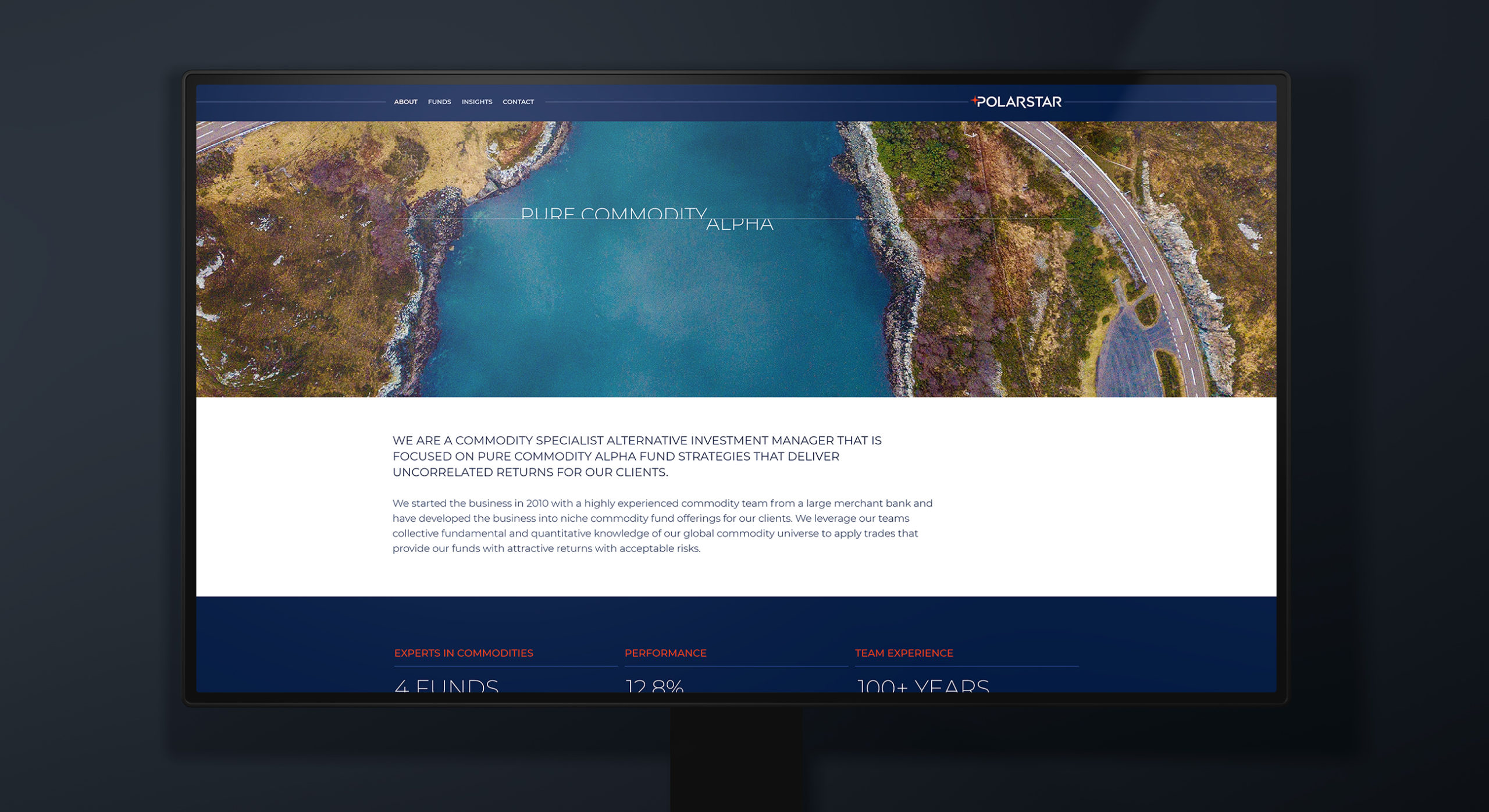
The branded website uses a simple structure yet creates depth with dynamic and animated page content
-
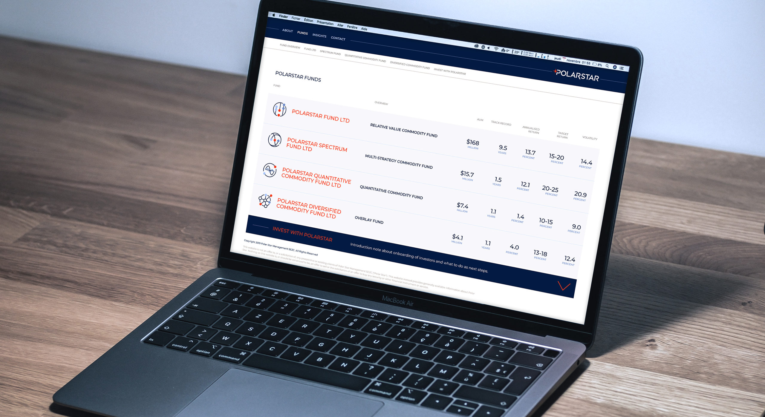
The website ensures all fund information is held within one page journey, but utilises accordion behaviours for both access and interest.
-
The website uses clearly demarcated and separated areas of image, content and charting in order to aid ease of information delivery.
-

We collaborated with the client's development teams who built out interactive charts where users are able to adjust time horizons and correlation in order to really dive into fund analysis.
-
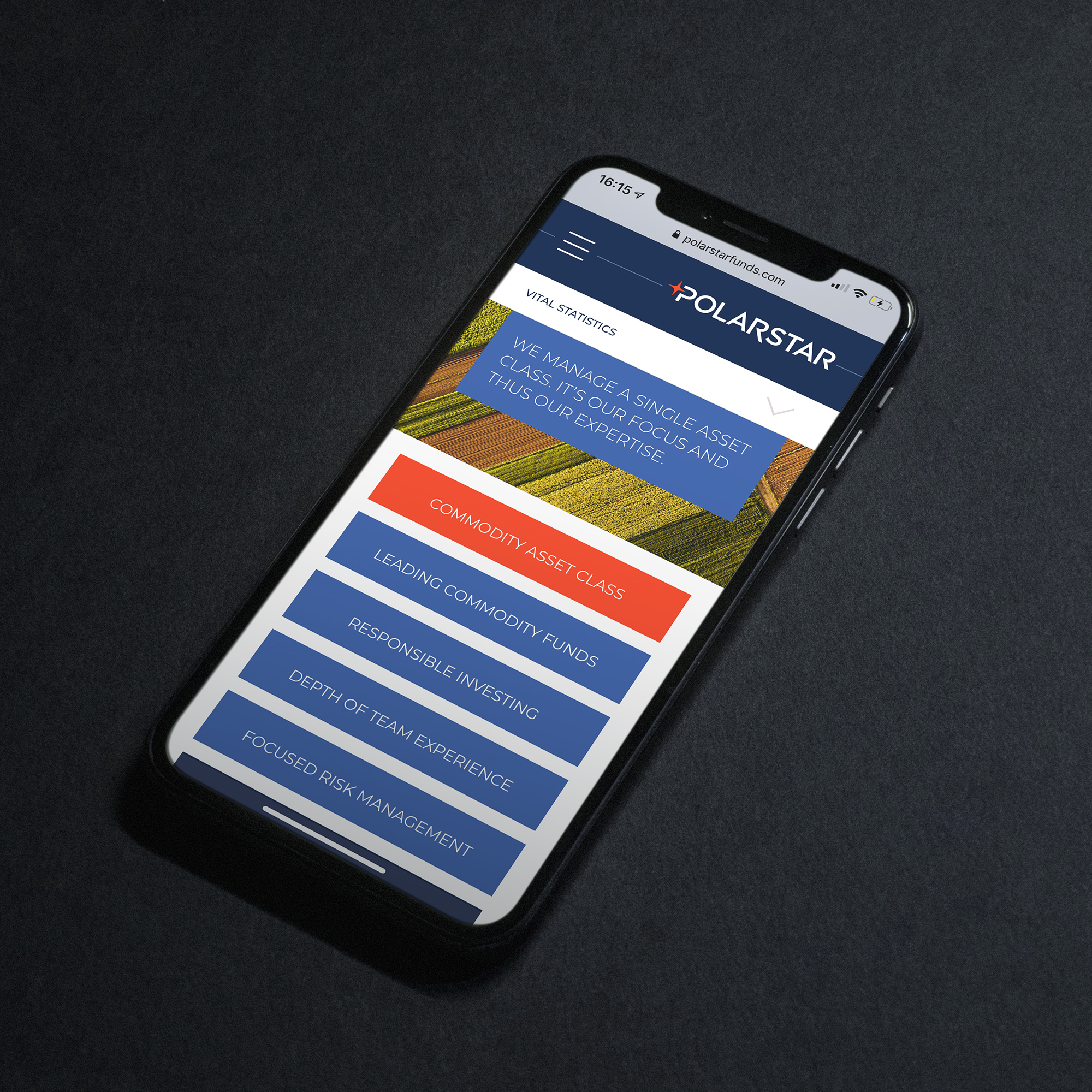
The PolarStar website is built in responsive templates which ensure a consistent look across all devices.
-

The resulting brand identity is powerful and clearly differentiated from the global competition.