Brand Identity & Interface Design

Rocudo

Creating a disruptive music technology brand.

Rocudo is a web enabled technology geared towards the music industry. It allows labels, artists and music fans to download easy-to-use remixing software for your desktop and rapidly compiles remixes on the fly. These mixes can then be intelligently published into a series of widgets which can be shared and virally distributed across the web. Our deliverables included strategic direction, brand identity, website and software interface design.

The final chosen symbol for Rocudo is inspired by an old reel to reel device, which hints at the remixing nature of the software platform.

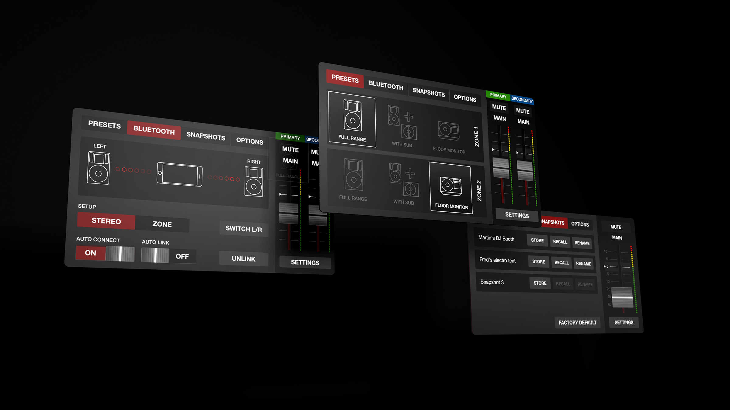
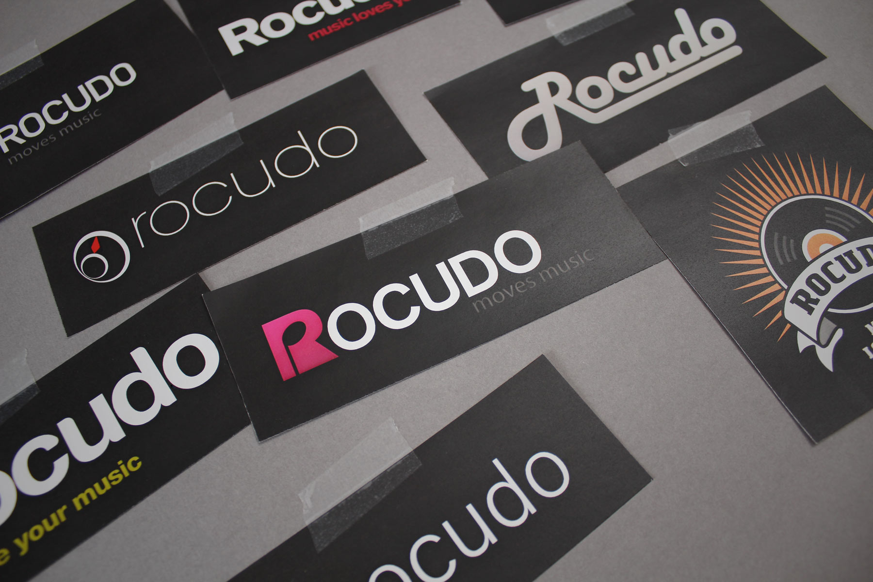
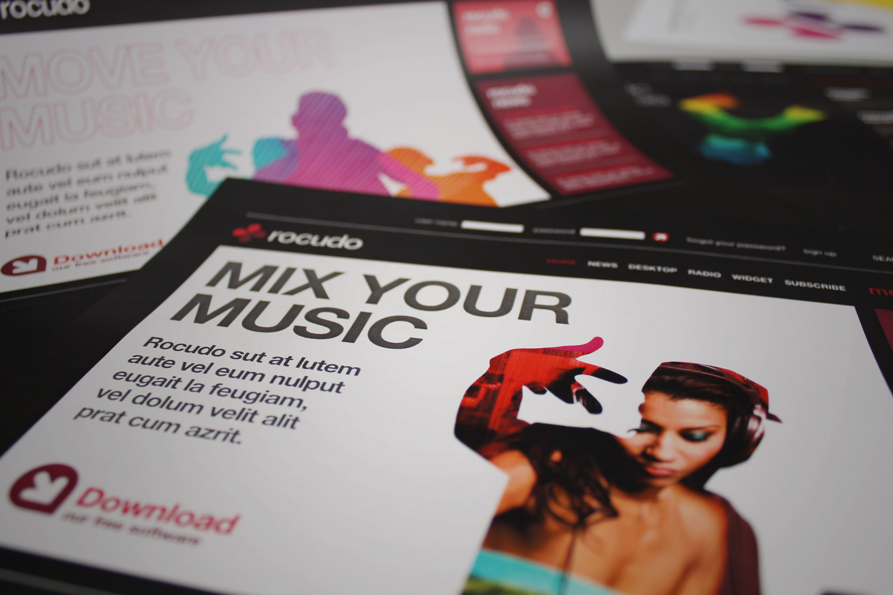
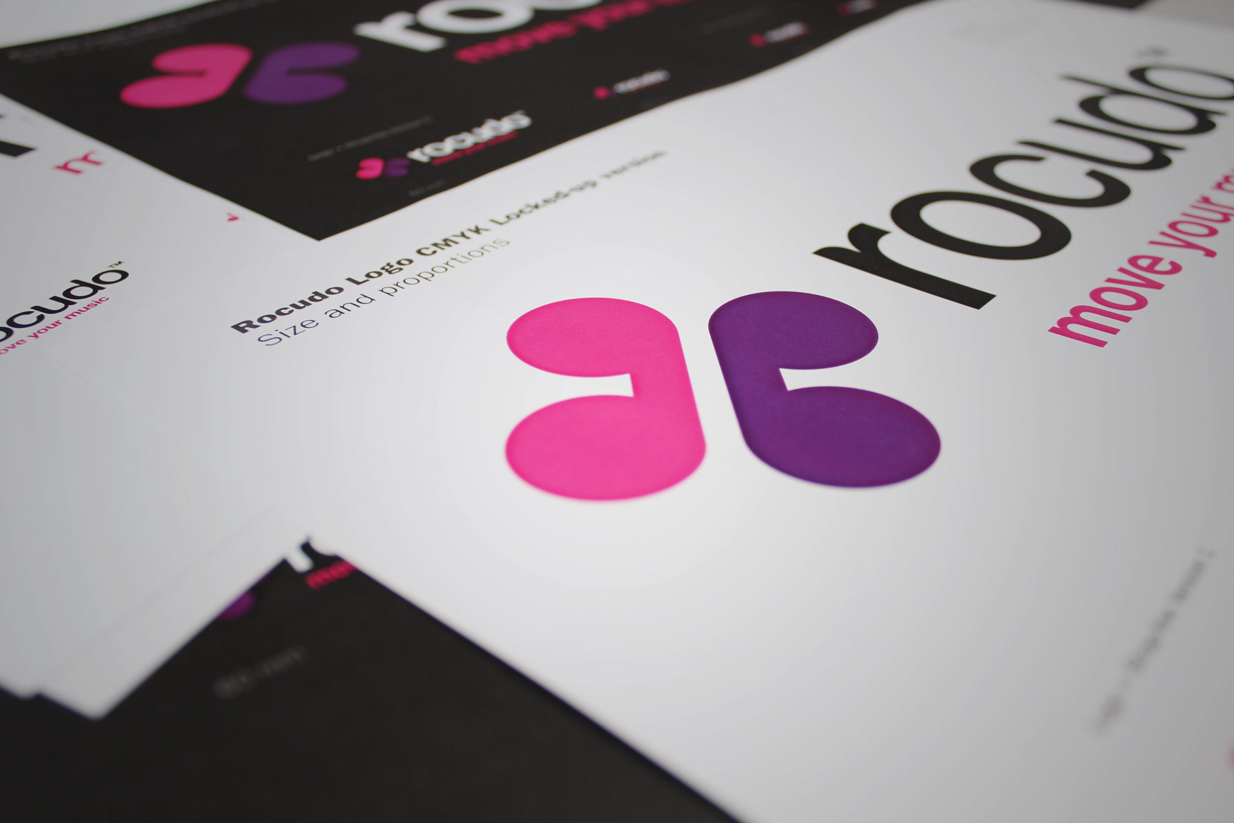
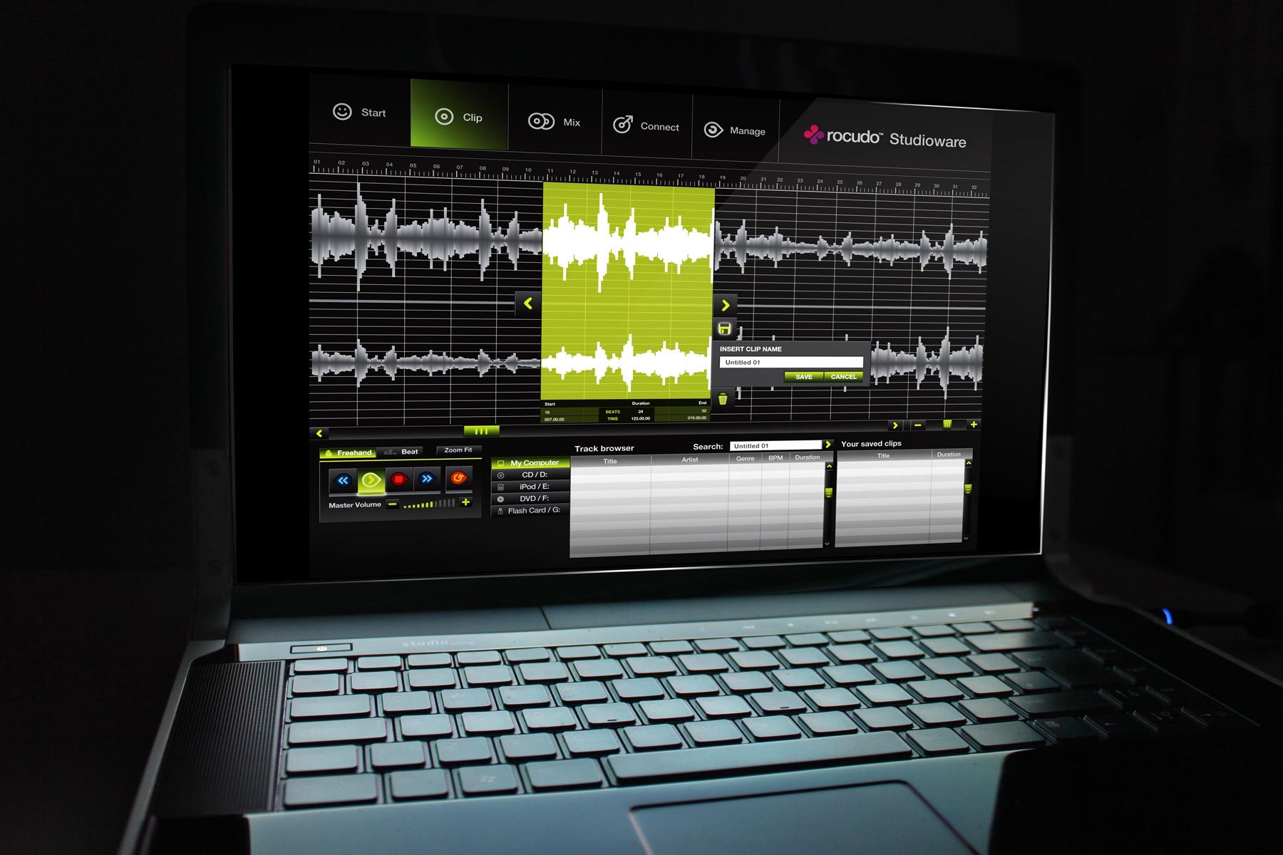
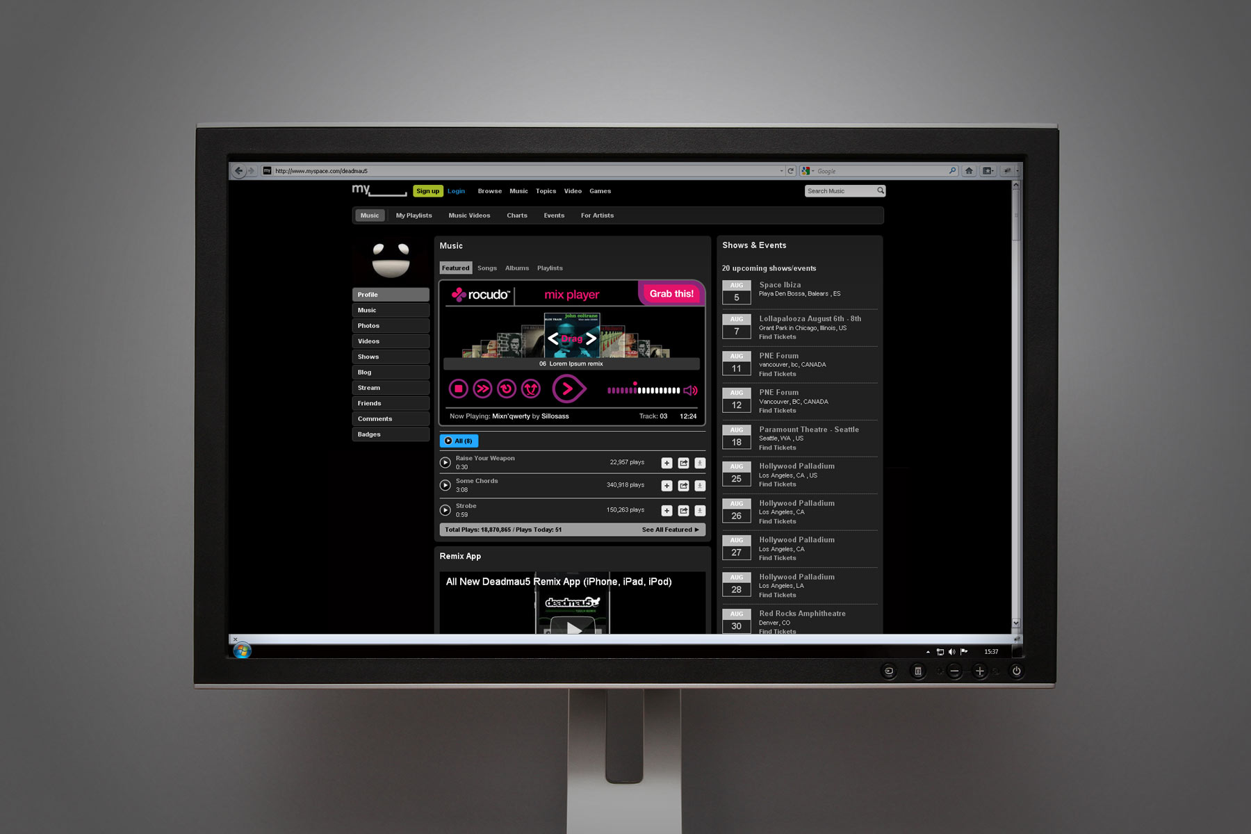
We ensured Rocudo communicates a brand that is driven, intelligent and stable.

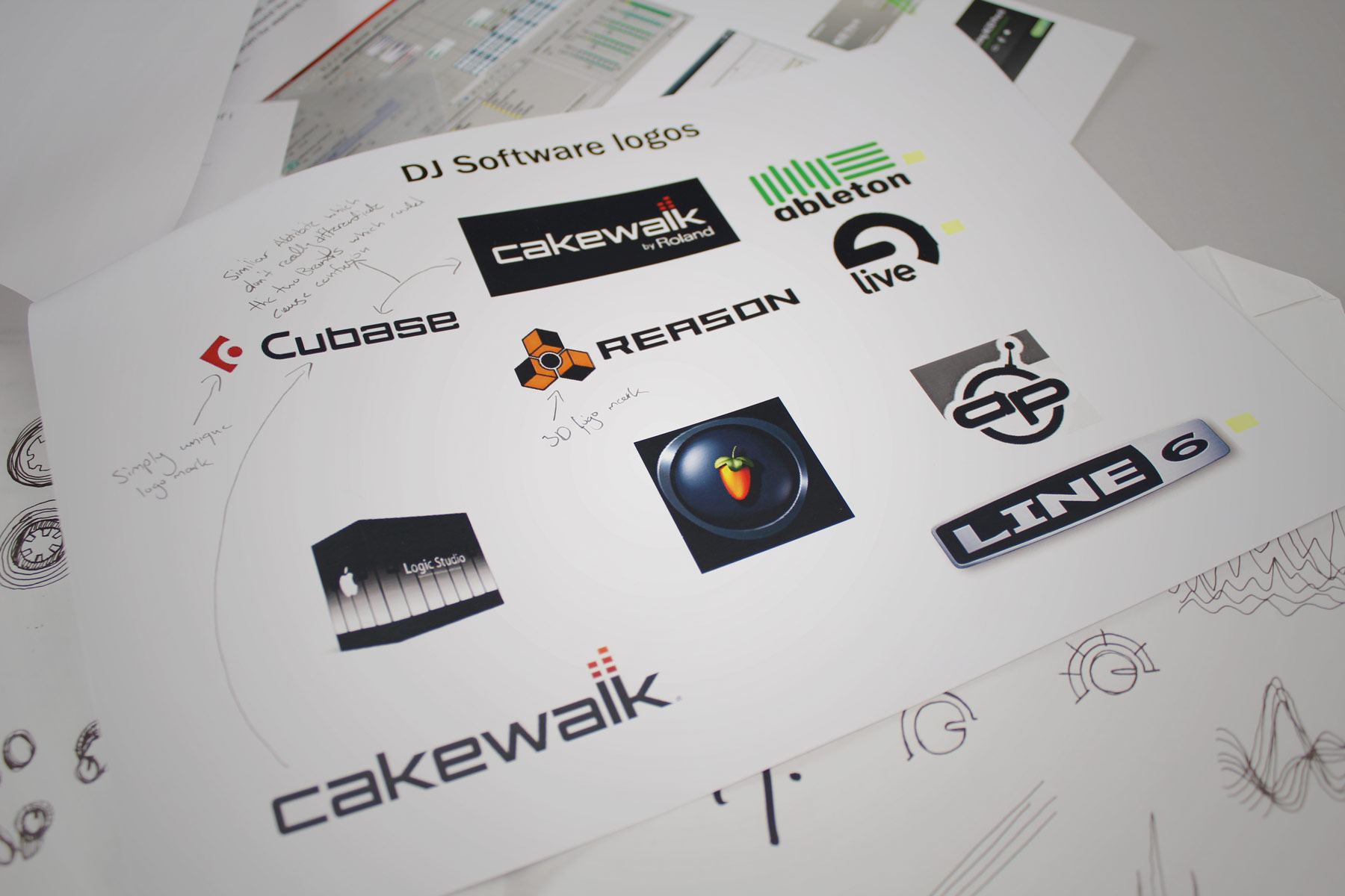
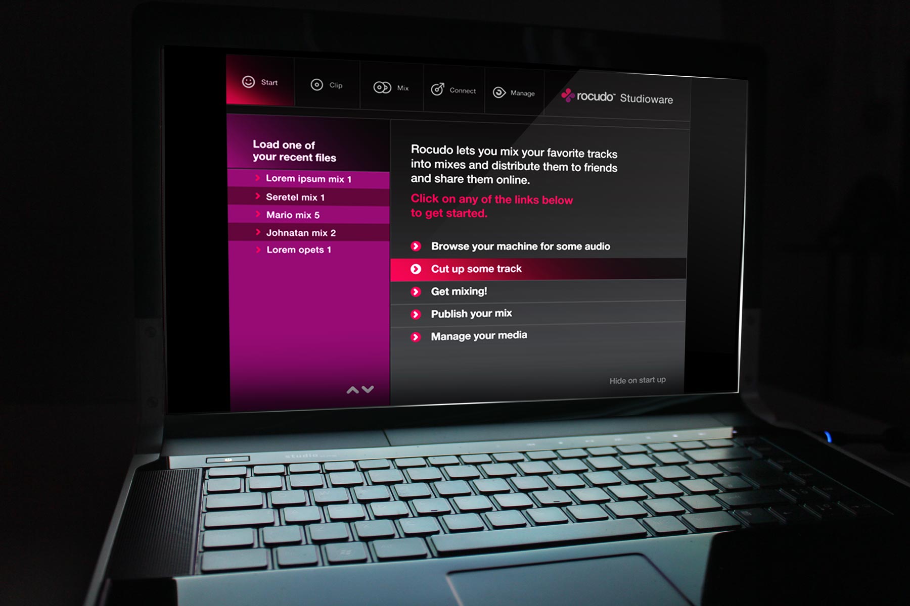
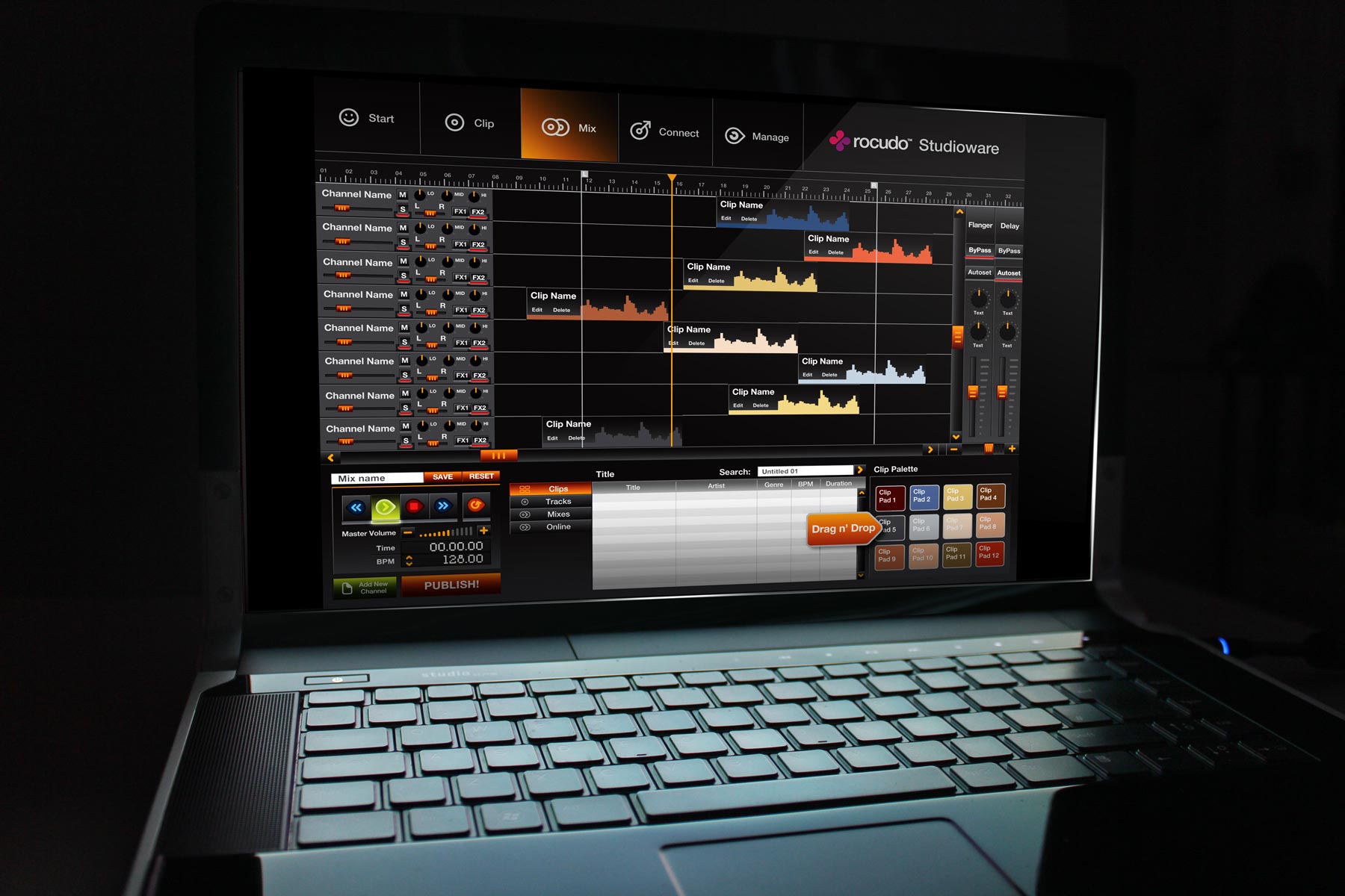
Due to the consumer-led nature and impressionable taste of the music technology sector, we were tasked with developing a brand that was contemporary yet still had its roots firmly in the music business. Although Firedog has extensive web 2.0 technology experience, instead of developing just another clichéd glossy technology logo, we ensured Rocudo communicates a brand that is driven, intelligent and stable. We also conducted usability analysis on the core Rocudo software product with a view to streamlining and optimising the user experience.

We created a number of concepts exploring different ways of capturing the product essence.

The icon, a hybrid adaptation of a reel-to-reel device, is easily memorable and strong enough to reduce well across the web medium.

The branding for Rocudo is both progressive and classic. The icon, a hybrid adaptation of a reel-to-reel device, is easily memorable and strong enough to reduce well across the web medium. Supporting this brand language is a strong look and feel underpinned by the colour black which creates a sleek and sophisticated impression.

To support the brand, we started to look at visual treatments that would enforce and communicate the capabilities of both the brand and the product itself.
We loved the fact that the symbol is so pure. Which suits the digital medium perfectly. Its easy to reproduce at small sizes and acts as a strong badge device in the interface itself.

The software interface design marries simplicity with a tangible, good looking feel, without overwhelming the end user.

The software interface design marries simplicity with a tangible, good looking feel, without overwhelming the end user. We were careful to make sure that the positioning of the product was sufficiently approachable yet serious enough to come across as a serious market mover. With 12000 free users from over 100 countries to date, full social network integration and major partnership deals with leading online music brands – Rocudo is poised to revolutionise the music business.

A key deliverable was the design of a series of widgets created to integrate with leading social networks.
Sign up for our Firedog Newsletter
* = required field