Brand identity

London Offshore Consultants (LOC)

A vibrant, flexible brand identity created for the world's largest marine engineering consultancy.

London Offshore Consultants (LOC) is an independent marine and engineering consultancy and survey organisation. The business, founded in London in 1979, has over 30 offices across the world, staffed by over 400 professionally qualified personnel. Our work for LOC extended to global qualitative and quantitative research, developing a strategic framework, primary brand identity, business unit branding, visual identity themes, print and digital advertising and communications design, brochures and print, website design, tactical support and brand and spirit guidelines.

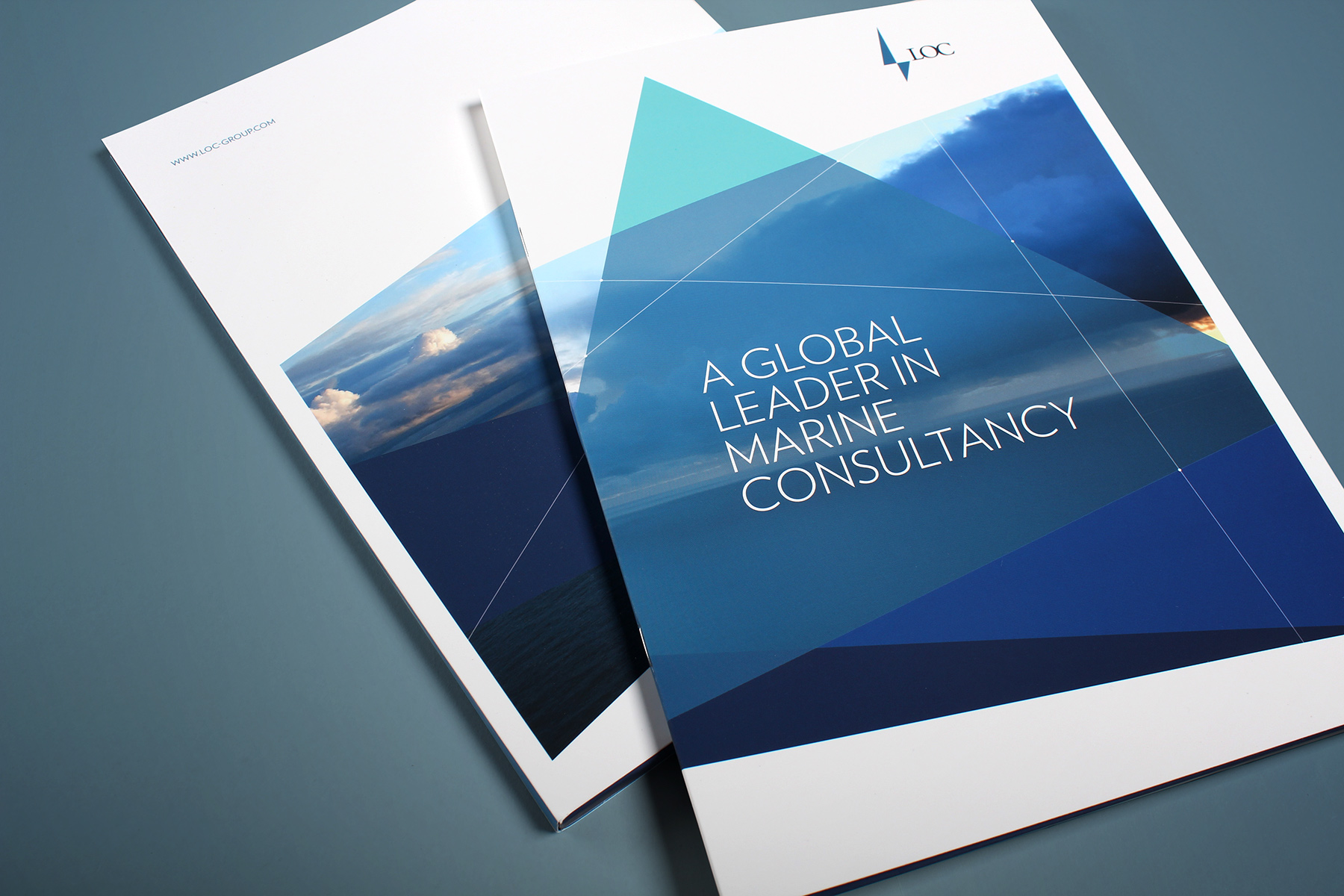
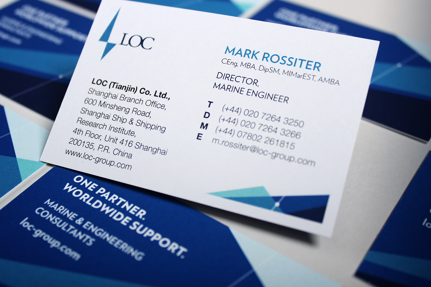
The visual identity creates a very striking aesthetic and delivers against the brief perfectly.

A visual identity oceans apart from its competition.

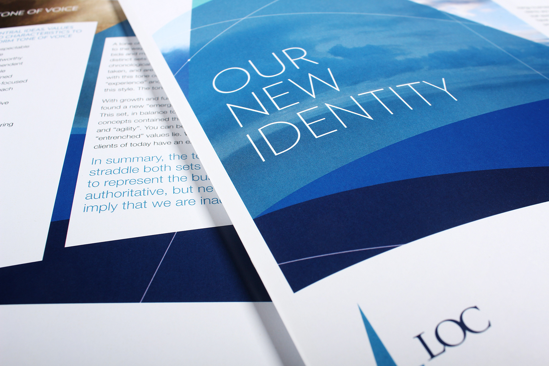
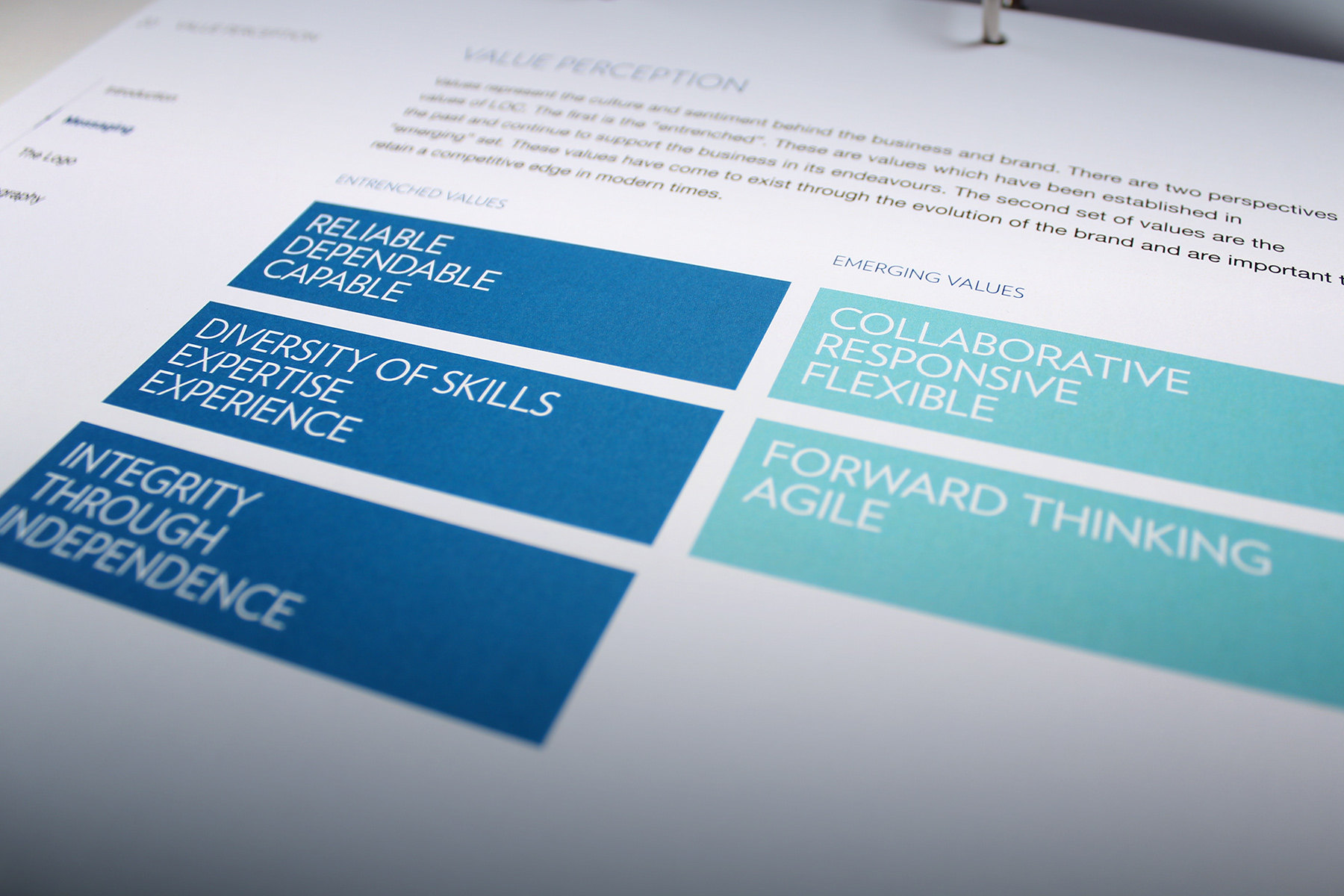
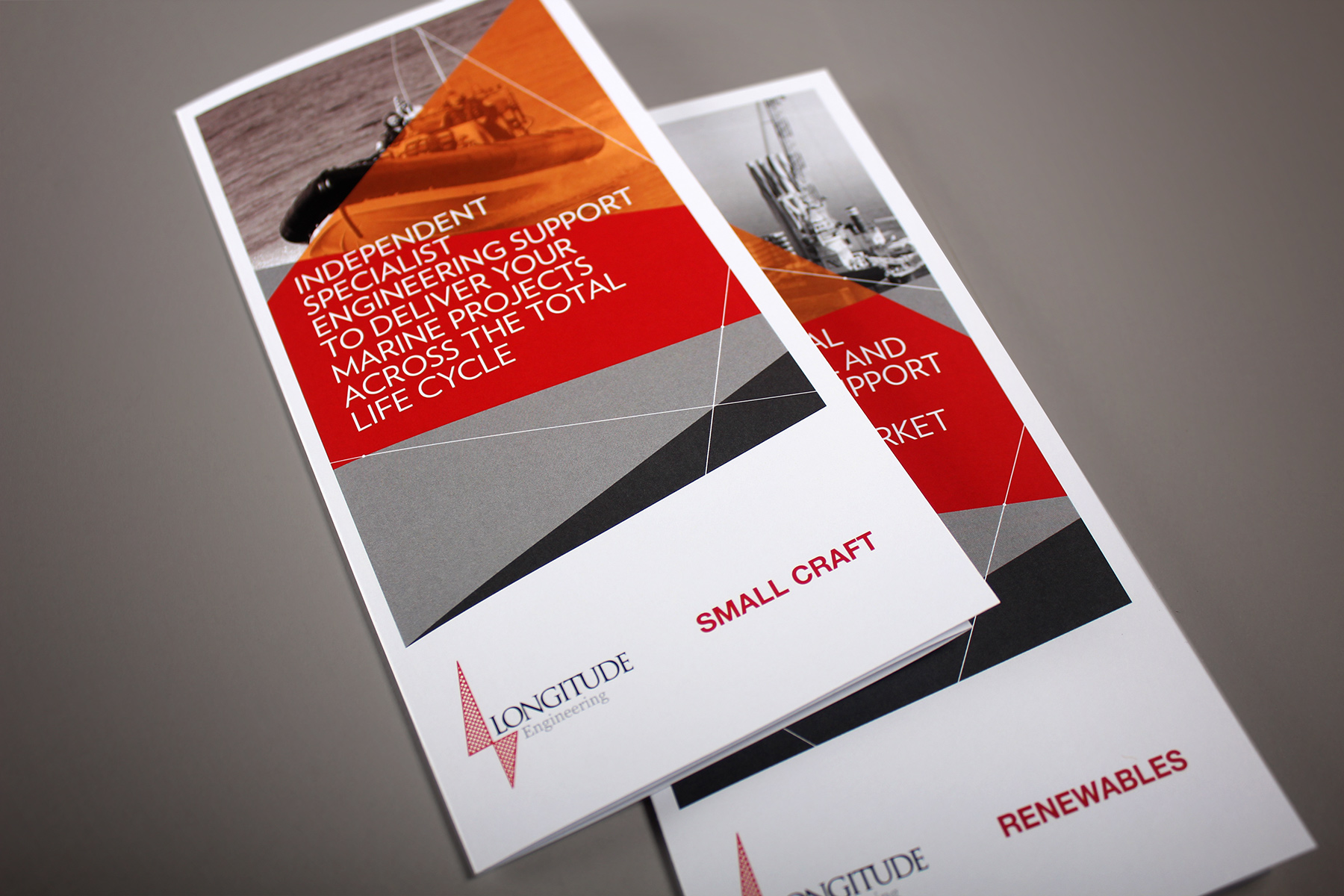
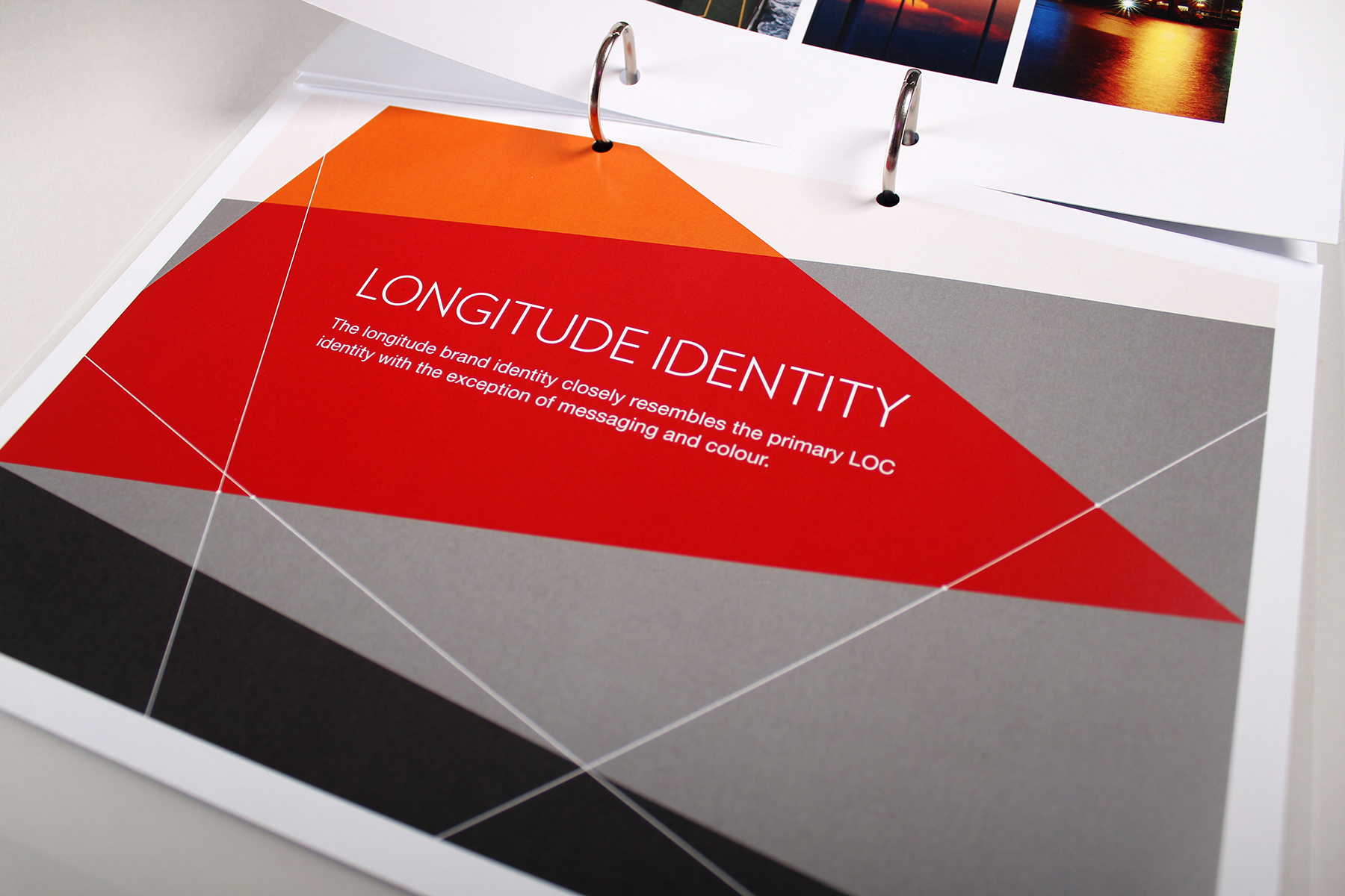
The incumbent brand identity lacked any visual thread and thus it felt incoherent and diluted. Our remit was to create a flexible engineering brand identity which could unify the various operating units and regions under one cohesive identity. Following the rebrand, we were to create a set of communications, as well as a new website for the group business. The brand needed to also adapt to the sister business, Longitude Engineering.

We focussed the brand on a common culture and shared global sentiment.

We began with engaging management staff in a series of workshops and one to one surveys. We also reached out to staff across the world with digital survey materials. We wanted to focus the brand on a common culture which unified people whilst also providing leadership with findings of global sentiment. We developed a universal proposition, a refreshed set of values and a strategic framework for the brand positioning.

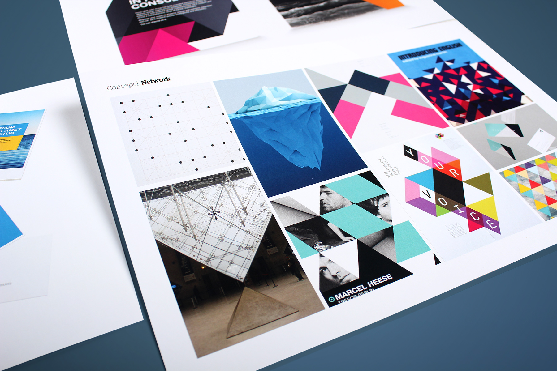
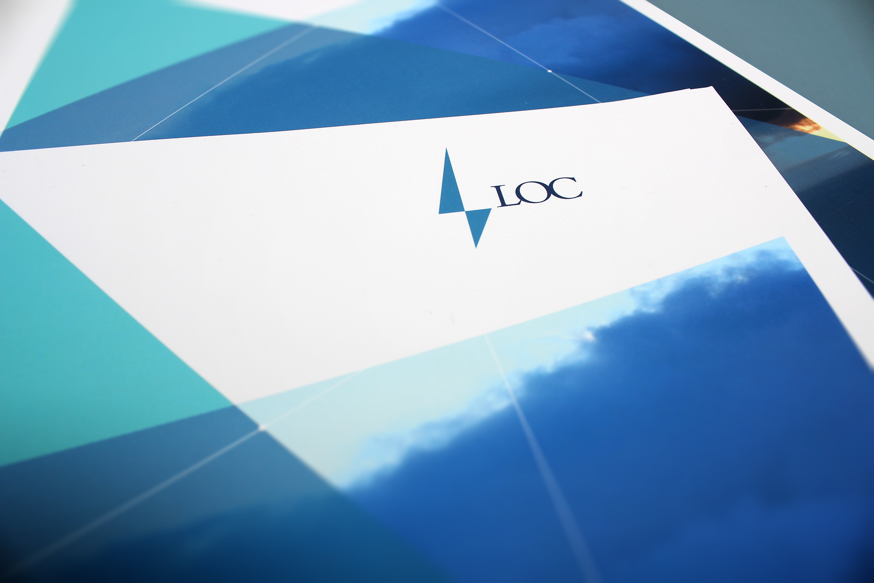
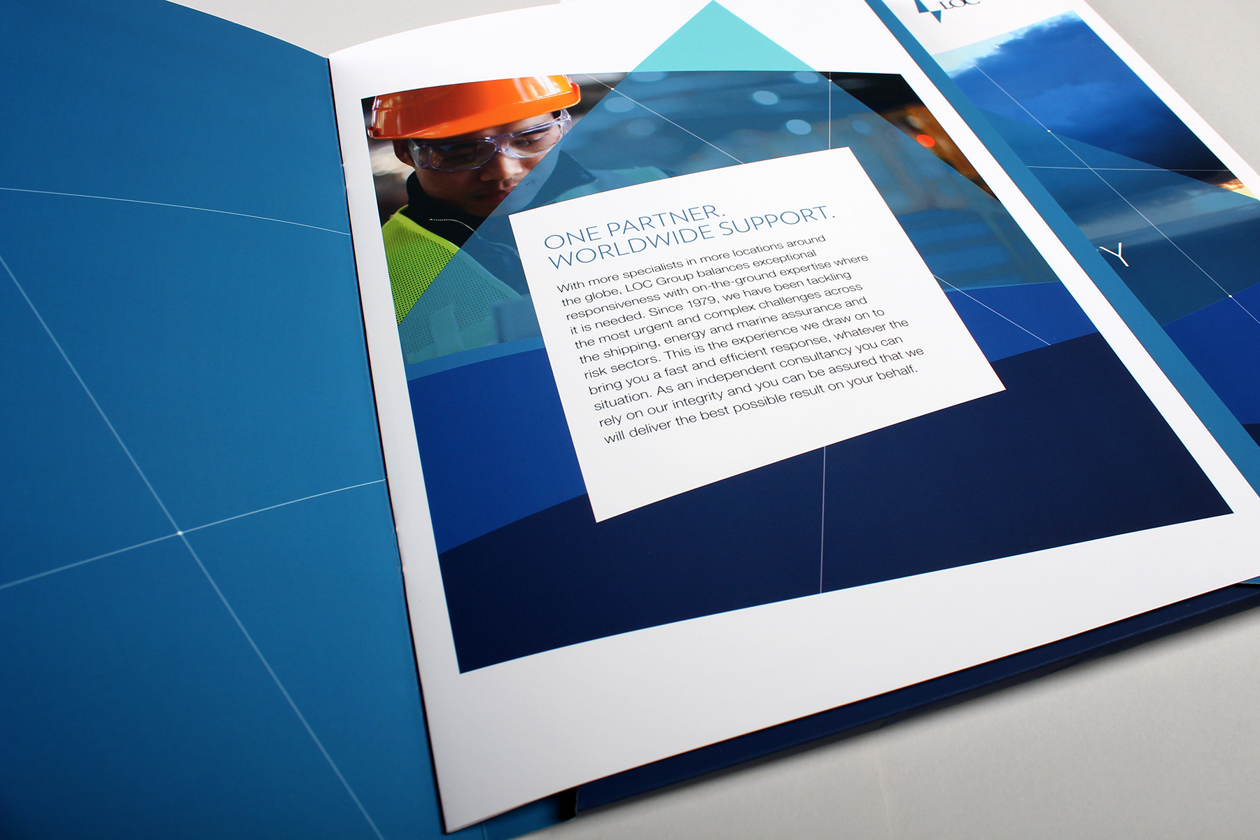
Our visual identity look and feel concept became inspired by the idea of global connectivity mashed up with a contemporary nautical twist.

The identity has been inspired by nautical themes, marine charts and engineering blueprints.

We followed through with a flexible visual identity concept, built upon a series of triangular partitions linked by a cartographic like thread. We wanted the system to be flexible enough so that it could easily be placed into any format. The system is cohesive and strong, yet due to its randomness of form, retains a contemporary aesthetic. The identity has been inspired by nautical themes, marine charts and engineering blueprints.

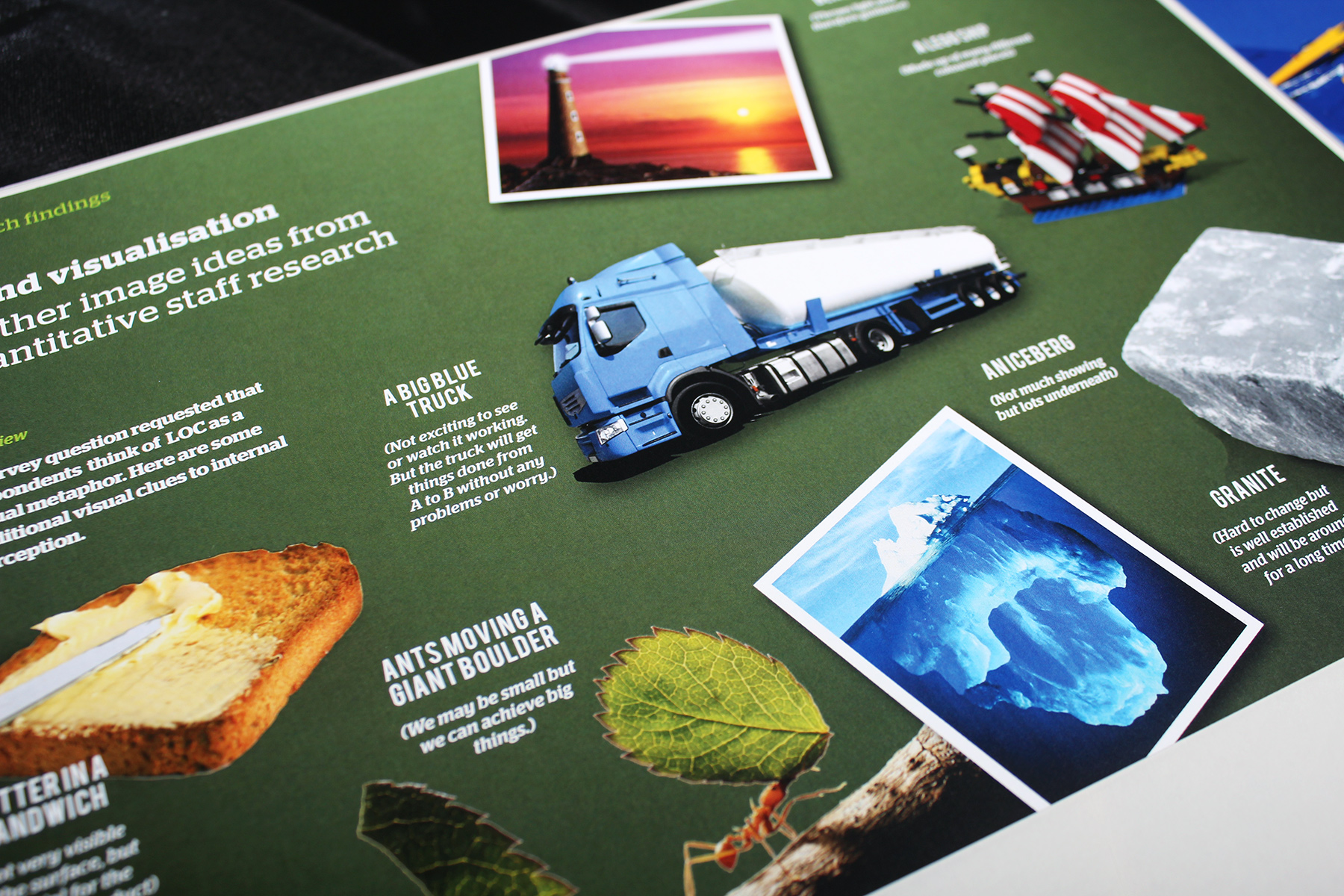
Imagery and graphic devices interact in a system which is both random, yet controlled at the same time.

We continue to work with LOC on a day to day basis, and have delivered a new engineering brand identity and website for sister business Longitude. We have also created a sub brand and visual identity extension for their LOC Renewables proposition. We also support LOC on a tactical basis, creating a raft of additional advertisements, campaign and communications materials.

Sign up for our Firedog Newsletter
* = required field