Brand identity

Method Investments

A refined brand identity for a boutique European advisory and fund business.

Method Investments & Advisory Ltd is a boutique, independent investment firm. Established in 2001, Method has successfully grown to establish a well capitalised business, offering a range of services to the global investment community. Our work included research, strategy, messaging, brand identity, visual look and feel design, literature and website design and build.

The identity is progressive yet retains a strategic brand story which gives it a sense of legacy

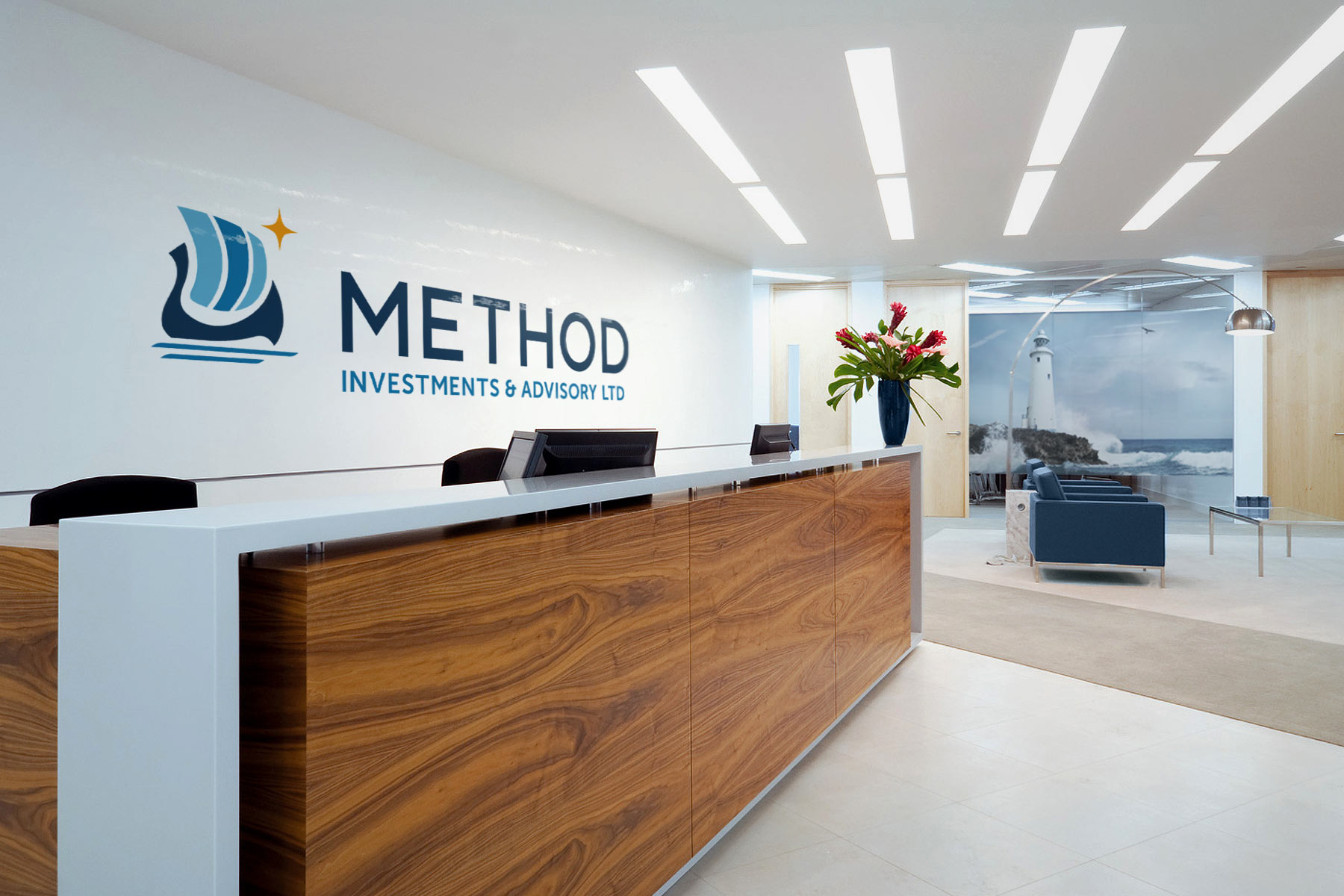
Method were looking to develop additional fund management products, moving their business model from purely trading and advisory into fund management.

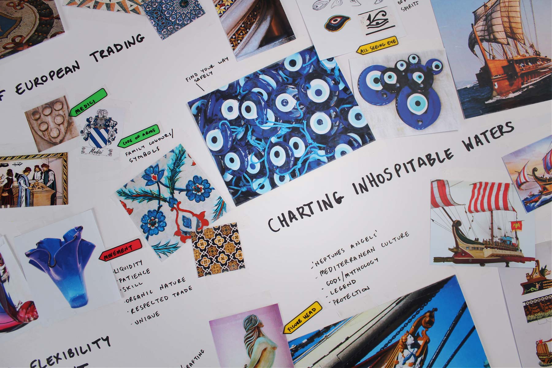
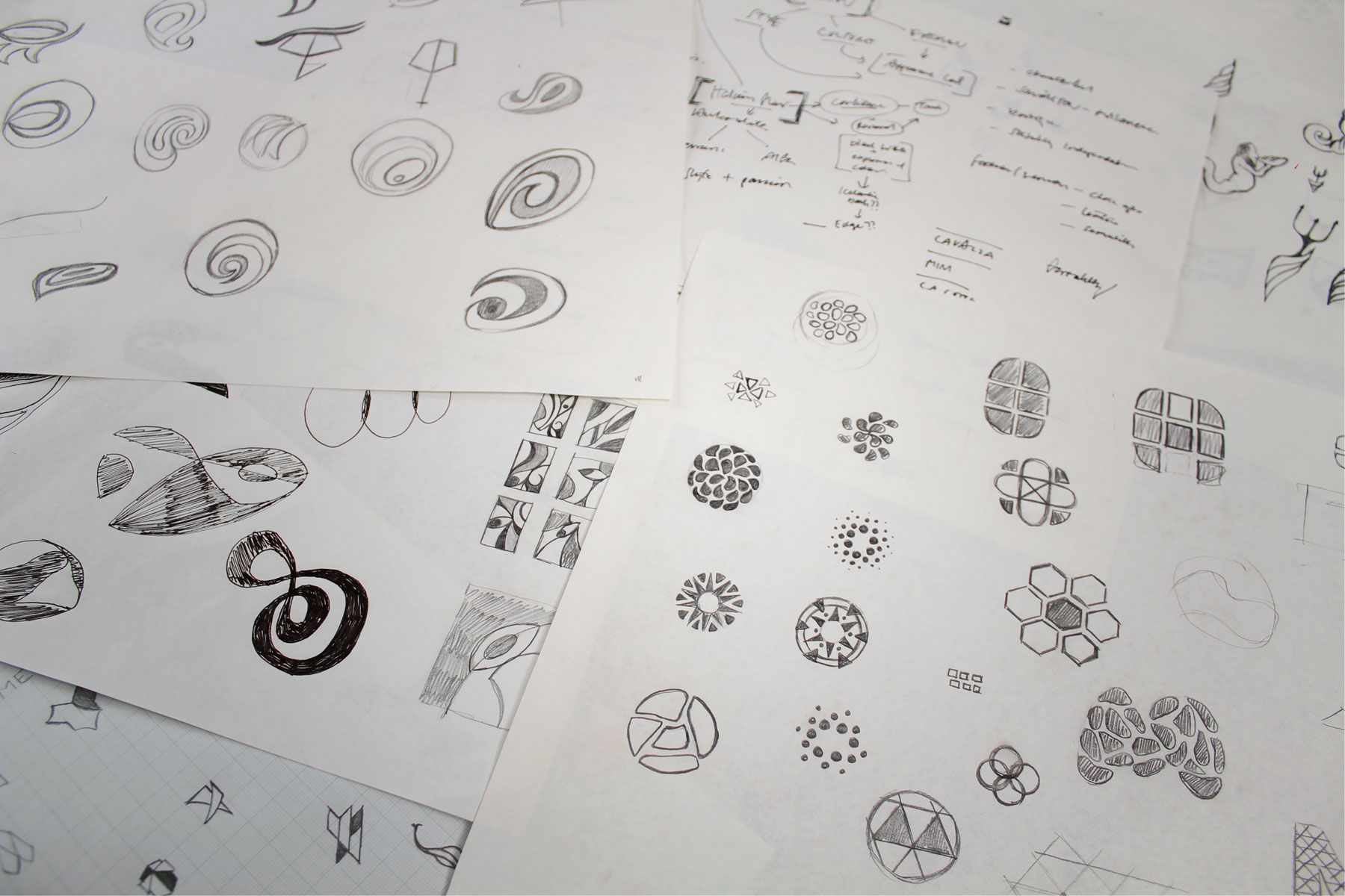
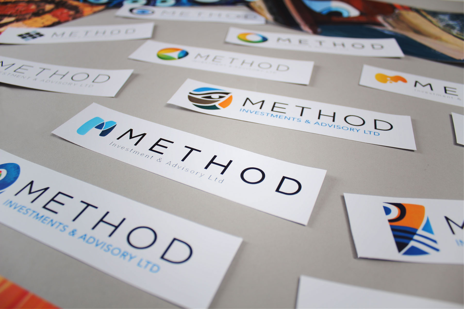
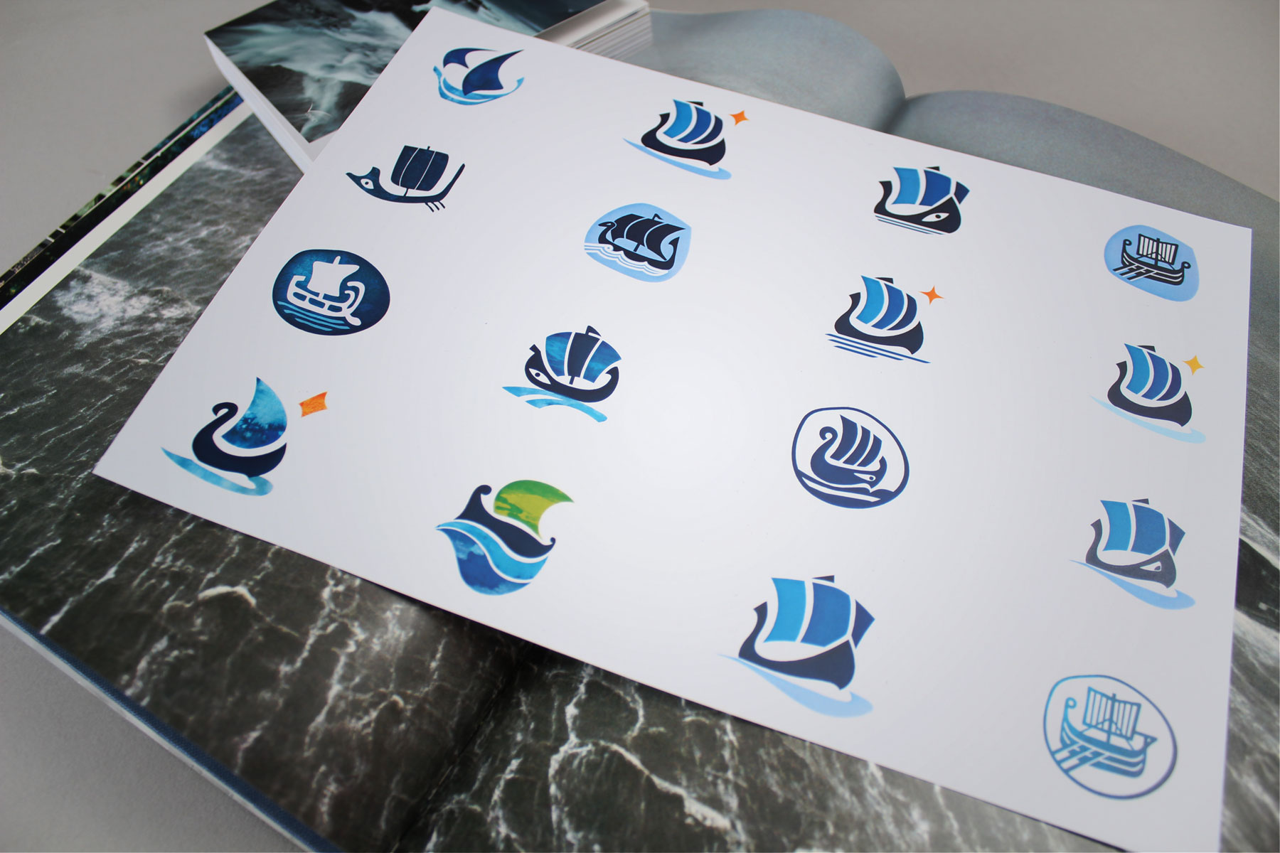
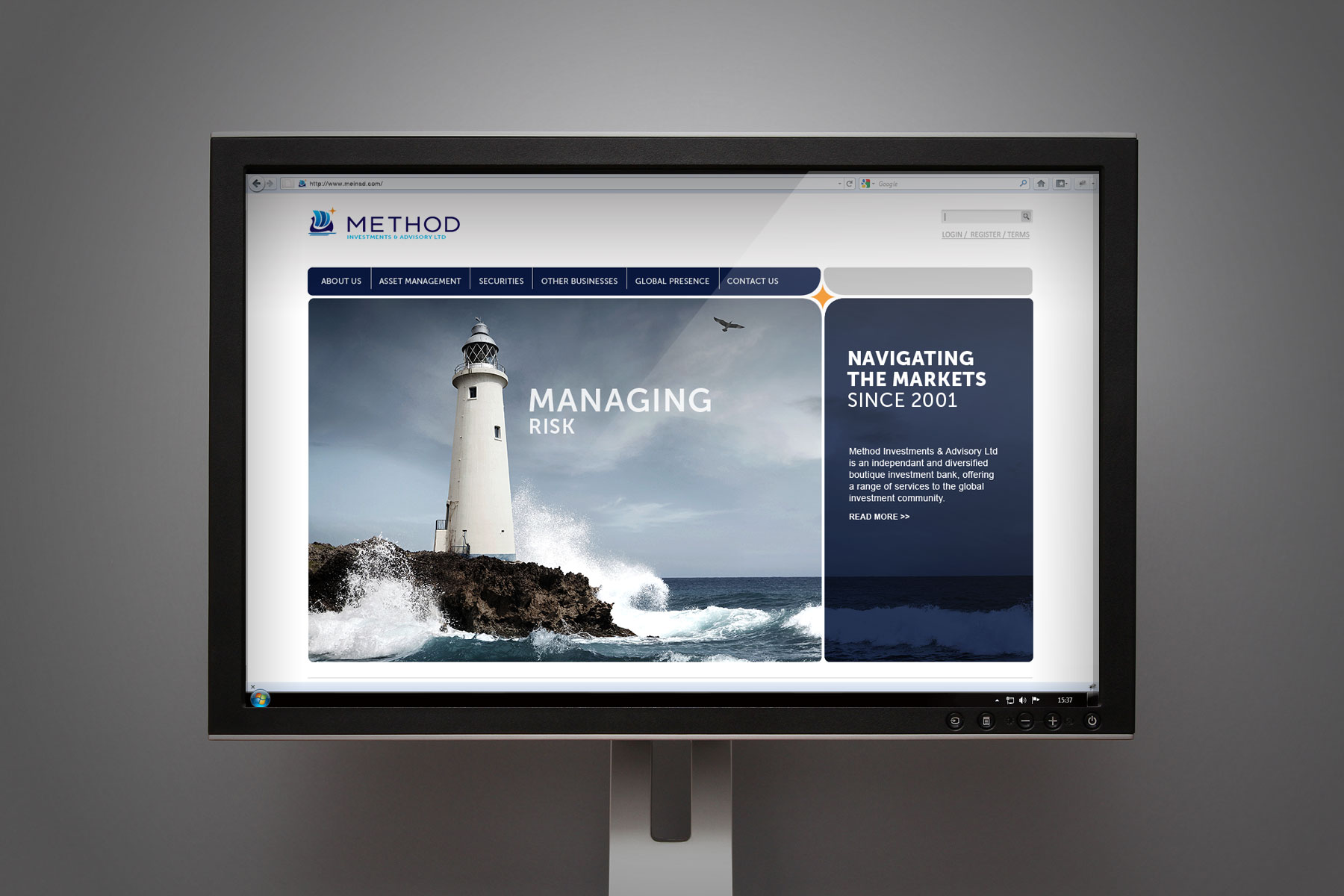
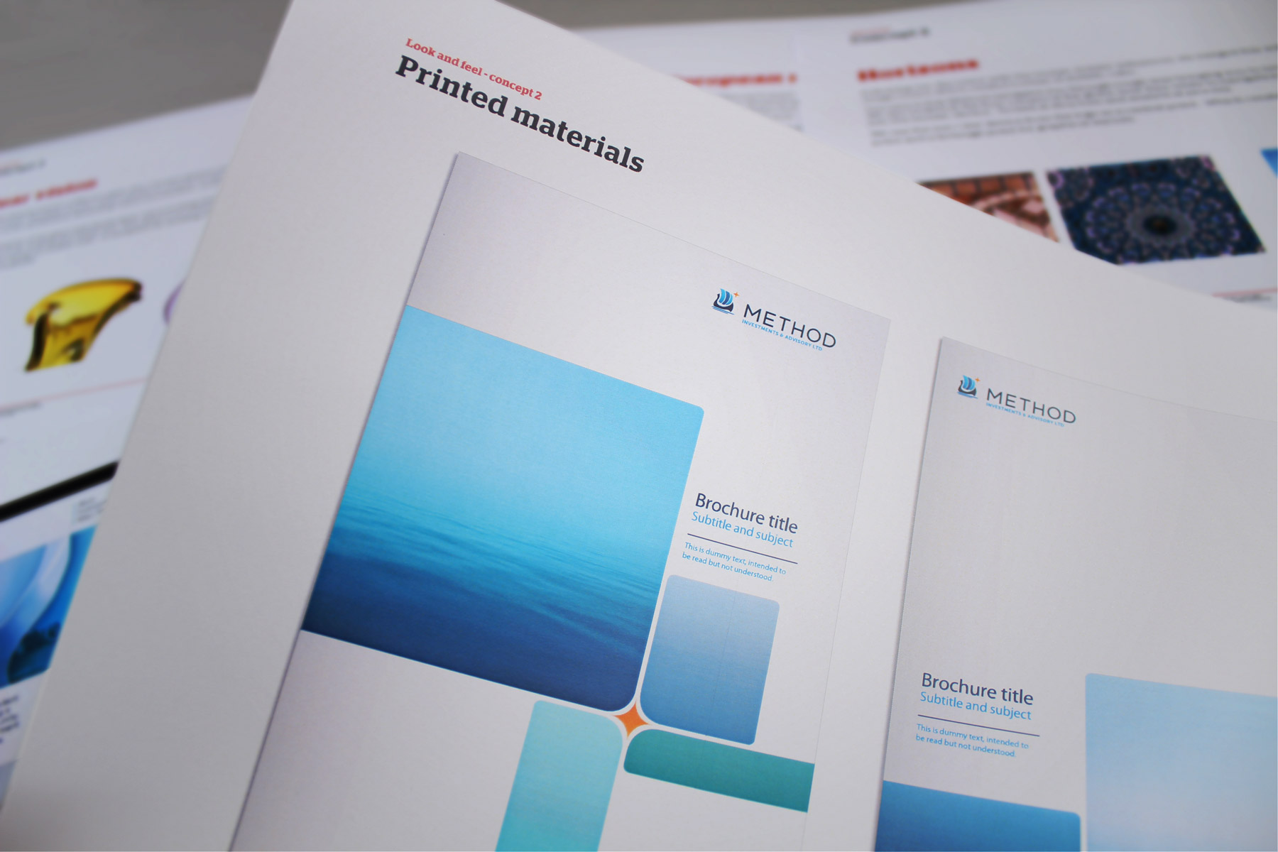
The aim of this rebrand project was to raise the profile of Method from a pure trading business to a serious player in the boutique fund investment landscape. Firedog was tasked with building a strategic direction and family of identities and websites which share the same corporate identity, yet have cultural nuances across the regions.

Our research made it clear that Method was already differentiated in a cluttered market. All we needed to do was communicate this.

Our focus group session and extensive industry research made it clear that Method was already differentiated in a cluttered market. All we needed to do was communicate this. The three themes emerging from our research were the idea of ‘boutique’ – Method are a small, agile company with a refreshingly personable, client-centric approach; ‘a new way’ – They are constantly innovating and finding the best and safest ways to generate return on investment; and ‘European flair’ – whilst they operate outside Europe as well, their extensive knowledge and experience in this area is an important asset to be embraced and communicated.

We combined the ship symbol with a clean and progressive type family ensuring that whilst we paid homage to origins we were also able to break from tradition
The choice of nautical imagery was carefully controlled to stay away from cliches whilst communicating strength and focus

We harnessed the idea of Method representing a strong and guiding European ship trading through turbulent seas.

For the creative look-and-feel our concept was based on the influences of the Mediterranean in the history of European trading. We harnessed the idea of Method representing a strong and guiding ship through turbulent seas. The resulting visual language is both unique and particular to their offer. The new brand and website were launched in the UK in May this year and the initial response to this invigorating brand has been incredibly positive. We are now focusing on the Luxembourg and US versions and will continue to work with Method on strategic implementation of their brand family.

The identity also simplifies into a clean look and feel applied to stationery and corporate correspondence
Sign up for our Firedog Newsletter
* = required field