Case Studies
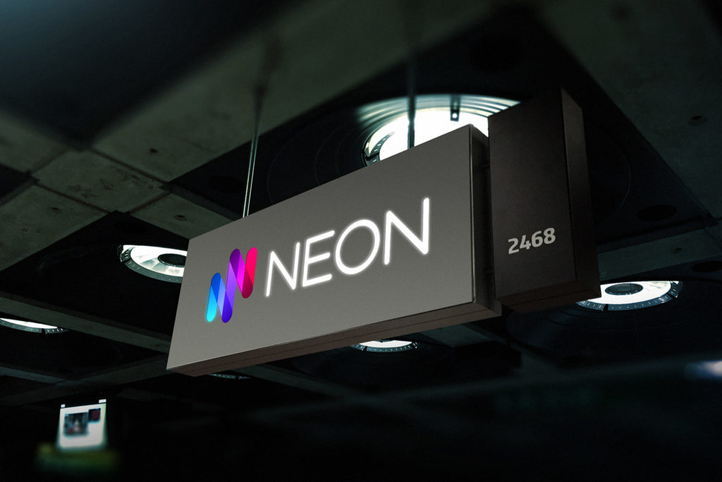
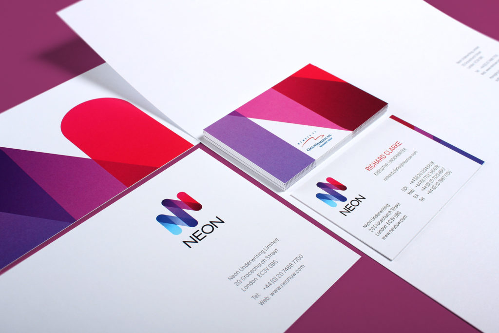
Bright, energetic and deeply alternative brand created for Lloyds of London insurer, Neon
Neon is a contemporary underwriter operating out of London. It is a Lloyds of London insurer operating in a saturated marketplace. Firedog has been commissioned to create a differentiated proposition which enables Neon to clearly stand apart from the crowd.
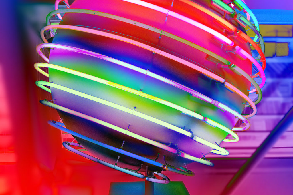
The Neon name is a branding designer’s dream brief. The Neon name originated in the 19th century and stems from the Greek term Neos, literally “something new”. We were to use this singular direction in order to create a bright and bold brand identity quite unlike it’s traditional peers.
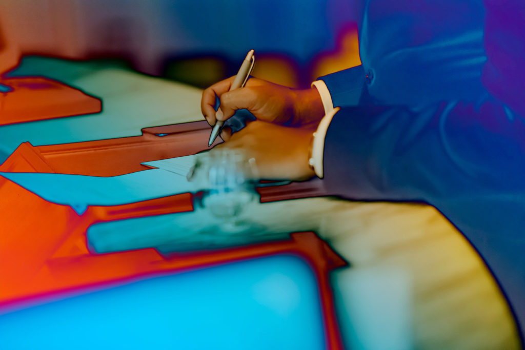
Firedog has been tasked with the full project remit from undertaking research, through to creating a strategic framework and culminating in a full brand and visual identity. We worked against a hard launch deadline whereby the previous business entity was retired and the new Neon identity unveiled all as an absolute surprise to the market including even the company’s own staff! This made for a high energy creative process which came right down to the wire.
We were very fortunate to work with a very brave, visually driven client; and the results are evident of a dynamic business striking out, challenging the status quo. We are very proud of the results and the bold brand identity has lived up to its word in shaking up a somewhat stuffy and traditional sector.
To find out a bit more about the creative process, have a look at the full case study.