Design
In search of authenticity – what “craft design” says about the current human condition
There has been a craft design movement brewing for the last few years. No more so than in our little neighbourhood of Shoreditch. It has become very hard to ignore the growth in “craft” design.
I use the term “craft”, (in parenthesis no less) because I’m not sure there is a name for it yet. But its signs are everywhere. Visually speaking, it’s a fascination with the movement from coated to uncoated. From smooth white to rough recycled. From full colour to single.
The most visible example is in packaging design. Not so much in big business brands like the ones Unilever champion, but rather in the brands we all like to call “artisanal.”
A good example of this movement in play is with our client, Twinings, and a competitor of theirs, teapigs. We produced a digital sales app for Twinings recently, and I recall some musings around the teapigs product in early discussions. The subject was around retail strategy; something that I would never profess to master. What I did clearly recall was the topic around teapigs selling their boxes of tea at £4.15 a unit (with only 15 bags). Yes, it’s loose leaf tea, and it’s probably not bad. But I cast my eye to the packaging of both and was struck by the print processes involved.
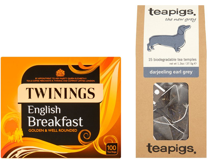
Looking at the teapigs brand identity, you couldn’t sail more in the opposite direction. Twinings English Breakfast, good value with 50 bags at £2.80 – contained perceivably more luxurious techniques. There is foil blocking, four colour print and a Royal Warrant to top it off. The typography is carefully rendered. The background is covered in detailed illustration. Looking at the teapigs brand identity, you couldn’t sail more in the opposite direction. Imperfect type mark (with the E.E.Cummings-like lower case initial T), mis-registered screen printed illustrations and a basic brown craft design board as the package itself. Being a brand designer by trade, I know this is not by chance. In fact, everything is rather considered.
This got me thinking back to the strategy, and ultimately where the consumer’s mind is placed. Teapigs have faith that the consumer is looking for something less shiny. Their growth as a brand is a clear indication of their intuition on shoppers’ habits. What’s even more fascinating is that teapigs is a subsidiary of Tetley, which in turn is owned by Indian large business brand Tata. So its artisan image is really just a sham.
The Twinings / teapigs example is just the start. Look at any of the premium / artisan products in your local store and you will quickly establish that the craft design aesthetic moves from the perfect to the imperfect – and at a price premium to boot.
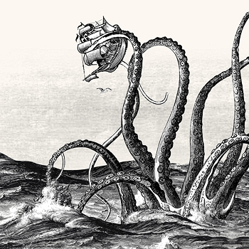
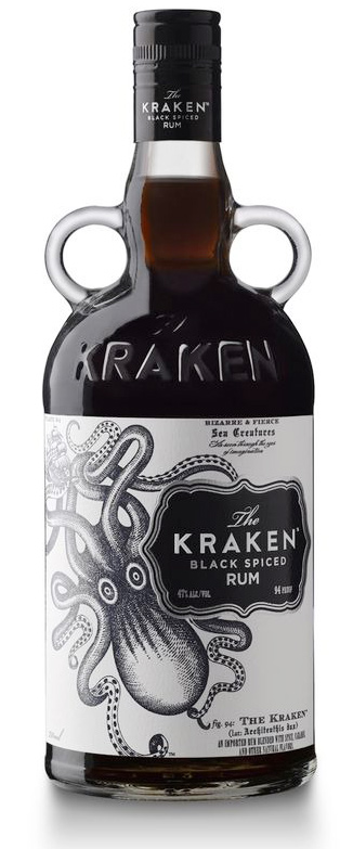
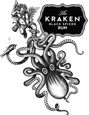
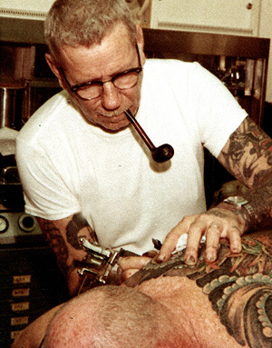
Drinking rum has never been a habit of the hoi-polloi. Even still, it has received the same treatment. My favourite artisan example in this category is “The Kraken” spiced rum. It features just one colour, with a deliberate homage to Victorian etching and associated nautical themes. Sailor Jerry follows the same kind of vibe, basing its identity on a prominent American tattoo artist, famous for his tattooing of sailors during the 20th century wars. Not traditionally associated with “classy” at all. Both of these rums could be considered premium, with the Kraken retailing for at least 30% more than similar competitors. Competitor Captain Morgan retails for £10 less a bottle, and features four colour print, foil blocking and embossing.
All of these examples show that the consumer is willing to pay more for a craft design product that projects a less well-made image.
This clearly breaks the rules that we have been taught as designers and creatives; that perfectly machined type and formal design is an indication of class.
So what does that say about the current human condition? Reality TV aside, I don’t quite think we are losing our refined tastes. Quite the opposite, in fact. I think it’s about the search for Authenticity.
Life imitates art. And in turn, art imitates life. The population have grown (even more) distrustful of politics and big business. Tesco’s poor fortunes of late are a clear signal of the UK zeitgeist. People have woken up to the fact that the Tesco brand represents a lack of authenticity. Tesco’s modern nemesis, Lidl, goes on to state in recent advertising “From now on, our advertising will feature the authentic, unvarnished voices of our customers. After all, they’re the ones who know us best.” Ouch.
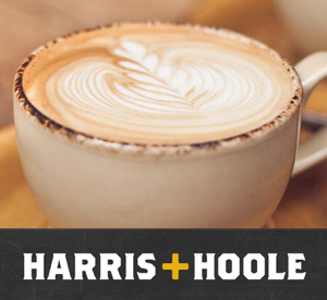
It has become laughable that, because companies like Tesco have failed so dismally in their own brand image, they have been silently diversifying by acquiring more authentic, smaller brands. For example, Tesco now owns 49% of artisan coffee shop Harris+Hoole. It’s interesting to note that when consumers find out that they have been duped in this way, they feel really cheated. A tweet from a consumer states : “Appalled to discover seemingly independent #Harris+Hoole coffee shop @N8CrouchEnd 49% owned by #Tesco. Never go again.”
Another customer states on the Guardian: “It’s disingenuous. It makes me upset. I feel duped. If it had been called Tesco Coffee, I wouldn’t have come in.”
On the subject of coffee, just look at the public outcry around Starbucks’ reticence to their UK tax obligations. Here is a global brand built on the visual of a hippy-like mermaid girl. In reality, public perception of Starbucks is that of a bunch of suited criminals, barely above prohibition-era mobsters. Is it surprising that consumers have lost empathy with glossy brands?
So where does that leave businesses looking to engage with consumers on an authentic level? Branding can often be the veneers on a set of rotten teeth. Look, it’s complicated. And very little of it actually has to do with old fashioned branding. Branding can often be the veneers on a set of rotten teeth. If your heart is not in the right place, a new haircut is unlikely to make people like you.
Go back to your boardrooms and look at your business. Perhaps think about your operations and consider where your nice margins equal lying to your customers. Do you have meaningful values? Do you have purpose? Do you believe in yourself?
That’s probably a fine place to start.